48 News
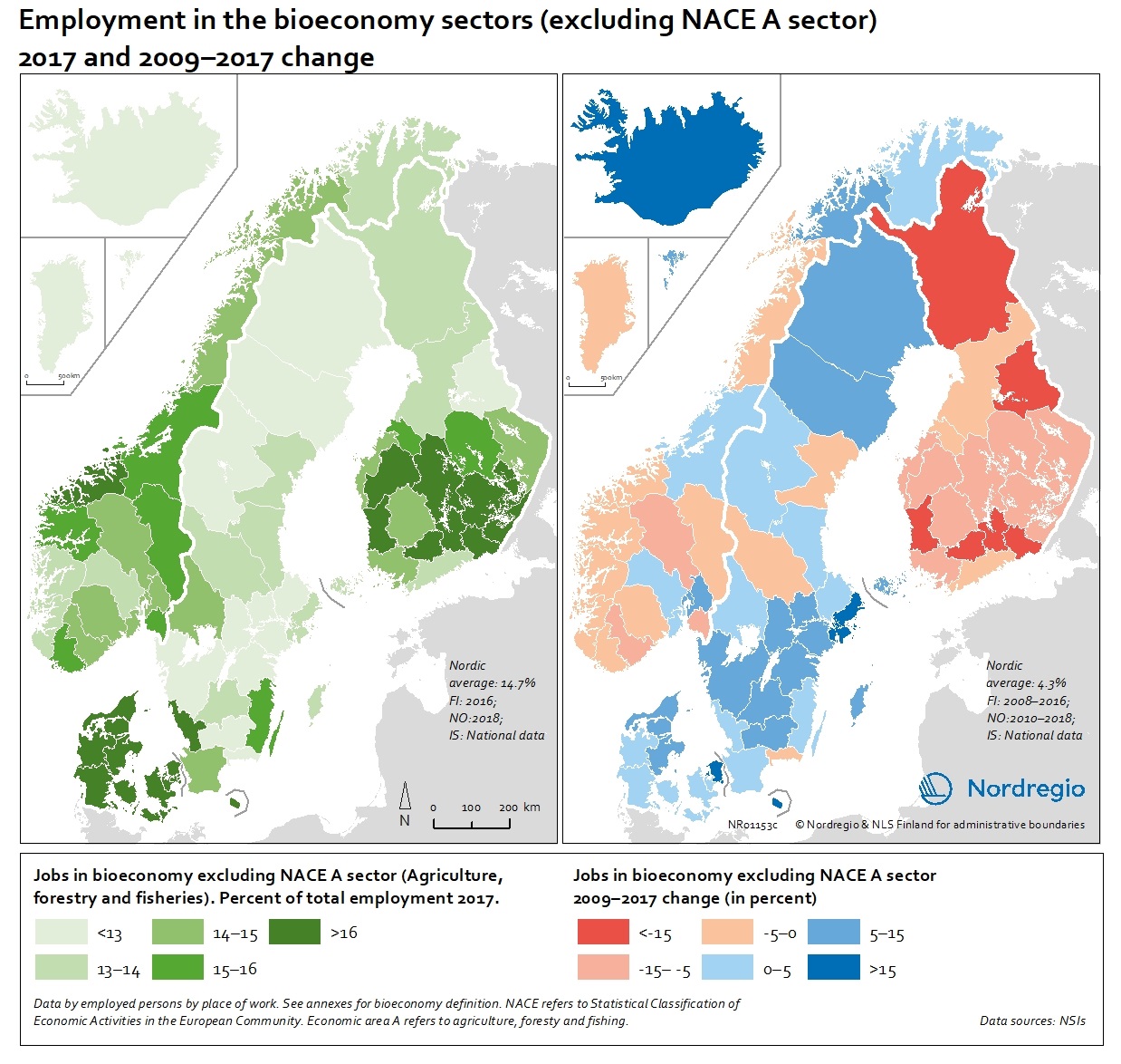
People employed in the bioeconomy excluding NACE sector A in 2017 and 2009-2017 change
These maps show the number of jobs in the bioeconomy sectors as a share of the total employment in 2017 (left) and 2009-2017 change (right), excluding the NACE A sectors. The non-NACE-A sectors have seen a more moderate decrease in Finland but a noticeable increase in most parts of Sweden, Denmark and the Faroe Islands and a remarkable increase in Iceland with more than 15% (Figure 9.3). The average increase in the Nordic Region is 4.3% in the non-NACE-A sectors. There are also notable differences within the countries, showing that regional differences matter. In Denmark, Greenland and the Faroe Islands, there is a positive trend in most regions, but in Finland, almost all regions are losing jobs in the primary industries. In Norway and Sweden, some regions show positive development while others are in decline. Read the digital publication here.
 2020 February
 - Economy
- Labour force
- Nordic Region
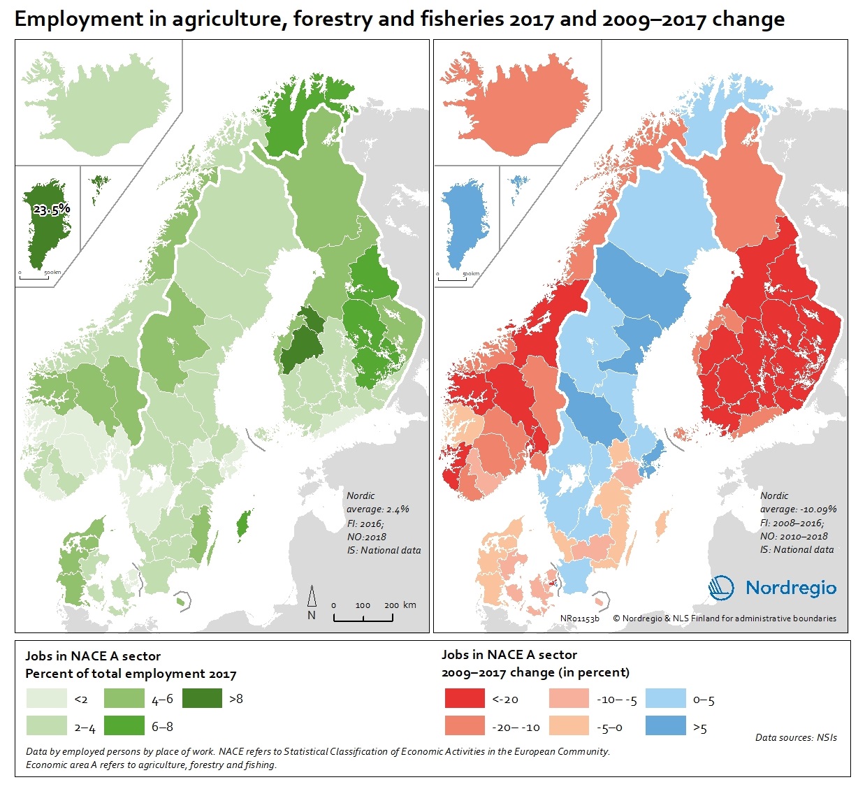
People employed in the agriculture, forestry and fisheries sectors (NACE Sector A) in 2017 and 2009-2017 change
These map show the number of jobs in the agriculture, forestry and fisheries sectors (NACE A sectors) as a share of the total employment in 2017 (left) and 2009-2017 change (right). The map (left) indicates ranges of people employed in agriculture, forestry and fisheries sectors between below 2% to above 8%, with the highest proportion being in Greenland with 23.5% in 2017. In the EU-28, the overall proportion of the total workforce with jobs in the NACE-A sectors is an average of 4.6%. Overall, the NACE-A sectors show a sharp decline in employment (right map), particularly in Finland, Iceland and Norway (except northern Norway), where the decline was up to 20% between 2009 and 2017. Read the digital publication here.
- 2020 February
- Economy
- Labour force
- Nordic Region
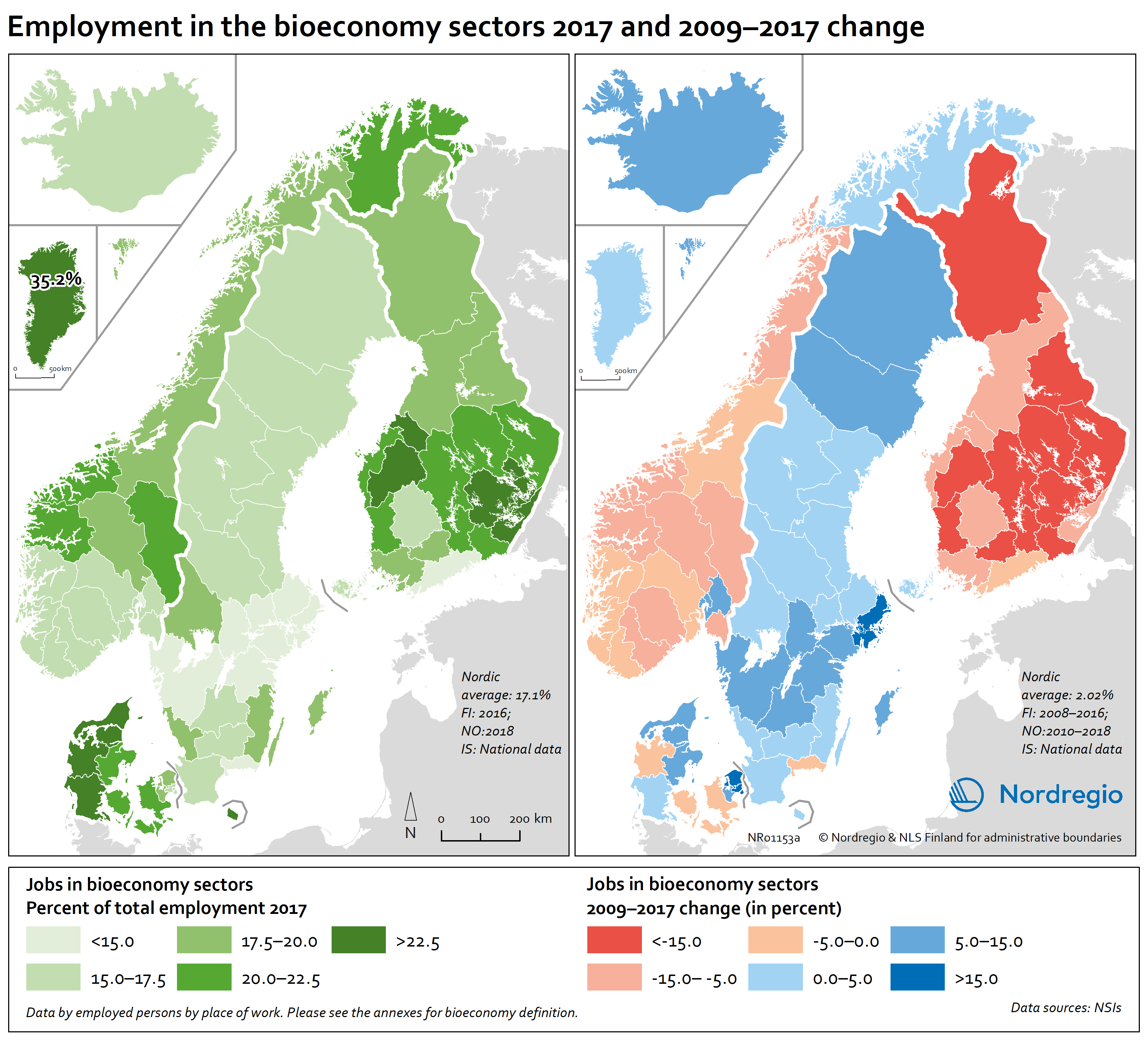
People employed in the bioeconomy including NACE sector A in 2017 and 2009-2017 change
These maps show the number of jobs in the bioeconomy sectors as a share of the total employment in 2017 (left) and 2009-2017 change (right). The share of jobs in the bioeconomy varies from below 15% to above 22.5%. For instance, in the western regions of Denmark, the central and southern regions in Finland, Greenland and some mid and northern regions of Norway, over 22.5% of the working population is employed in the bioeconomy. At the same time, most regions in mid-Norway, in all Finnish and some Danish regions witnessed negative development in jobs in the bioeconomy. In Greenland, Iceland, Faroe Islands, Sweden, Northern Norway and other parts of Denmark the situation is very different and the number of jobs in the bioeconomy has increased. These proportions should also be seen in relation to the increase in total number of jobs17 in most regions in the Nordic countries except for the Finnish regions and Åland where there is a decline in most regions. Read the digital publication here.
- 2020 February
- Economy
- Labour force
- Nordic Region
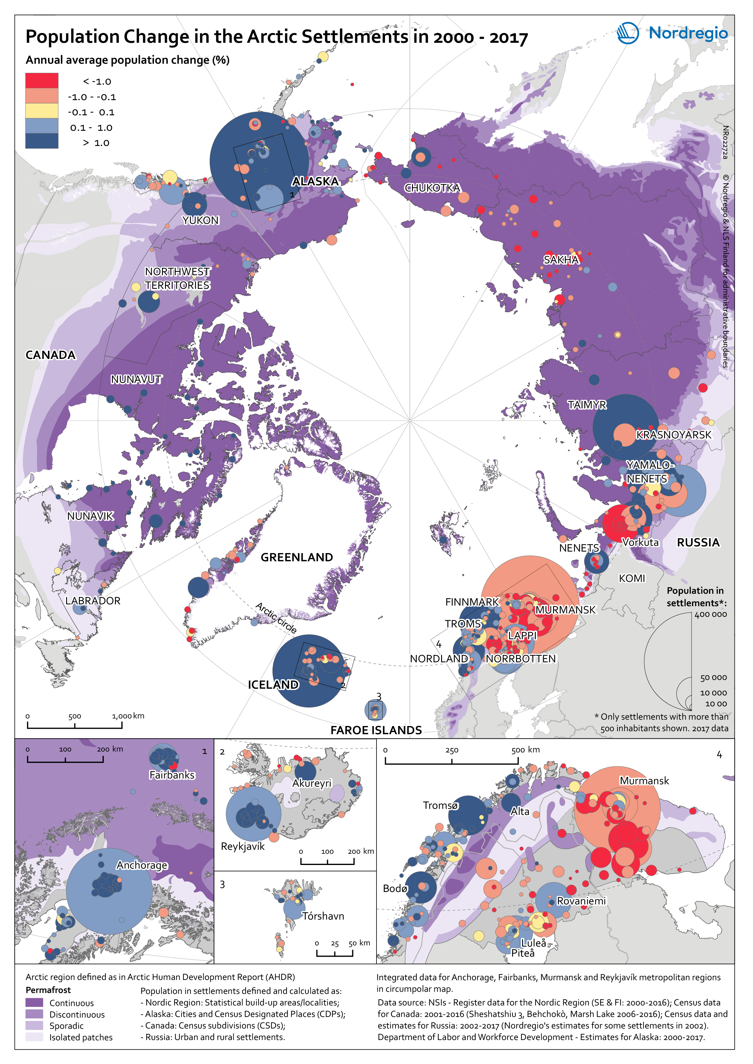
Population change in Arctic settlements
The map provides an overview of the population change in Arctic settlements with 500 inhabitants or more during the period 2000 to 2017. The purple underlaying layer shows the extent of permafrost across the Arctic. The circles indicate settlements with 500 inhabitants or more and are proportional to the total population in 2017. Blue tones indicate population growth between 2000 and 2017, while red tones indicate population decline. Four zoomed-in maps show areas with high settlement density – Arctic Fennoscandia, Iceland, the Faroe Islands, and Alaska. In Alaska, population increased in the largest settlements between 2000 and 2017. The population decline in small settlements located far from the two large cities – Anchorage and Fairbanks – has been caused by outmigration, which has cancelled out the positive natural population growth. In the Canadian Arctic, most people live in a few settlements. Similar to Alaska, the population increased in the largest settlements and decreased in small settlements. Most of the smaller settlements in Arctic Fennoscandia have witnessed a population decline between 2000 and 2017, except in Norway. The dominant pattern in Fennoscandia is a population growth in larger settlements and a population decline in surrounding smaller settlements. This is similar to the pattern observed in the other Nordic Arctic countries – Iceland, Greenland, and the Faroe Islands. New inhabitants settled in the capitals (Reykjavik, Nuuk, and Torshavn) and regional centres, from both domestic and international locations, while settlements in sparsely populated areas are becoming less attractive to incomers. In the Russian Arctic, the regions can be divided into the oil and gas areas of the Khanty-Mansi and Yamal-Nenets, and other areas. The population is growing in the oil and gas areas and declining slowly in the others. Over 75% of the settlements have been shrinking throughout the 21st century, mainly because…
- 2019 March
- Arctic
- Demography
- Migration
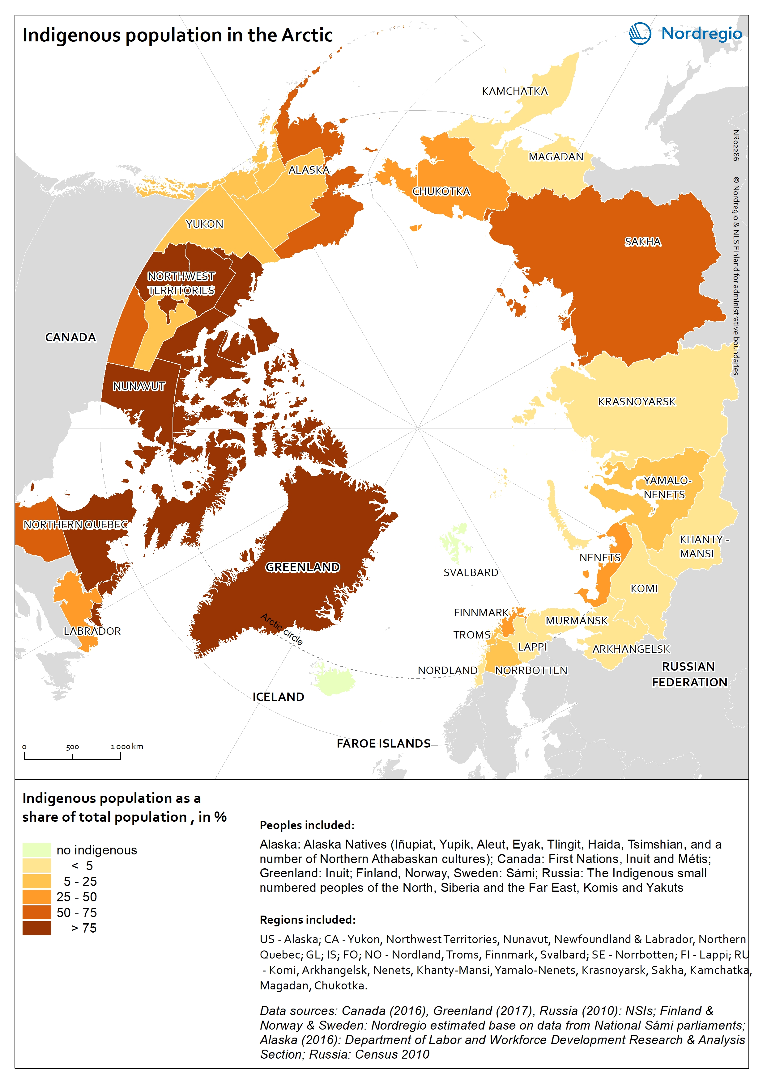
Indigenous population in the Arctic
The map shows the indigenous population as a share of the total population in the Arctic. Approximately one million people, or 9% of the total population in the Arctic is indigenous. Indigenous population reassembles more than 40 different ethnic groups. In terms of statistics there are no circumpolar definition of an indigenous person and therefore the number of indigenous people is based on different national definitions. Official statistics do not necessarily recognize indigenous populations separately. The indigenous population is the highest in the Canadian Arctic and in Greenland, weighing more than 75% of the total population. The Yukon, the southern part of Northern Quebec, and Labrador and Newfoundland (Canada) have the lowest shares of indigenous population. In the remaining part of the Arctic, indigenous peoples represent less than half of the total population, except in Sakha (Russian Federation), Southwest Region and Northern Region (Alaska, USA) where 50-75% of the population is indigenous. There are no indigenous people in Iceland, the Faroe Islands and Svalbard.
- 2019 March
- Arctic
- Demography
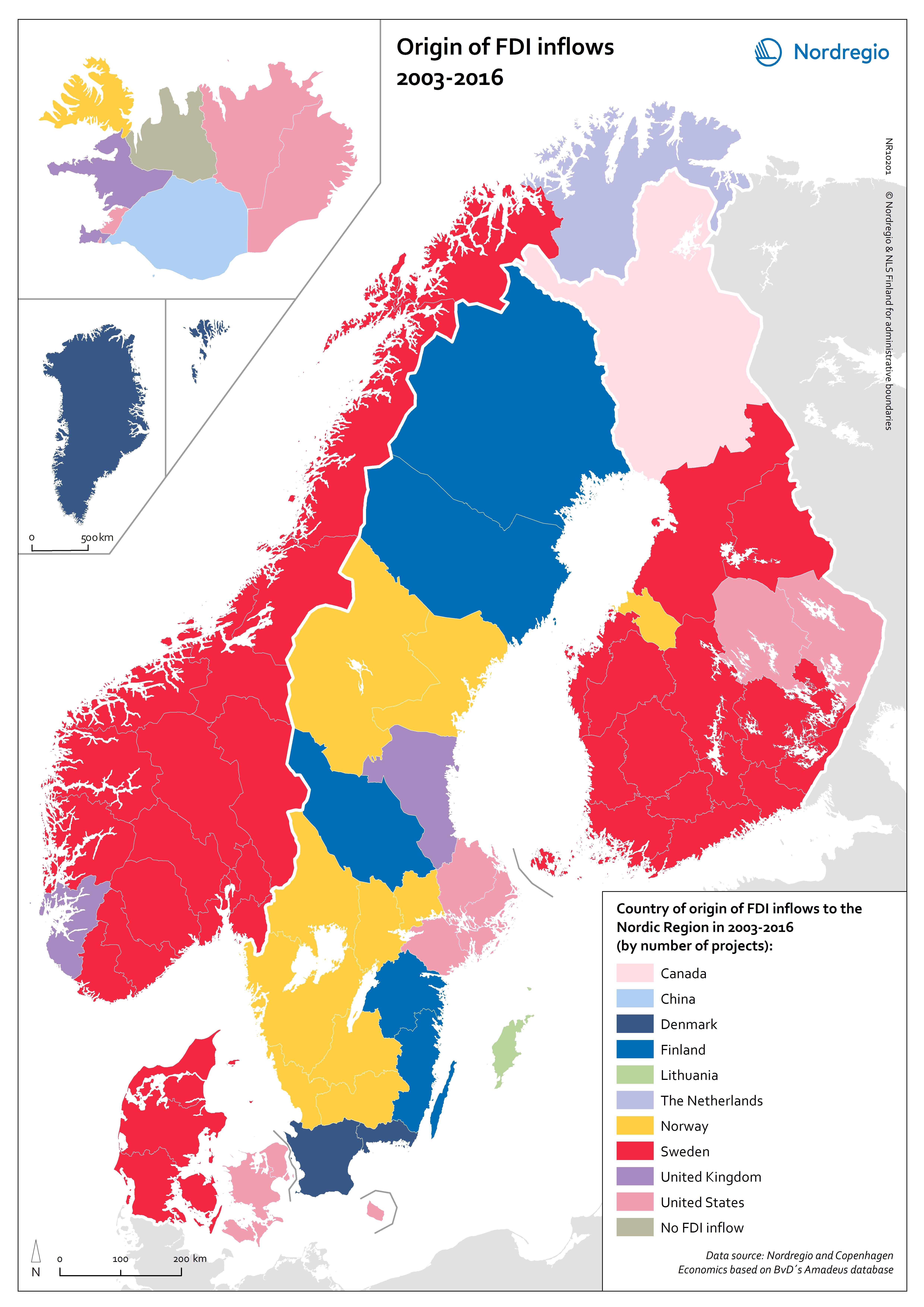
Origin of FDI inflows 2003-2016
This map shows the country of origin of Foreign Direct Investment (FDI) in the Nordic regions between 2003 and 2016. The colours indicate different countries of origin of FDI inflow by number of projects between 2003 and 2016. FDI inflows examined by country of origin, reveal an interesting pattern in terms of intra-Nordic investment inflows, confirming the assumption that proximity, both in terms of geographical distance, and in terms of rules, regulation and business culture is an important driver of FDI. A breakdown at the regional level reveals that 55 out of the 74 Nordic regions received the largest number of FDI projects from a region located in another Nordic country. The largest share of these intra-Nordic flows originates from Sweden (35 regions in total), particularly in the manufacturing sector as well as the ICT sector in Norway. The largest share of FDI projects from Finland are attracted to Sweden’s highly competitive international manufacturing industry. Denmark is the main source country of FDI inflows in both Greenland (mostly in the transportation and storage and business services sectors) and the Faroe Islands (mostly manufacturing and finance and insurance activities sectors). Eighteen Nordic regions have their largest source country in terms of project located outside the Nordic Region, i.e. other European and extra-European countries. FDI inflows from other European countries are the highest in terms of projects in six Nordic regions, most of these regions can be characterised by their relative remoteness and strong industrial profile. Finally, two extra-European countries, namely the United States and Canada, are the largest source country in twelve Nordic regions, that are either capital city regions with a strong and diversified service sector or peripheral industrial regions.
- 2018 December
- Economy
- Nordic Region
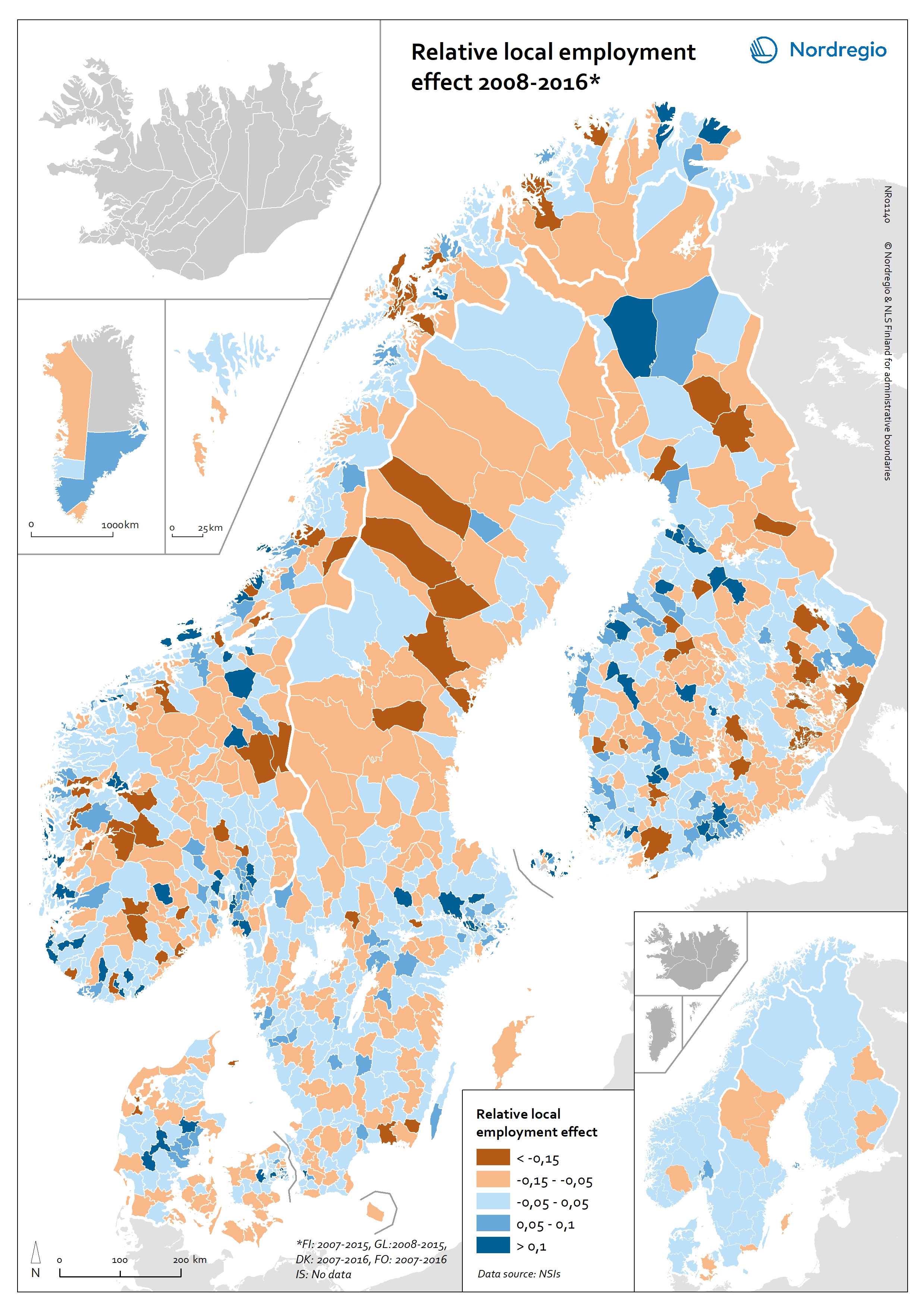
Relative local employment effect 2008-2016
The map shows the change in jobs (growth or decline) at municipal level over a period that can be attributed to local factors (e.g. local policies or local natural or institutional conditions) and is thus not due to national or industry trends. The map is based on shift-share analyses which can help answer why employment is growing or declining in a local or regional industry. This type of analysis can answer questions like: How much of local job growth can be attributed to expected national and sectoral trends and how much is due to local factors Is the local economy growing or declining? How does the community compare with other communities? What are the local strengths and weaknesses in providing jobs and in which sectors? What industries are doing well? What industries should be targeted? There are large differences between municipalities in terms of the change in employment due to local factors. For example some of the municipalities in Mid Jutland in Denmark show a high local employment effect while others in the North of Jutland do not. These differences can be due to access to markets, to industrial culture, to municipal or regional facilitation etc. In-depth research is needed in order to understand the reasons. The map does not show the total change in jobs.
- 2018 June
- Labour force
- Nordic Region
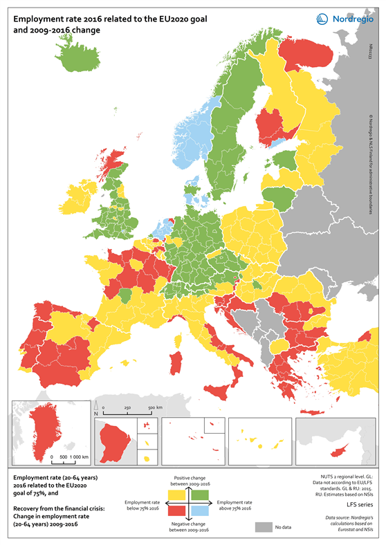
Employment rate 2016 related to the EU2020 goal and 2009-2016 change
This map shows the employment recovery from the financial crisis, with the employment rate (20-64 years) in European regions in 2016 related to the EU2020 goal of 75%, as well as the change in the employment rate between 2009 and 2016. The green colour indicates regions with employment rates above 75% and an increase in the employment rate between 2009 and 2016. The red colour indicates regions with employment rates below 75% and a decrease in the employment rate between 2009 and 2016. The yellow colour indicates regions with employment rates above 75% and a decrease in the employment rate between 2009 and 2016. The blue colour indicates regions with employment rates below 75% and a decrease in the employment rate between 2009 and 2016. The grey colour indicates regions with no data available. On a European scale, the effect of the financial crisis on employment became noticeable from 2009 onwards when average employment rates started to decline. This continued until 2013 when the average European employment rate reached its lowest level of 68.3% for the age group 20–64 years. After 2013 the employment rate started to rise again but it took until 2016 for the average European employment rate to reach and then surpass pre-crisis levels. In 2016 the average employment rate in the European union was 71%, edging closer to the EU2020 goal of 75%. In some regions, primarily in southern Europe, employment rates have still to recover to pre-crisis levels. This is particularly so for Greece, Spain, Italy and Portugal which were particularly hard hit by the debt crisis and thus had to undertake massive cuts across the public sector. On the other hand, some countries such as Germany, Austria and Switzerland saw rising employment rates even during the financial crisis. The differential nature of outcomes in…
- 2018 February
- Europe
- Labour force
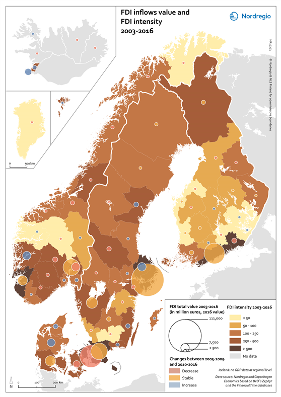
FDI inflows value and FDI intensity 2003-2016
This map shows the total value of Foreign Direct Investment (FDI) in million euros, and the intensity of the FDI in the Nordic regions between 2003 and 2016. The FDI intensity is an index of the value of FDI inflows divided by the gross regional product. The FDI intensity index allows comparing the performance of the Nordic regions in attracting FDI inflows by taking the size of the regional economy into account. A high intensity result reflects a more resilient regional economy, due to a diversity of investors. The brown shading indicates different FDI intensities in the regions between 2003 and 2016. The lighter the shade, the lower the FDI intensity. The grey colour indicates regions with no data. The circles indicate the total value of FDI in million euros (2016 value) in the regions between 2003 and 2016. The larger the circle, the greater the value. The colour in the circles indicate changes in the FDI total value between 2003 and 2016. The pink colour indicates regions with a decrease in the FDI value, the yellow colour indicates stable FDI values, and the blue colour indicates regions with an increase in the FDI value. Large capital city regions tend to be the main beneficiaries of FDI inflows and this pattern is also observed in the Nordic Region. Stockholm region emerges as the clear leader with a total deal value of EUR 110,000m. The Danish capital region attracted about half of Stockholm Region’s deal value – EUR 53,804m followed by Helsinki (EUR 45,000m), Skåne (EUR 30,000m), and Oslo (EUR 29,100m). The total deal value for Reykjavík is rather modest – at around EUR 2,000m, and is comparable to regions such as Dalarna and Jönköping (Sweden), Sør-Trøndelag (Norway) and Lappi (Finland). All Nordic regions have witnessed an increase in FDI inflows…
- 2018 February
- Economy
- Nordic Region
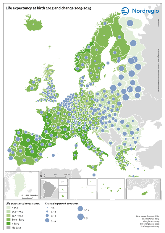
Life expectancy at birth 2015 and change 2005-2015
This map shows the life expectancy at birth in the regions of Europe in 2015 and the change between 2005 and 2015. The green shading indicates the life expectancy at birth in years in the regions of Europe in 2015. The darker the green the longer the life expectancy at birth. The grey colour indicates regions with no data. The blue circles represent the changes in the life expectancy at birth between 2005 and 2015. The larger the circle, the greater the increase in the life expectancy at birth between 2005 and 2015. As one of the UN Sustainable Development indicators for good health and well-being, life expectancy at birth measures the general health status of a population. Life expectancy at the national level is highly correlated to national income indicators such as GDP per capita. Most of Europe has however reached a level where further increases in wealth no longer increase average life expectancy. The longest life expectancies are found in parts of Spain, France, Italy, Switzerland and Norway. In 2015 there is still a visible East-West divide, where countries in Eastern Europe, in the south-east of the Baltic Sea Region and Northwest Russia have a significantly lower life expectancy. The size of the blue bubbles indicate however that these regions have witnessed the largest increases over the last ten years. If their economies continue to grow it is likely that their life expectancy will continue to increase for some years to come. Regional differences are partly due to individual characteristics, but also to the local environment as well as the politics and institutions that influence the local economy, access to local services and care, general educational levels and the local norms that influence lifestyles.
- 2018 February
- Demography
- Europe
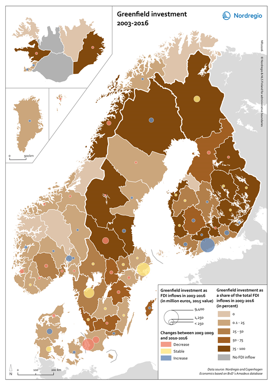
Greenfield investment 2003-2016
This map shows the value of greenfield investment as Foreign Direct Investment (FDI) inflow in million euros, and the greenfield investment as a share of the total FDI inflow in the Nordic regions between 2003 and 2016. Greenfield investments and mergers and acquisitions are fundamentally different forms of FDI, implying that their effect on host economies differs substantially. Consensus does however exist around the notion that the short-term effect should be greater when a foreign company’s penetration occurs through greenfield investment. The brown shading indicates different shares of greenfield investment related to the total FDI inflows in the regions between 2003 and 2016. The lighter the shade, the lower the share of the greenfield. The grey colour indicates regions with no FDI inflow data. The circles indicate the greenfield investment in million euros (2015 value) in the regions between 2003 and 2016. The larger the circle, the greater the value. The colour in the circles indicate changes in the greenfield investment between 2003 and 2016. The blue colour indicates an increase in deal value in the second period (>60% of the inflows of 2003–2016 took place in 2010–2016), yellow indicates a stable value in inflows between the two periods (40–60% of the inflows of 2003– 2016 took place in 2010–2016), while red indicates a decrease over time between the two periods (<40% of the inflows of 2003–2016 took place in 2010–2016). Examined by regions with the largest share of greenfield investment during the period 2003–2016, the administrative regions of Helsinki (EUR 9,402m), Stockholm (EUR 7,896m) and Copenhagen (EUR 6,601m) emerge as Nordic leaders in attracting this form of foreign investment. Due to their innovation-based economies and booming start-up scenes, both Västra Götaland and Skåne (Sweden) have also performed exceptionally well in attracting greenfield investment securing deal value totals of EUR…
- 2018 February
- Economy
- Nordic Region
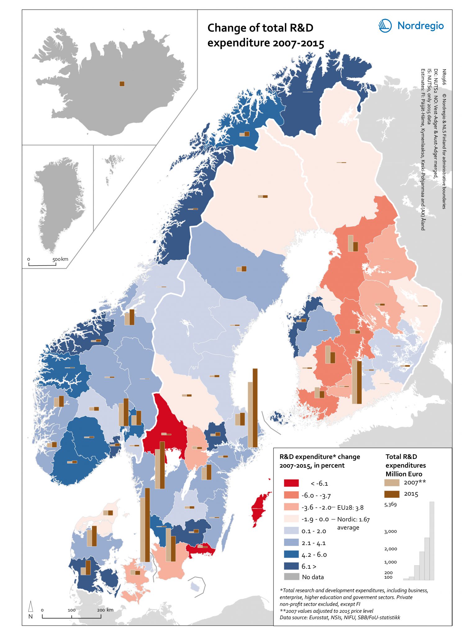
Change of total R&D expenditure 2007-2015
This map shows the change in the expenditure in research and development (R&D) between 2007 and 2015 in the Nordic Region. The blue tones indicate regions with a positive change in the R&D expenditure between 2007 and 2015. The red tones indicate regions with a negative change in the R&D expenditure between 2007 and 2015. The darker the colour, the stronger the change. The grey colour indicates no data. The bars indicate the value of expenditure in R&D in million euros, the light brown for 2007 and the dark brown for 2015. The values of 2007 expenditures were adjusted to 2015 price level. High levels of Research and Development (R&D) expenditure are viewed as a vital enabling factor for innovation which is one of the key policy components of the Europe 2020 Strategy. At the regional level in Finland, most regions have shown a downward trend in R&D expenditures both in percentage and in real terms. This reflects the challenging fiscal policy and economic conditions experienced in Finland after the global financial crisis in 2008 and the difficulties faced by the ICT sector, where R&D is highly concentrated, as well as the inability of other industries to compensate for the decline of the ICT sector. Åland on the other hand has shown a positive trend in R&D expenditures, although having very low values in absolute numbers for both years. Sweden has experienced a dramatic decrease (< -6.1%) in R&D expenditures in Värmland, Blekinge and Gotland which was in large part, if not entirely, caused by the relocation of important R&D facilities/resources. Similarly, some major closures and redundancy notifications led to substantial cuts in R&D spending in Skåne in 2015, despite the increasing number of start-ups. For Iceland, available data for the 2013–2016 period indicates a steady and stable increase in…
- 2018 February
- Economy
- Nordic Region
- Research and innovation
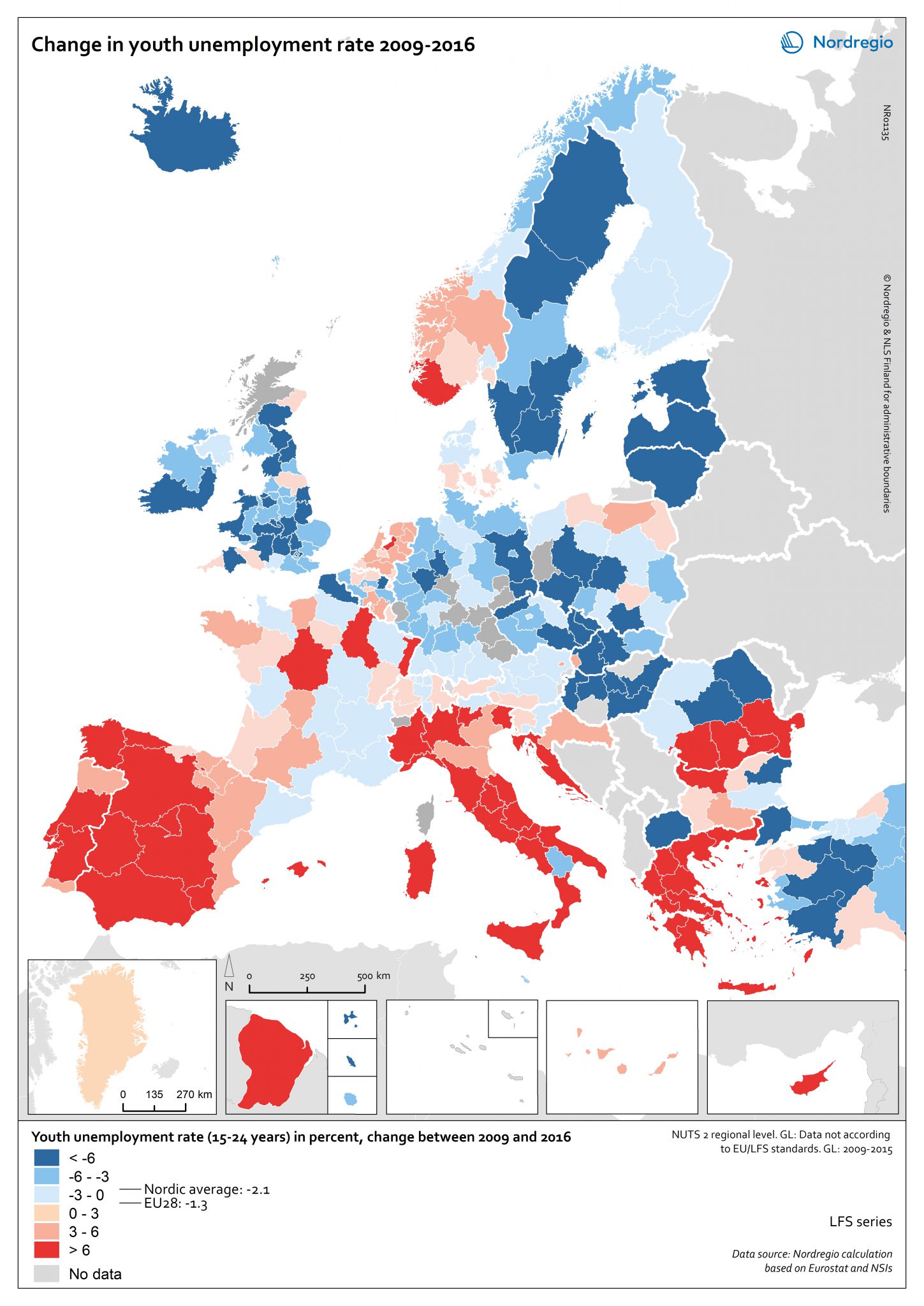
Change in youth unemployment rate 2009-2016
This map shows the change in youth unemployment rate (15-24 years) between 2009 and 2016 in the European continent. The red tones indicate regions with positive change in the youth unemployment rates between 2009 and 2016. The blue tones indicate regions with negative change in the youth unemployment rates between 2009 and 2016. The darker the colour, the highest/lowest change in the youth unemployment rate. The grey colour indicates regions with no data available. Young people are more likely to experience labour market disadvantage due to their relative lack of experience. In many European countries, recovery from the 2008 crisis is an ongoing process that continues to have a serious impact on young people’s participation in economic and social life. In a European comparative perspective, the Nordic countries have bounced back fairly well overall, though some variation between the countries is evident. In Sweden, Iceland and Finland, all regions have experienced at least some decrease in the youth unemployment rate, with the most substantial drops observed in Sweden. In some regions in Norway and Denmark however, the youth unemployment rate was higher in 2016 than in 2009. It is important to consider the recovery evident in the context of the current youth unemployment rate.
- 2018 February
- Europe
- Labour force
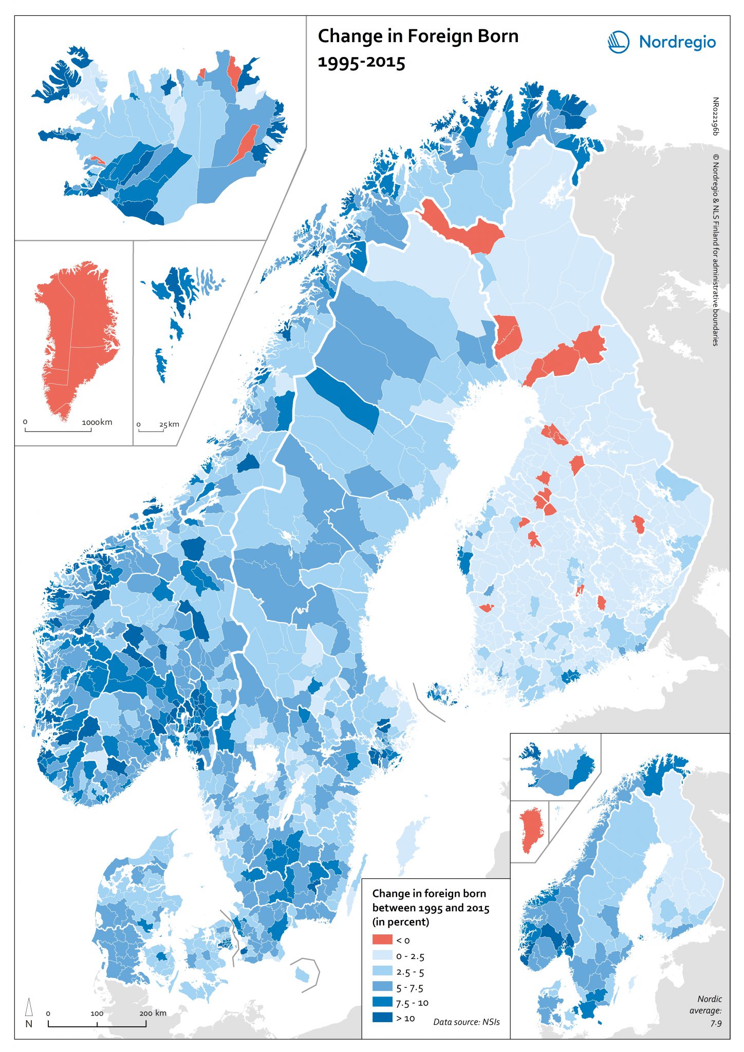
Change in Foreign Born 1995-2015
This map shows the change in the foreign-born population in the Nordic municipalities between 1995 and 2015. The smaller map shows the change in the foreign-born population in the Nordic Regions between 1995 and 2015. The blue tones indicate municipalities or regions with an increase in their foreign-born population between 1995 and 2015. The darker the blue the stronger the positive change. The red colour indicates municipalities or regions with a decrease in foreign-born population between 1995 and 2015. There has been an increase in the percent of foreign born in almost every region in the Nordic Region. Over the past 20 years, the share of the foreign-born population in the Nordic Region has increased from 6.5% to 14.3%. On the national level, the increase has been fastest in Norway followed by Sweden. At the regional level, the increase has been fastest in Rogaland, Oslo and Akershus in Norway and in Suðurnes in Iceland. The only municipalities that have seen declines in the percent of foreign born are municipalities in Iceland and central and northern Finland outside the larger urban areas and across Greenland.
- 2018 February
- Demography
- Nordic Region
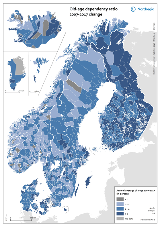
Old-age dependency ratio 2007-2017 change
This map indicates changes in the old-age dependency ratio in the Nordic municipalities between 2007 and 2017. The old-age dependency ratio is the number of elderly people at an age when they are generally economically inactive (i.e. aged 65 and over), compared to the number of people of working age (i.e. 15–64 years old). It is a standard indicator used to measure the pressure on working-age population. The blue tones represent positive changes (i.e. ageing population), with dark blue indicating the most positive changes. The dark grey tone indicates negative change. Municipalities with no data available are shown in light grey. The map highlights ageing population in the Nordic Region. However, population ageing between 2007 and 2017 has been least pronounced in large urban areas. There, the negative change has largely been a result of the influx of young people from rural areas and abroad who moved to these urban centres for education and work. Strong annual average increases of more than 4% occurred in rural areas of Finland, Iceland and urban-adjacent municipalities in Denmark, for instance in the surrounding areas of Aarhus and Copenhagen.
- 2018 February
- Demography
- Nordic Region
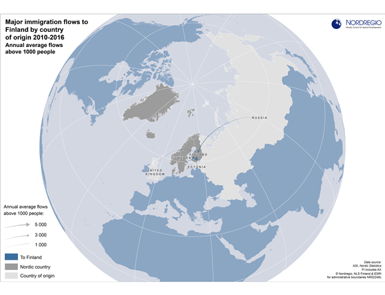
Major immigration flows to Finland 2010-2016
Average annual flows above 1000 people by country of origin Migration flows by country of origin are of growing interest in the Nordic Region due to the recent unprecedented inflows of migrants. There are also interesting differences between the Nordic countries with respect to the dominant countries of origin of migrants and the size of inflows. Finland had only four inflows exceeding annual averages of 1000 people during the measured period. The inflow from Estonia was by far the largest, an annual average of around 5000 people, flowed by inflows from Sweden and Russia (just under 3000), and the United Kingdom (around 1000).
- 2017 June
- Demography
- Finland
- Migration
- Nordic Region
- Other
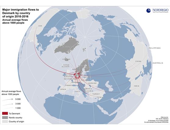
Major immigration flows to Denmark 2010-2016
Average annual flows above 1000 people by country of origin Migration flows by country of origin are of growing interest in the Nordic Region due to the recent unprecedented inflows of migrants. There are also interesting differences between the Nordic countries with respect to the dominant countries of origin of migrants and the size of inflows. During the measured period, there were more than 23 average annual inflows to Denmark that exceeded 1000 people. However, none of these inflows were as large as the dominant inflows to Norway and Sweden during the same period. The largest inflows to Denmark were around 5000 people each from U.S., Sweden, Germany and Poland. Due to historic and political connections, Denmark, unlike Norway, Finland and Sweden, had substantial annual inflows from the Faroe Islands, Greenland and Iceland (around 1000 or 2000 each). These numbers are particularly notable in the context of the small populations of
- 2017 June
- Demography
- Migration
- Nordic Region
- Other
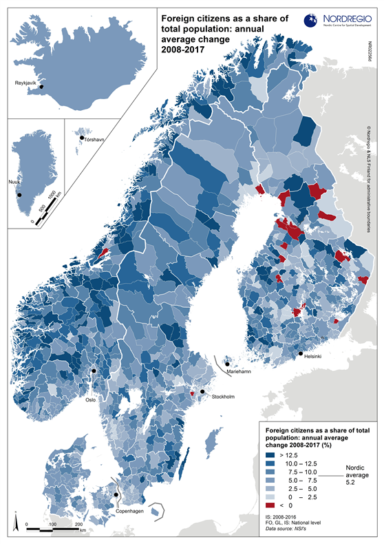
Foreign citizens as a share of total population: annual average change 2008-2017
As the map shows, the pattern is rather scattered at the municipal level. Those that have seen the highest increase in the share of foreign citizens in their populations are mainly rural municipalities which started out with quite low shares. The reverse is true in the capital regions of Copenhagen, Helsinki, Mariehamn, Oslo and Stockholm. The populations of these regions have for many years included a large share of foreign citizens and, as such, the increase in the overall share appears relatively modest. Finland, which, compared to other Nordic countries, has had a relatively low share of foreign citizens residing in the country, has the largest number of municipalities (14) which have experienced a negative change over the period 2008-2017. In Sweden, there were two municipalities with a similar negative trend (Haparanda and Nykvarn), while there was only one municipality in Norway which experienced a similar negative change (Verran). The share of foreign citizens in the population increased in all Danish municipalities during the period. At the regional level, the five largest increases have occurred in Norwegian and Swedish regions, located rather far from the capital regions: Møre og Romsdal (Norway), Blekinge län (Sweden), Sogn og Fjordane (Norway), Kalmar län (Sweden) and Finnmark (Norway). At the other end of the scale, the five regions with the smallest increase are: Kainuu (Finland), Norrbottens län and Stockholms län (Sweden), Pirkanmaa and Keski-Suomi (Finland).
- 2017 June
- Demography
- Nordic Region
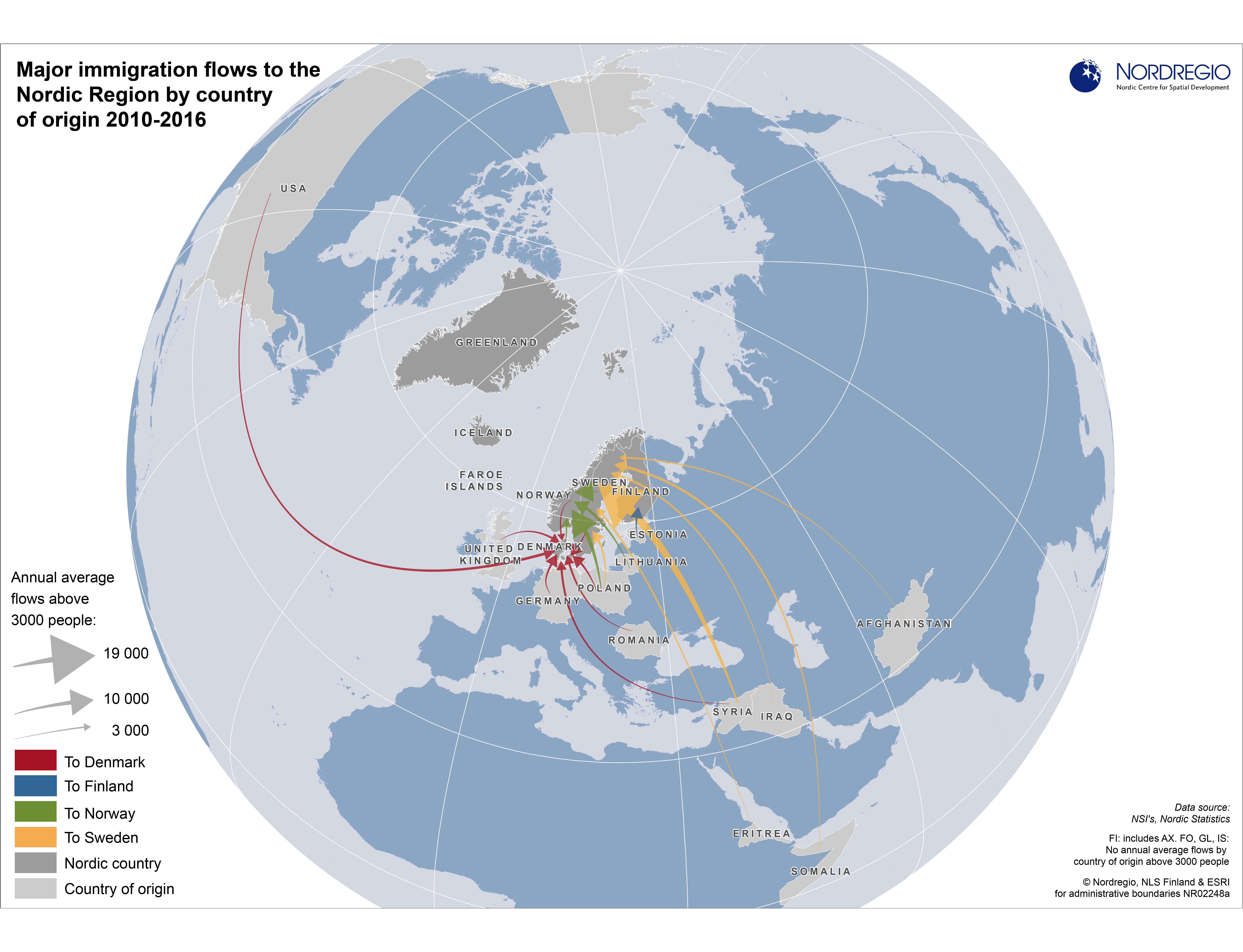
Major immigration flows to the Nordic Region 2010-2016
Average annual flows above 3000 people by country of origin Migration flows by country of origin are of growing interest in the Nordic Region due to the recent unprecedented inflows of migrants. There are also interesting differences between the Nordic countries with respect to the dominant countries of origin of migrants and the size of inflows. The map shows some clear spatial patterns regarding the dominant countries of origin of migrants and the size of inflows to each of the Nordic countries. Finland had only one average annual inflow of over 3000 people during the measured period, namely from Estonia. Compared to the other Nordic countries, Sweden had by far the largest immigrant flows, with average annual arrivals of nearly 19 000 immigrants from Syria, around 5000 from both Somalia and Poland, about 4000 from Iraq and Eritrea, and circa 3000 from Afghanistan, India, China and Iran. For Norway, inflows above 3000 people were all from nearby countries: Sweden, Lithuania, Denmark, and Poland. Inflows from Poland were particularly high – an annual average of almost 11 000 people. Although Denmark experienced a similar number of inflows above 3000 people, these inflows were smaller and more evenly distributed than in Norway and Sweden. The largest inflows were around 5000 people and included migrants from the U.S., Sweden, Germany and Poland.
- 2017 June
- Demography
- Migration
- Nordic Region
- Other
