80 News
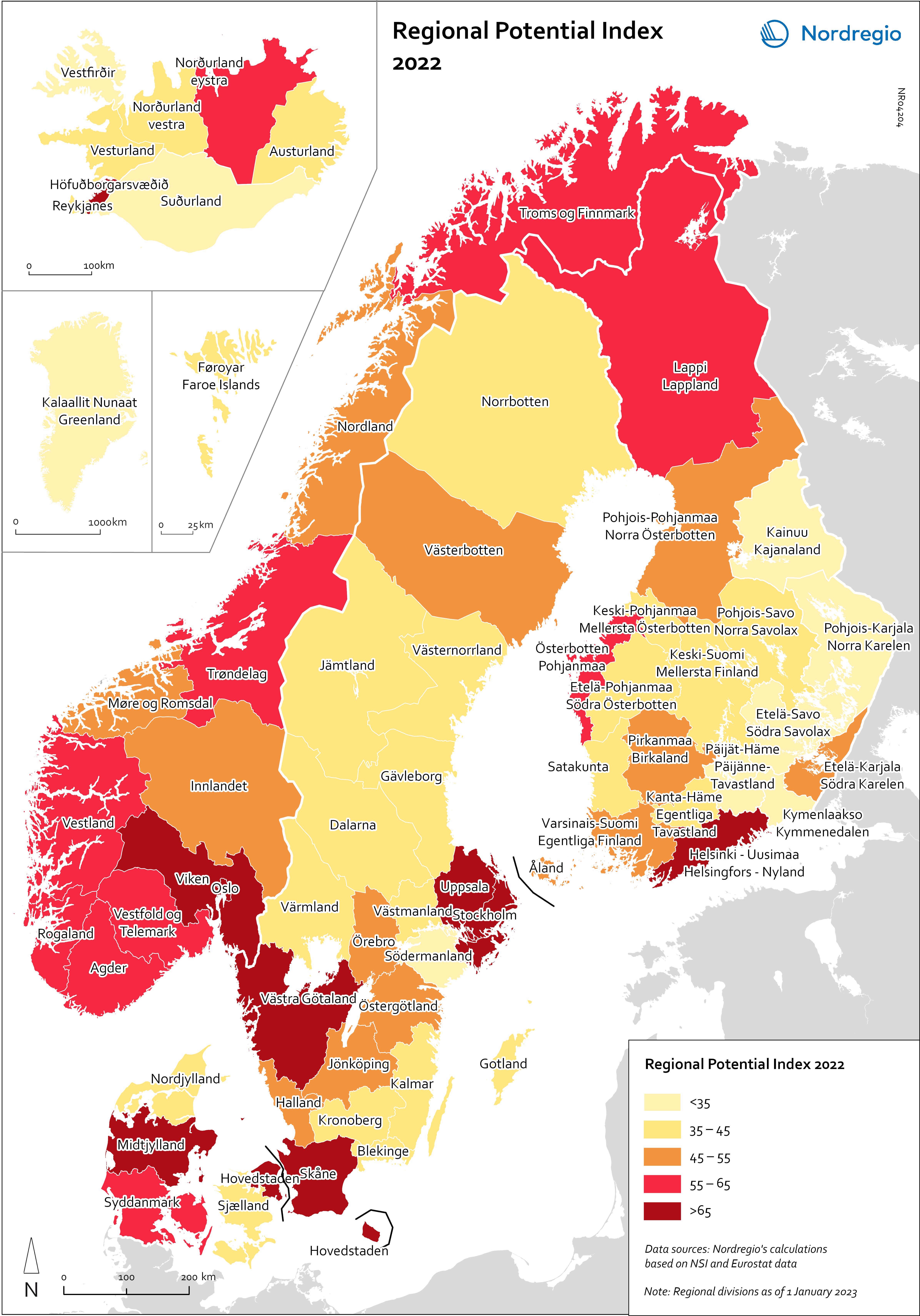
Regional Potential Index 2022
This map shows the result of Nordregio’s Regional Potential Index in 2024 (data from 2022). Nordregio’s Regional Potential Index (RPI) enables cross-regional comparison of development potential and illustrates the regional balance between the Nordic countries and has been part of the State of the Nordic Region report since 2018. The purpose of this multidimensional index is to summarise the current and past performance of the Nordic regions across major policy domains. The index helps to identify regions that have high potential and those in need of further support to boost their potential and meet existing challenges. It provides policy-makers with a comparative learning tool that informs the design of effective regional development strategies at Nordic level. Nordregio’s RPI is a multi-item measurement scale that incorporates information about the demographics, labour market and economic output of the Nordic countries’ 66 administrative regions. It consists of eight indicators classified into four main groups and eight subgroups. These components and indicators were originally selected on the basis of their relevance for regional development. The 2024 RPI is based on a new refined method that maintains a similar set of indicators but applies a more robust statistical process to the construction of the RPI. In brief, the new methodology consists of a pre-processing stage, in which the input data is prepared for analysis, and a processing stage, in which the indicators are weighted and aggregated. More information about the method can be found in the State of the Nordic Region 2024 report. The RPI was calculated retroactively for the 2015–2023 period. However, the focus in this section is on 2022 – the most recent year in our time series with full data coverage. The map shows the redesigned RPI for that period. In line with the principles of accumulation and agglomeration that drive the…
 2025 April
 - Demography
- Economy
- Labour force
- Nordic Region
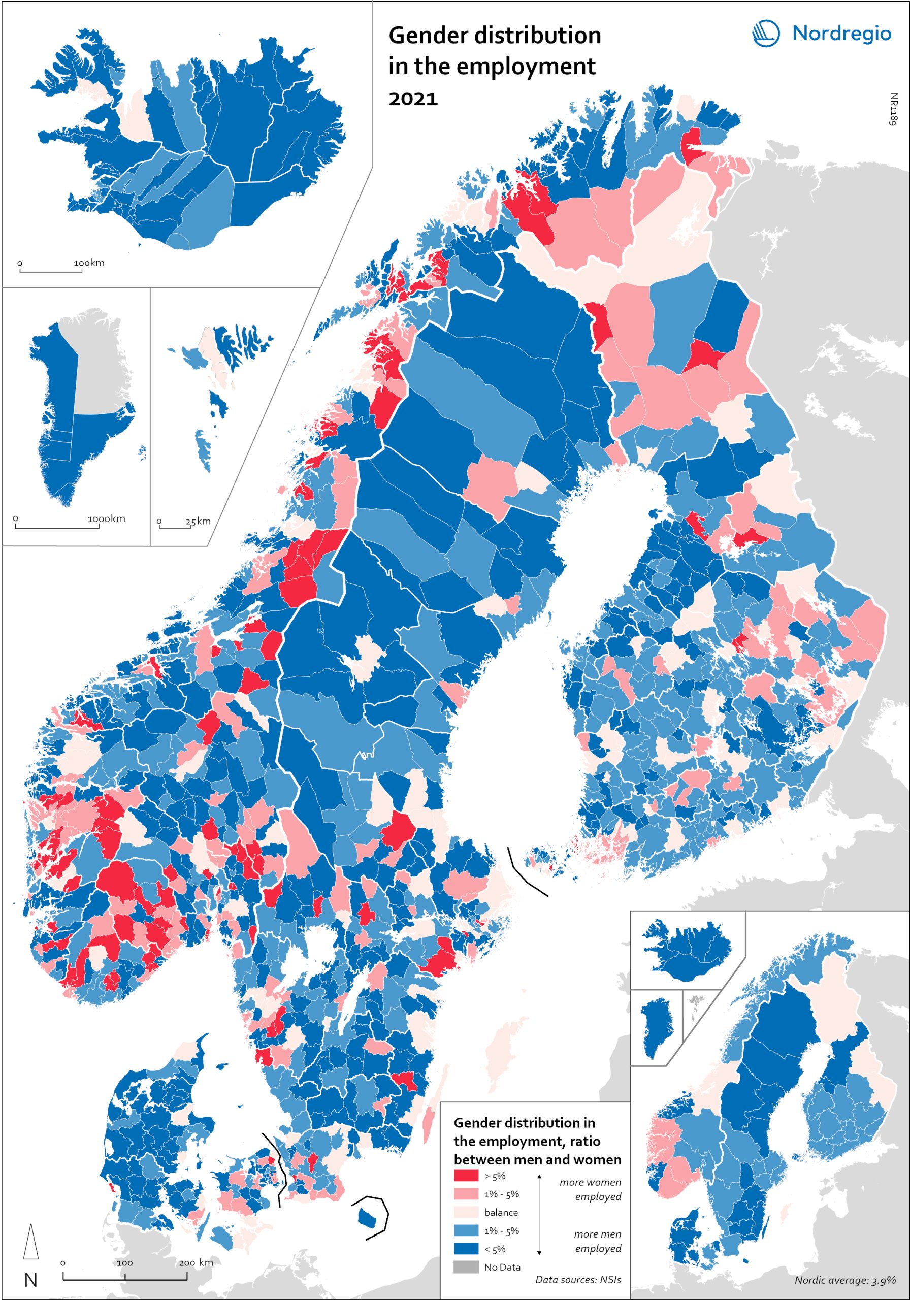
Gender distribution in employment 2021
This maps shows the gender distribution in employment at both municipal (big map) and regional levels (small map) in the Nordic Region in 2021 (measured in November). Blue shades indicate more men employed and red shades more women. Most regions had higher employment rates for men than women, with an average of 3.7% more men across the countries and sectors. In Finland, the rates were more balanced, with only 1.3% more men in employment. In three regions in Finland, employment rates were slightly higher for women: Etelä-Karjala – Södra Karelen, with 0.8% more women than men; Kainuu – Kajanaland, with 0.4%; and Uusimaa – Nyland with 0.1%. These are the only regions in the Nordic countries with a prevalence of employed women at the regional level. For the rest, employment rates were higher for men, with Icelandic regions having the largest share: Suðurnes had 11.3% more men than women, Vesturland 8.8%, Austurland 8.7%, and Suðurland 8.2%. The average for the Icelandic regions was 7.5%. For Denmark, this was 4.9%, for Sweden, 3.9%, and for Norway, 3.4%. At the municipal level, however, the situation was much more varied. Åland is one of the most extreme examples. Although the average was 2.5% more men employed than women, Åland has several municipalities with extremes at both ends. On the one hand, there are municipalities like Lumparland, with 16% more women than men, and Brändö, with 11.3%. On the other hand, Kökar had 64% more men than women. The variations between Ålandic municipalities can largely be attributed to the municipalities’ population size. The larger cities, like Trøndelag in Norway, may be more balanced at the regional level, but within the region, there are municipalities with a 20% prevalence of women in employment (Namsskogan, Meråker, Holtålen), as well as some with 18% (or higher) more…
- 2025 April
- Economy
- Labour force
- Nordic Region
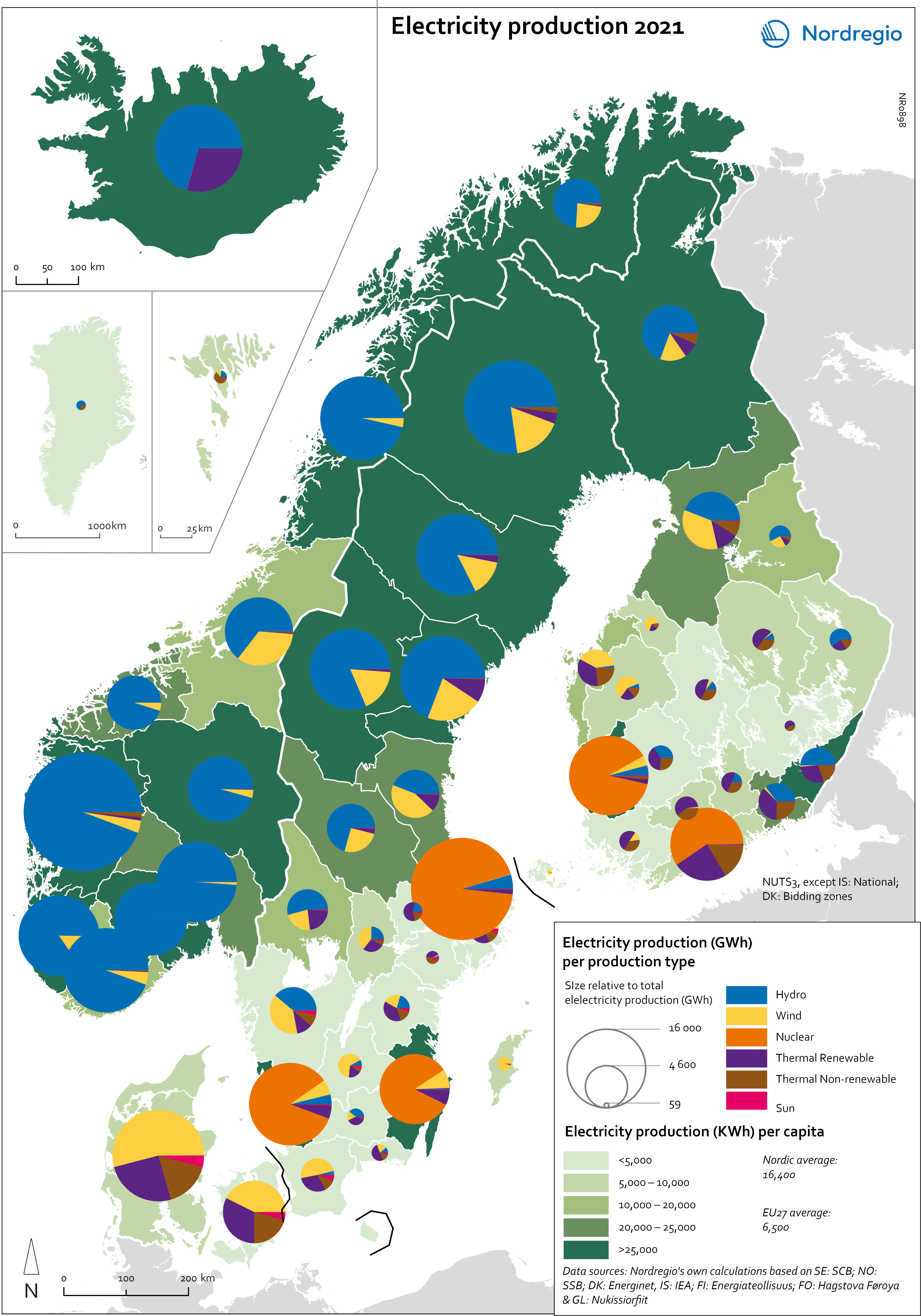
Electricity production 2021
This map shows the spatial distribution of Nordic electricity production per capita, by volume and source type in the Nordic Region in 2021. The data is presented at a regional level, except for Iceland (national level) and Denmark (bidding zones). The circles represent electricity production in GWh, while the green shades indicate electricity production per capita (kWh). Finally, the colour of the circles denotes the source of electricity. The Nordic Region overall has a high electricity production per capita; in fact, Iceland and Norway have the world’s highest electricity production per capita. The electricity mix in 2021 was 96% fossil-free – 73% from renewables (mainly hydropower) and 17% from nuclear power. In 2000 85% of the electricity production was fossile-free. Still there are clear spatial differences in the electricity production. Firstly, we see the high amount of electricity being produced for the five nuclear facilities in Sweden and Finland. Secondly, a substantial volume of hydro-electricity is produced in southern Norway, throughout Iceland, Northern Sweden and Northern Finland. As a result, over half of Nordic electricity is produced from hydropower. Wind power is the source of electricity that has been growing the most during the last two decades, from 1.2% in 2000 to 14% in 2021. The regions with the highest electricity production per capita are in Iceland, Northern Sweden, and Northern and Western Norway. Both Finland and Denmark are net importers of electricity, but both countries have rapidly transitioned away from fossil fuels. Cheap and fossil-free electricity is a prerequisite for the green transition and with growing industries within e.g. battery production, green steel and mining, the need for fossil-free electricity is expected to increase in the coming decades.
- 2025 April
- Environment
- Labour force
- Nordic Region
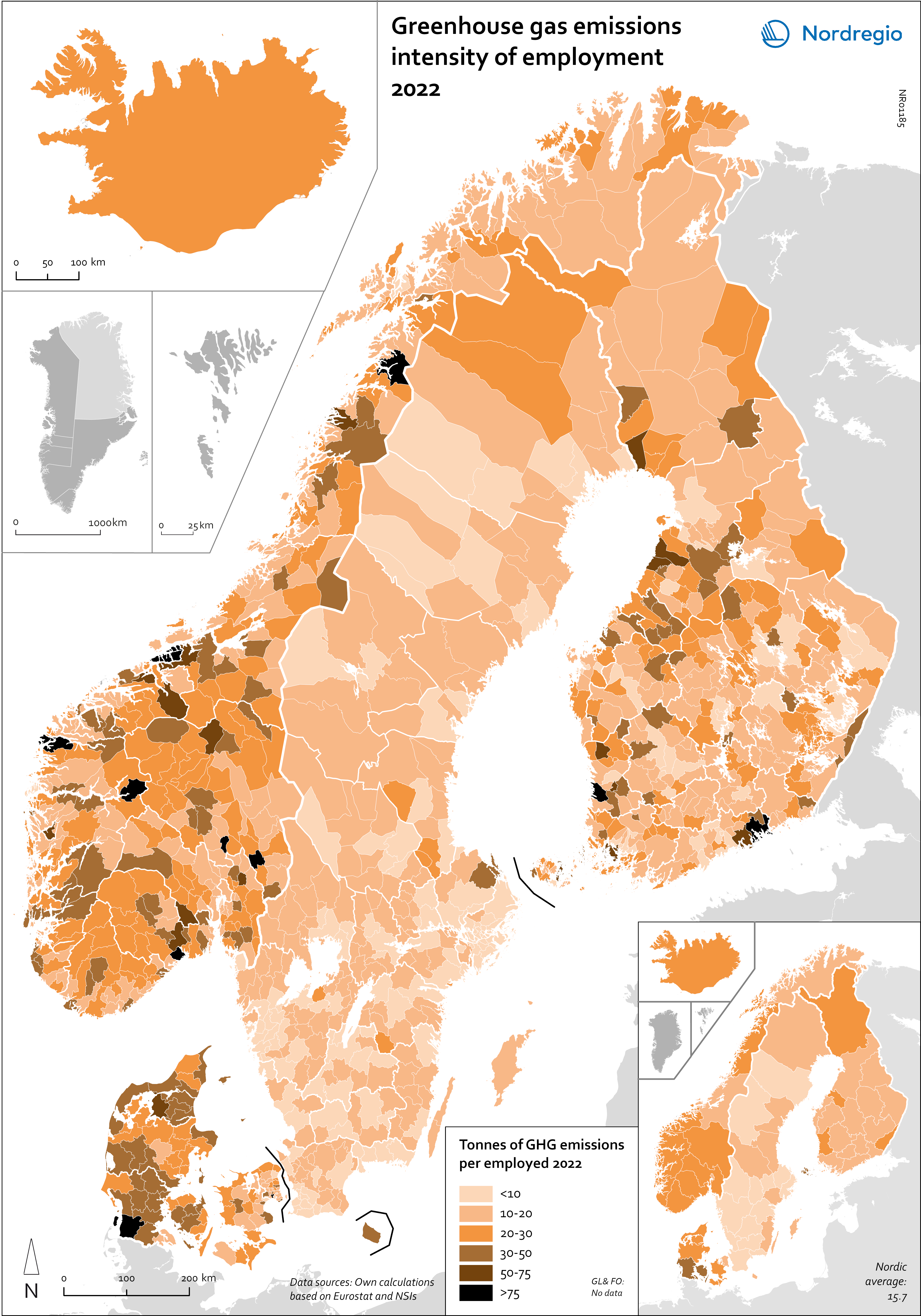
Greenhouse gas emissions intensity of employment in 2022
This map shows the tonnes of greenhouse gas emissions per person employed in Nordic municipalities (big map) and regions (small map) in 2022. The data for Iceland is presented at the national level, while no data was available for the Faroe Islands and Greenland. The map is based on data on emissions per sector and country from Eurostat and detailed employment by sector data from the Nordic statistical offices. By calculating the average emissions per person employed and per sector we could use municipal employment by sector data to assess the average emissions per person employed in each municipality. The results are an estimation based on the assumption that all jobs in the same sector have the same GHG emissions. In 2022, greenhouse gas (GHG) emissions per person employed in the Nordic Region were 15.7 tonnes. This is higher than the EU average of 13.5 tonnes. There are also fairly big differences between the Nordic countries, with higher emissions per person employed in Iceland (28.6), Denmark (23.1) and Norway (20.5) and lower emissions in Finland (15.7) and Sweden (8). On the other hand, the emissions per person employed have decreased faster in the Nordic Region than for the EU as a whole. In the last decade, emissions per person employed fell by 24% in the Nordic Region compared to the EU average of 22%. The biggest decrease (32%) was in Finland. The sectors with the highest emissions per worker vary slightly between the countries. In Sweden and Norway, the sector with by far the highest emissions per worker was the manufacture of petroleum coke and refined petroleum products. However, it should be noted that the number of workers in this sector is small. In Denmark, the highest emissions by person employed could be found in water transport; in Finland, in…
- 2025 April
- Environment
- Labour force
- Nordic Region
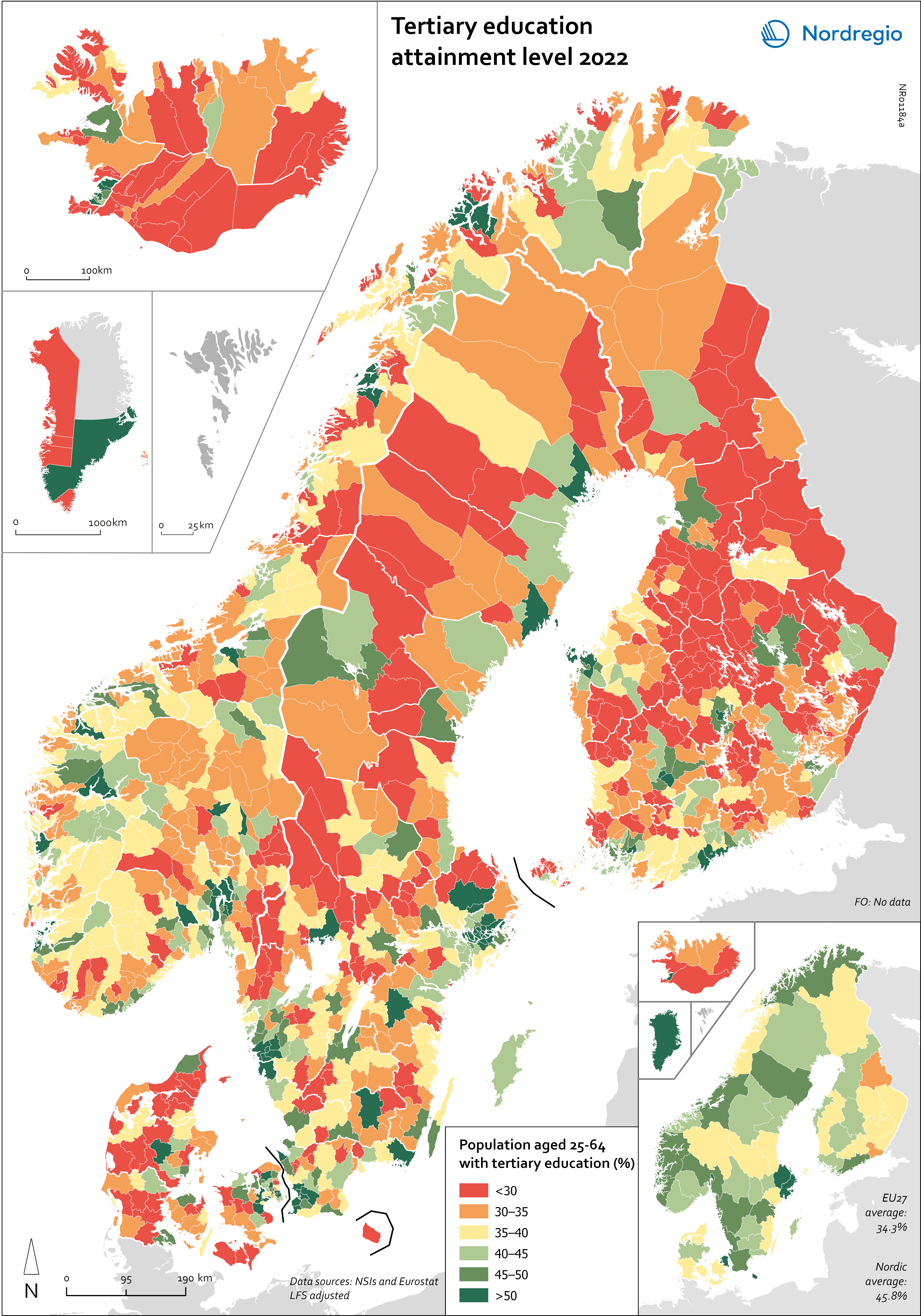
Tertiary education attainment level 2022
This map shows the share of people aged 25-64 years with a tertiary education in Nordic municipalities (big map) and regions (small map) in 2022. All of the Nordic countries have a higher share of people who completed tertiary education than the EU average. The highest share is in Sweden (48.6%), followed by Norway (47.8%), Iceland (42.9%), Finland (42.7%) and Denmark (42.1%). There are, however, big differences within the countries with a considerable urban-rural divide in terms of tertiary education. The capital regions of Oslo (66%), Stockholm (58%), Copenhagen (Hovestaden) (51%), Reykjavik (51%) and Helsinki (Uusimaa) (49%) stand out with particular high share of tertiary educated population. Conversely, rural regions such as Iceland outside of Reykjavik (30%), Kymenlaakso (34%), Kainuu (34%), Etelä-Savo (35%), Satakunta (35%) in Finland and Syddanmark (35%), Midtjylland (36%) and Nordjylland (36%) in Denmark are among the regions with the lowest share of tertiary educated population. The successful implementation of the Bologna Process and the derived increase in educational levels of young people in the Nordic Region coincides with large numbers of the ‘baby boomer’ generation leaving the labour market. This generation has a significantly lower level of education than the current 24–35 age group – i.e. those who are now entering the labour market. This trend can be seen across the Nordic Region.
- 2025 April
- Labour force
- Nordic Region

Employment in high-skilled occupations 2022
This map displays the share of high-skilled workers as a share of the total number of workers in Nordic municipalities (big map) and regions (small map). “High-skilled workers” is here defined as group 1-3 (Managers, Professionals and Techinicians/associated professionals) of the International Standard Classification of Occupations (ISCO). For Iceland national data is used. The EU average of high-skilled workers is 43%, and the Nordic countries are at the top of the rankings – 49.5% in Finland, 51.1% in Denmark, 54.2% in Norway, 54.5% in Iceland and 58.9% in Sweden. On a regional level, the highest share is in the capitals and bigger cities, such as Stockholm (72%), Oslo (71%), Hovedstaden (Copenhagen) (60%), Uppsala (60%) and Uusima (Helsinki) (59%). The lowest shares are in the Finnish regions of EteläPohjanmaa, Keski-Pohjanmaa, Satakunta and Etelä-Savo (less than 40%). However, this does not necessarily mean that employers will have a greater chance of successfully recruiting high-skilled workers in the future, partly because those in this group already have jobs and partly due to generally lower investments in education.
- 2025 April
- Labour force
- Nordic Region
- Research and innovation
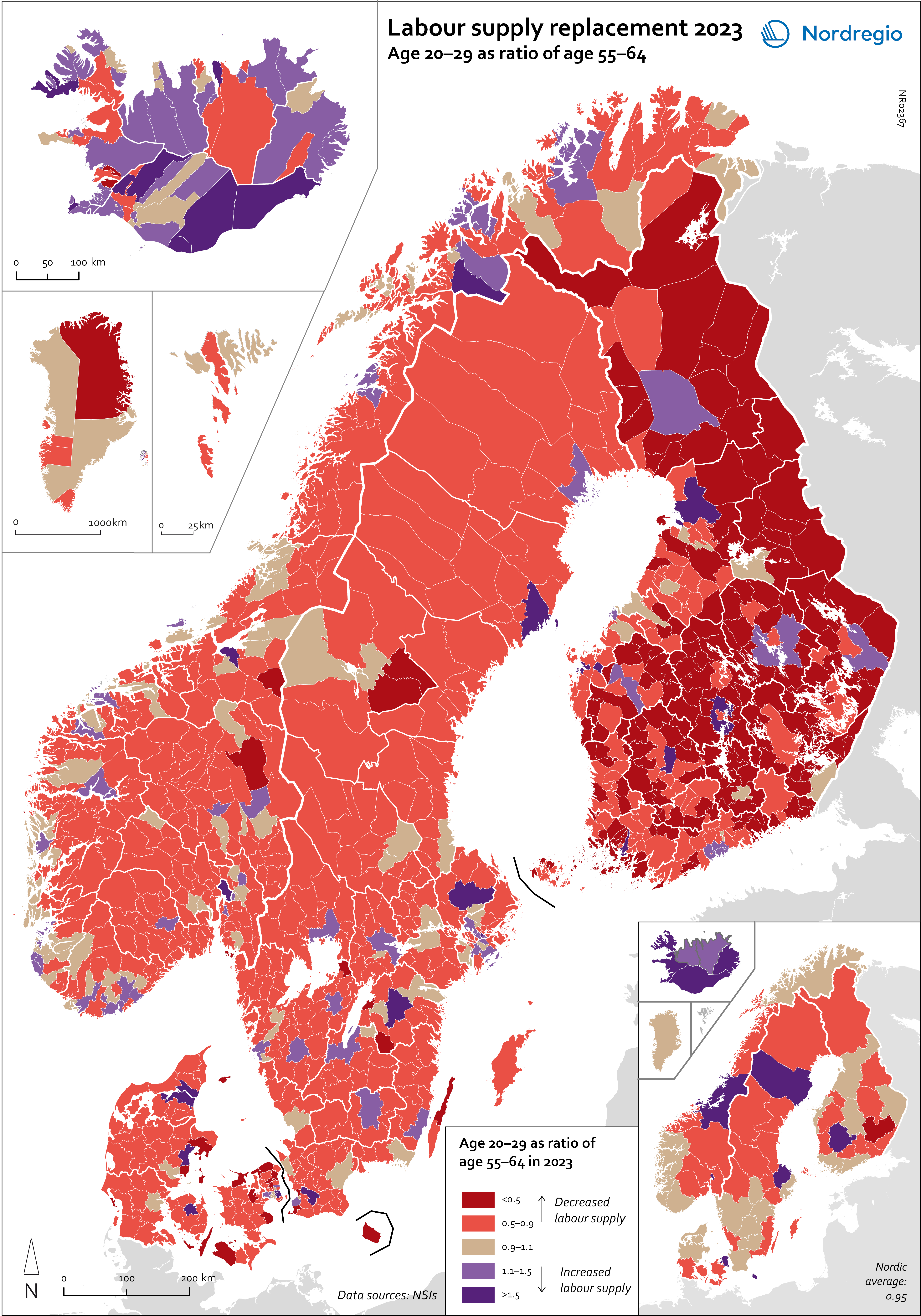
Labour supply replacement 2023
This map shows the ratio between the age groups 20–29 and 55–64 at the municipal level (big map) and regional level (small map). A ratio below 1 indicates that fewer individuals are entering the labor market than leaving it, while a ratio above 1 means more people are entering than exiting. For the Nordic Region as a whole, the ratio is 0.95, meaning that there are slightly fewer people in the age group 20–29 than 55–64. Iceland is the only country with a ratio above 1 (Iceland: 1.3; Greenland: 0.99; Denmark: 0.97; Norway: 0.95; Finland: 0.94; Sweden: 0.93; Faroe Islands: 0.88; Åland: 0.63). All of the Icelandic regions, as well as the capital regions of Norway, Denmark and Finland, have a ratio above 1. In Sweden, the highest ratios are in Uppsala (1.25), Västerbotten (1.14) and Östergötland (1.03), while the ratio in Stockholm is below 1 (0.95). The lowest ratios are found in Etelä-Savo (0.62) and Åland (0.63) in Finland, Sjælland (0.63) in Denmark, Västernorrland (0.74) in Sweden, and in Vestfold og Telemark (0.78) and Viken (0.77) in Norway. However alarming these trends and developments are, they are neither new nor undescribed. An analysis of the factors and policy strategies that are influencing these developments enables adjustments to be made to future trends.
- 2025 April
- Demography
- Labour force
- Nordic Region
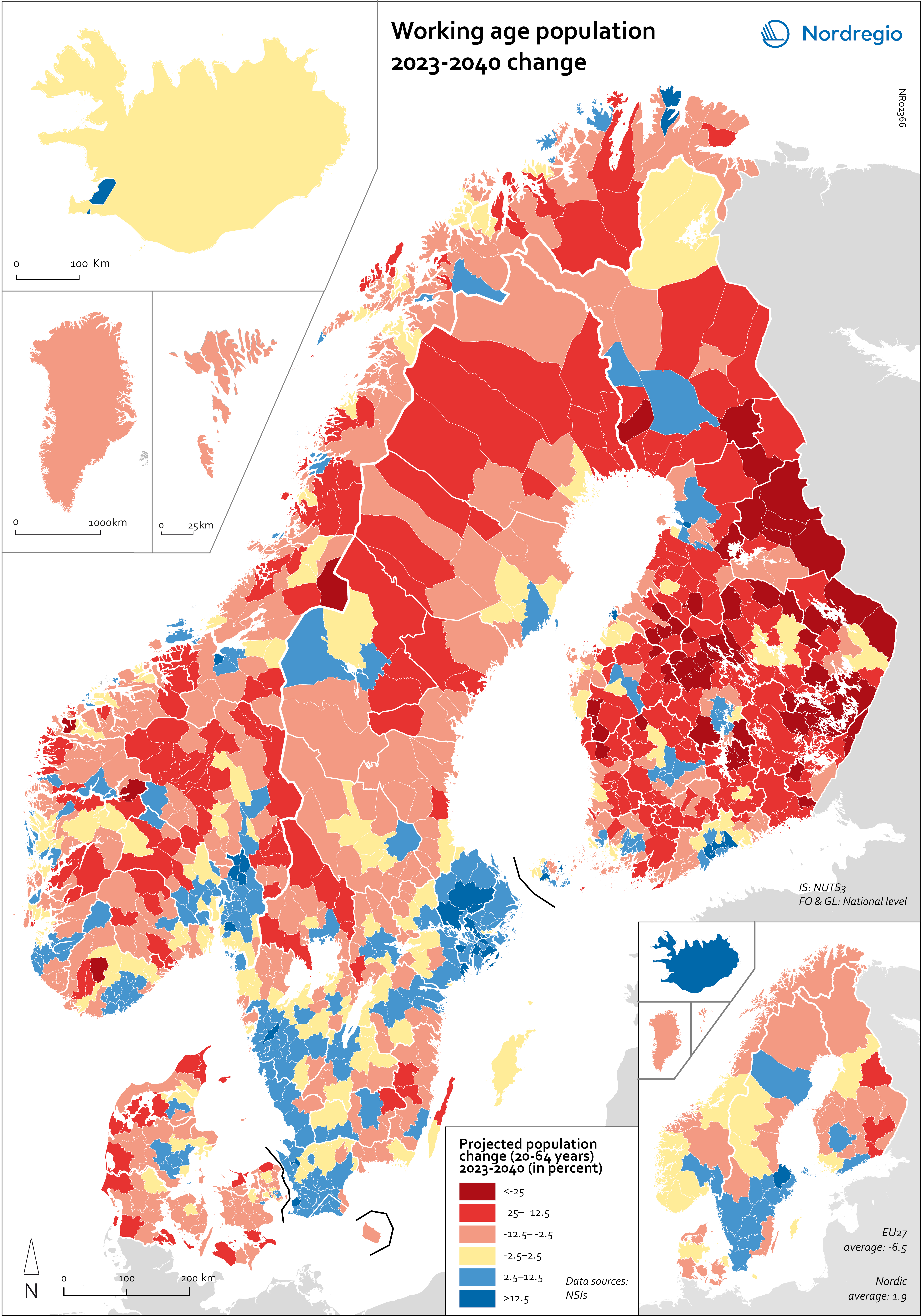
Working age population – 2023-2040 change
This map illustrates the projected change in the working-age population across Nordic municipalities (large map) and regions (small map) from 2023 to 2040. The working-age population is defined here as individuals aged 20 to 64. The blue areas on the maps represent municipalities and regions where the working-age population is expected to increase during this period. In contrast, the red areas indicate a projected decline in the working-age population. These projections are based on data from Nordic statistical institutes, though it’s important to note that the underlying assumptions may vary between Nordic countries. In most of the Western world, the working-age population is decreasing. In the EU, this age group is expected to decrease by 6.5% between 2023 and 2040. Only five EU countries – Malta, Luxembourg, Ireland, Sweden and Belgium – are expected to enjoy growth in the working-age population during this period. However, in the Nordic Region as a whole, the working-age population is expected to grow slightly, with an average increase of 1.9%. As the map shows, the distribution is quite varied, with considerable differences both between and within the countries. The biggest increase is expected in Iceland (28%), followed by Sweden (5.8%), Åland (3.9%) and Norway (0.6%). Decreases are expected in Finland (-0.5%), the Faroe Islands (-2.6%), Denmark (-3.2%) and Greenland (-11.4%). This development is in addition to the decreases already experienced by Finland since 2013. In general, the trend of growing populations in cities and decreasing populations in rural areas is expected to continue. The regions that are expected to have the highest working-age population growth include Höfuðborgarsvæðið in Iceland, Uppsala (+13%), Stockholm (+12%), Skåne (+9%), Halland (+7%) and Västra Götaland (+6%) in Sweden, Uusimaa (+8%) and Pirkanmaa (+5%) in Finland, and Oslo and Viken in Norway (+5%). In addition, Copenhagen municipality (+5%), Rødovre (+9%)…
- 2025 April
- Demography
- Labour force
- Nordic Region
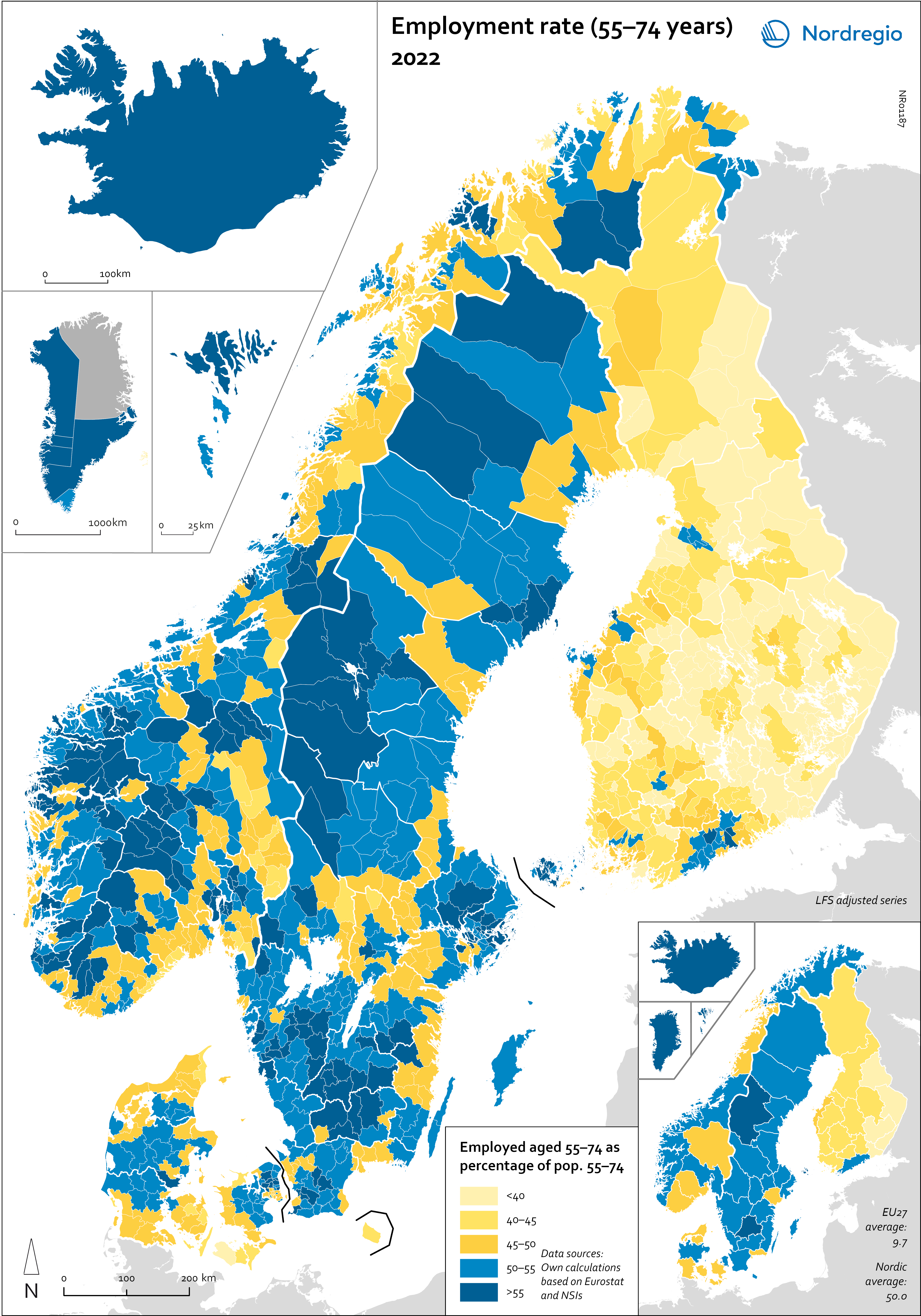
Employment rate (55-74 years) 2022
This map shows the employment rate for the age group 55-74 years in the Nordic municipalities (big map) and regions (small map) in November 2022. Employment rate refers to the share of population in a particular age group that is in employment (LFS definition), in this map it is measured for the age group 55-74 years. Older adults (55+) were less affected by the pandemic. In general, this age group has a stronger attachment to the labour market, and a higher proportion work in occupations where remote work was possible. For quite some time, the Nordic Region has boasted a higher employment rate among older adult workers compared to the rest of Europe, although this gap has narrowed somewhat in recent years. In 2022, 75.5% of the Nordic population aged 55–64 were employed, whereas the EU average stood at 62.3%, representing a difference of 13 percentage points. In 2012, however, this difference was 21 percentage points, and in 2002, it was 29. The map shows variation between the Nordic countries, with Finland exhibiting a lower employment rate for this age group. The highest rates were observed in the Faroe Islands (62%), Greenland (61%), Åland (56%), and the Swedish regions of Jämtland-Härjedalen (55%) and Jönköping (54%). The Labour Force Survey (LFS) is the official source for labour market statistics and the only source that is comparable across countries. The data comes from a standardised survey that is conducted in the same way in all EU countries, as well as in many non-EU countries, including in Norway, Iceland and the Faroe Islands. The LFS is the main source for the map, however since it is not possible to break down at a municipal level, register data has been made to create estimates at a municipal level.
- 2025 April
- Labour force
- Nordic Region
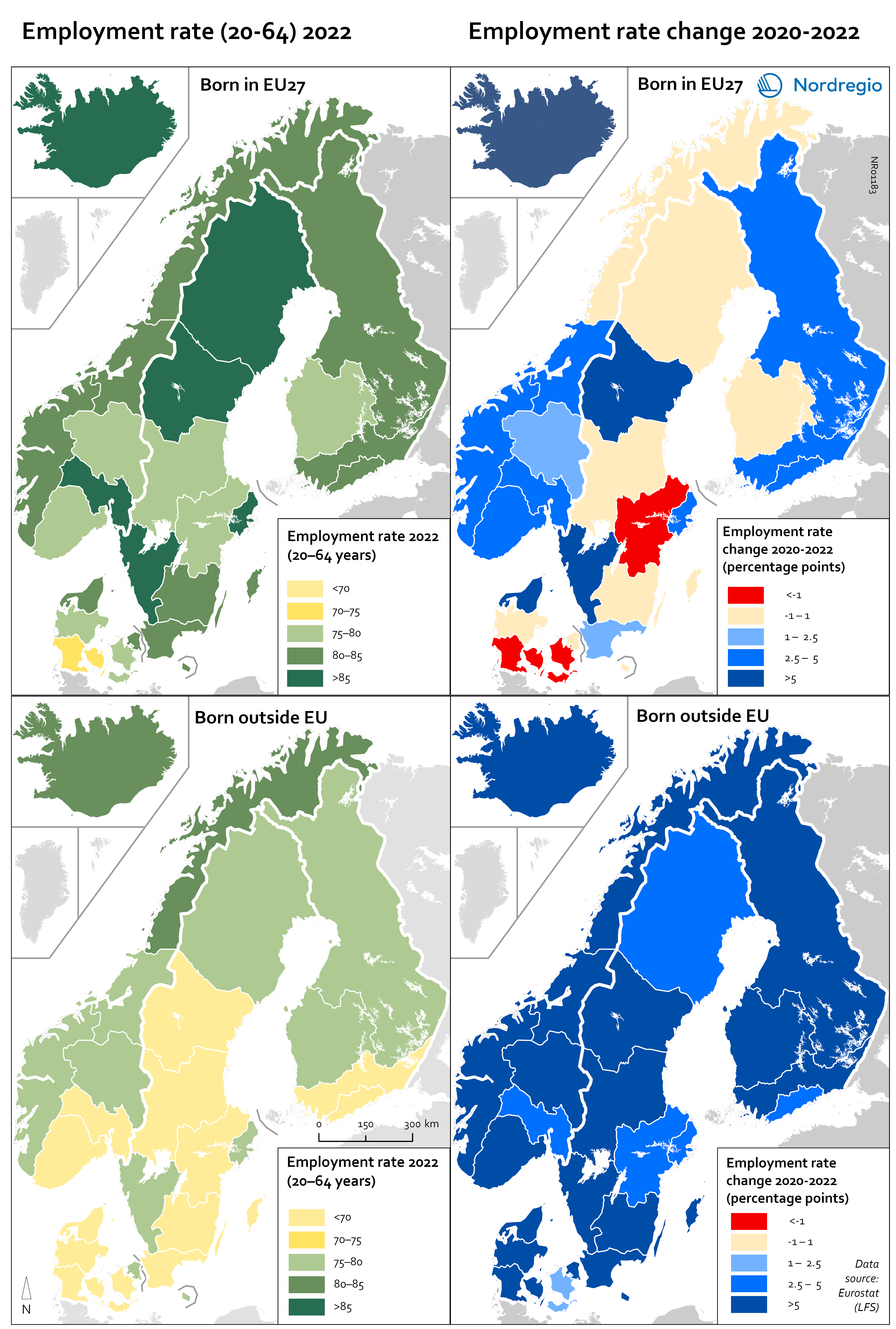
Employment rate 2022 and Employment rate change 2020-2022 among foreign-born
These maps shows the employment rate in 2022 for those born in a EU country (top left) and those born outside of the EU (bottom left), as well as the change in employment rate between 2020 and 2022 for those born in the EU (upper right) and outside the EU (lower right). The data is displayed at NUTS 2 level and comes from the labour force survey (LFS). The category ‘foreign-born’ is quite heterogeneous and consists of everything from labour migrants to refugees – two groups who face quite different conditions and have different connections to the labour market. The employment rate for people born in another EU country – a group that includes a large proportion of labour migrants – has been on par with the employment rate for native-born people for a long time. As can be seen in the top-left figure in the map, in 2022 all NUTS2 regions except Southern Denmark had an employment rate of 75% or more for this group. The highest employment rate was observed in the Swedish NUTS2 regions of Middle Norrland, Stockholm and Western Sweden, followed by Oslo in Norway and Iceland. The employment rate for people born outside of the EU (a group that largely consists of refugees) has been lower for a long time than that of native-born people and those born in the EU. While the employment rate for people born in non-EU countries is still lower than for natives (a 15 percentage point difference (pp) in Sweden, 11 pp in Norway, 7 pp in Denmark and Finland, and 2 pp in Iceland), this gap has been closing in the last couple of years since the pandemic. Between 2020 and 2022, the employment rate for those born outside of the EU rose almost eight percentage points in Denmark…
- 2025 April
- Labour force
- Nordic Region
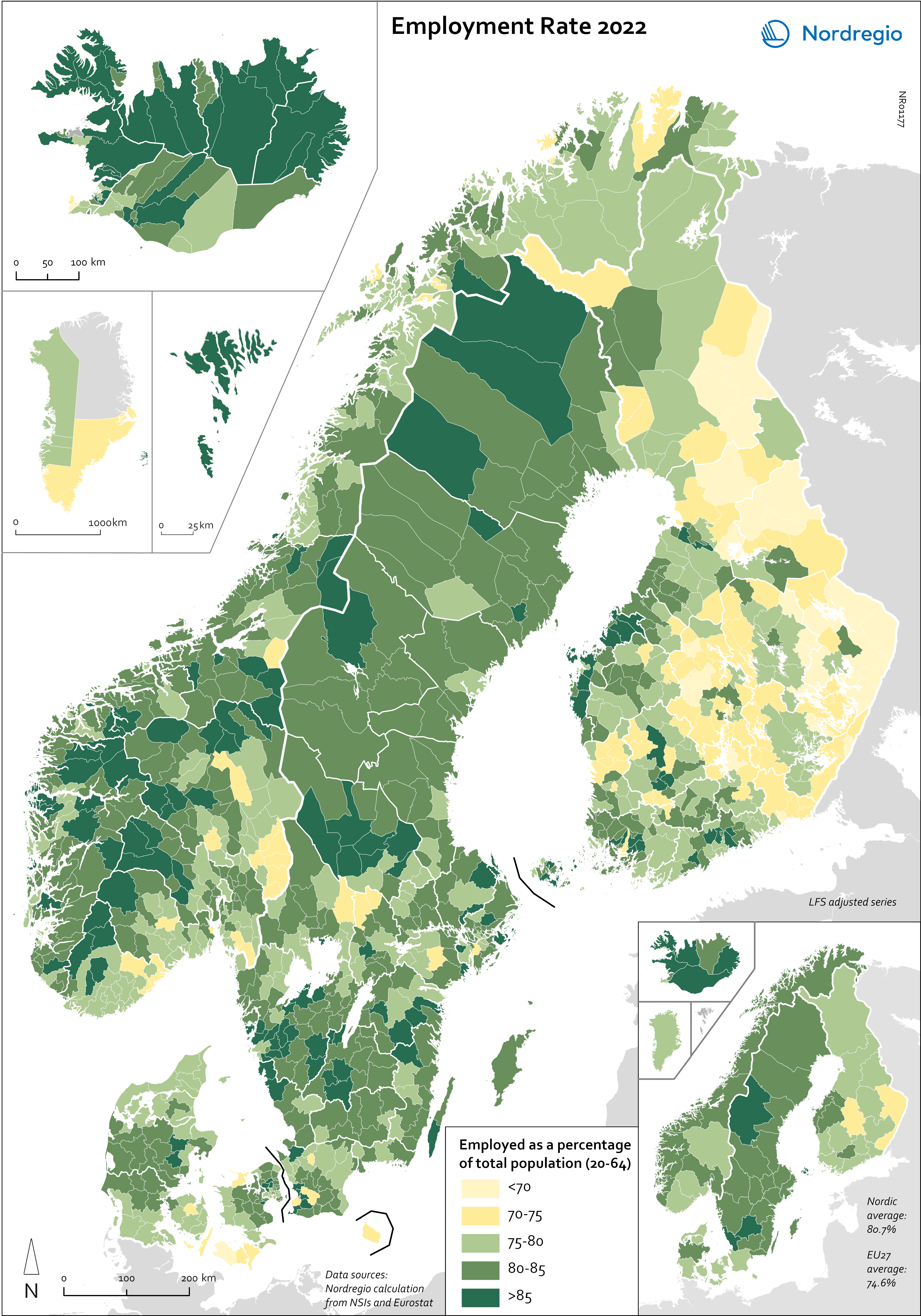
Employment rate 2022
This map shows the employment rate for Nordic municipalities (big map) and regions (small map) in 2022 (measured in November). Employment rate refers to the share of population in a particular age group that is in employment (LFS definition), in this map it is measured for the age group 20-64 years. At a national level, all of the Nordic countries have employment rates higher than the EU average (74.6%). The highest rates were in the Faroe Islands (93%), Åland (86%) and Iceland (83%), followed by Sweden (82.2%), Denmark (80.1%), Norway (80.9%), Finland (78.4%) and Greenland (75%). Of the EU countries, only the Netherlands (82.9%) had a higher employment rate than Sweden in 2022. As the map shows, most of the regions and municipalities had employment rates above 75% (the green areas on the map) in 2022, meaning that three-quarters of people aged 20–64 were working. In addition to the Faroe Islands, Iceland and Åland, the Swedish regions of Jämtland-Härjedalen, Halland and Jönköping also had employment rates of more than 85%. The only regions with employment rates under 75% were the Finnish regions of North and Southern Karelia and KeskiSuomi. On a municipal level, the highest employment rates were found in rural municipalities, mainly in Iceland and the Faroe Islands, as well as some municipalities in Österbotten in Finland (such as Pedersöe and Korsholm). Of the intermediate municipalities (between urban and rural), the highest employment rates were in the Swedish municipalities Habo (Jönköping), Hammarö (Värmland), Nykvarn (Stockholm), Gällivare (Norrbotten), Kungsbacka (Halland), Svedala (Skåne) and Mosfellsbær (Höfuðborgarsvæðið) in Iceland. Of the urban municipalities, the employment rate was highest in Garðabær and Kópavogur in the Capital Region of Iceland, Tyresö and Täby in the Stockholm region, Partille in Västra Götaland in Sweden, and Bærum and Rælingen in Viken in Norway. The lowest employment…
- 2025 April
- Labour force
- Nordic Region
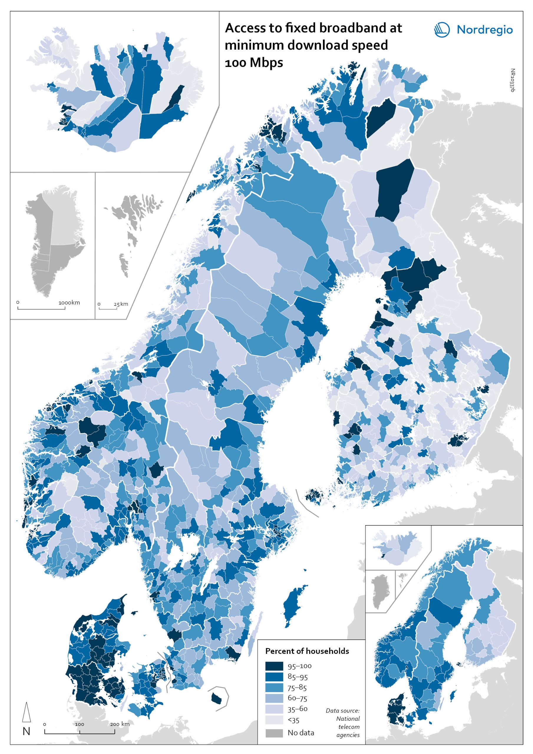
Access to fixed broadband at minimum download speed 100 Mpbs
The map shows the proportion of households that had access to fixed-line broadband with download speeds >100 Mbps (superfast broadband) at the municipal level, with darker colours indicating higher coverage. Overall, Denmark has the highest levels of connectivity, with 92% of municipalities providing superfast broadband to at least 85% of households. In over half (59%) of all Danish municipalities, almost all (>95%) of households have access to this connection speed. The lowest levels of connectivity are found in Finland. This is particularly evident in rural municipalities where, on average, less than half of households (48%) have access to superfast broadband. Connectivity levels are also rather low in some parts of Iceland, for example, the Westfjords and several municipalities in the east. Households in urban municipalities are still more likely to have access to superfast broadband than households in rural or intermediate municipalities, but the gap appears to be closing in most. This is most evident in Norway, where the average household coverage for rural municipalities increased by 31% between 2018 and 2020. By comparison, average household coverage for urban municipalities in Norway increased by only 0.7%. In the archipelago (Åland Islands, Stockholm and Helsinki), general broadband connectivity is good; however, some islands with many second homes still have poor coverage.
- 2022 March
- Labour force
- Nordic Region
- Others
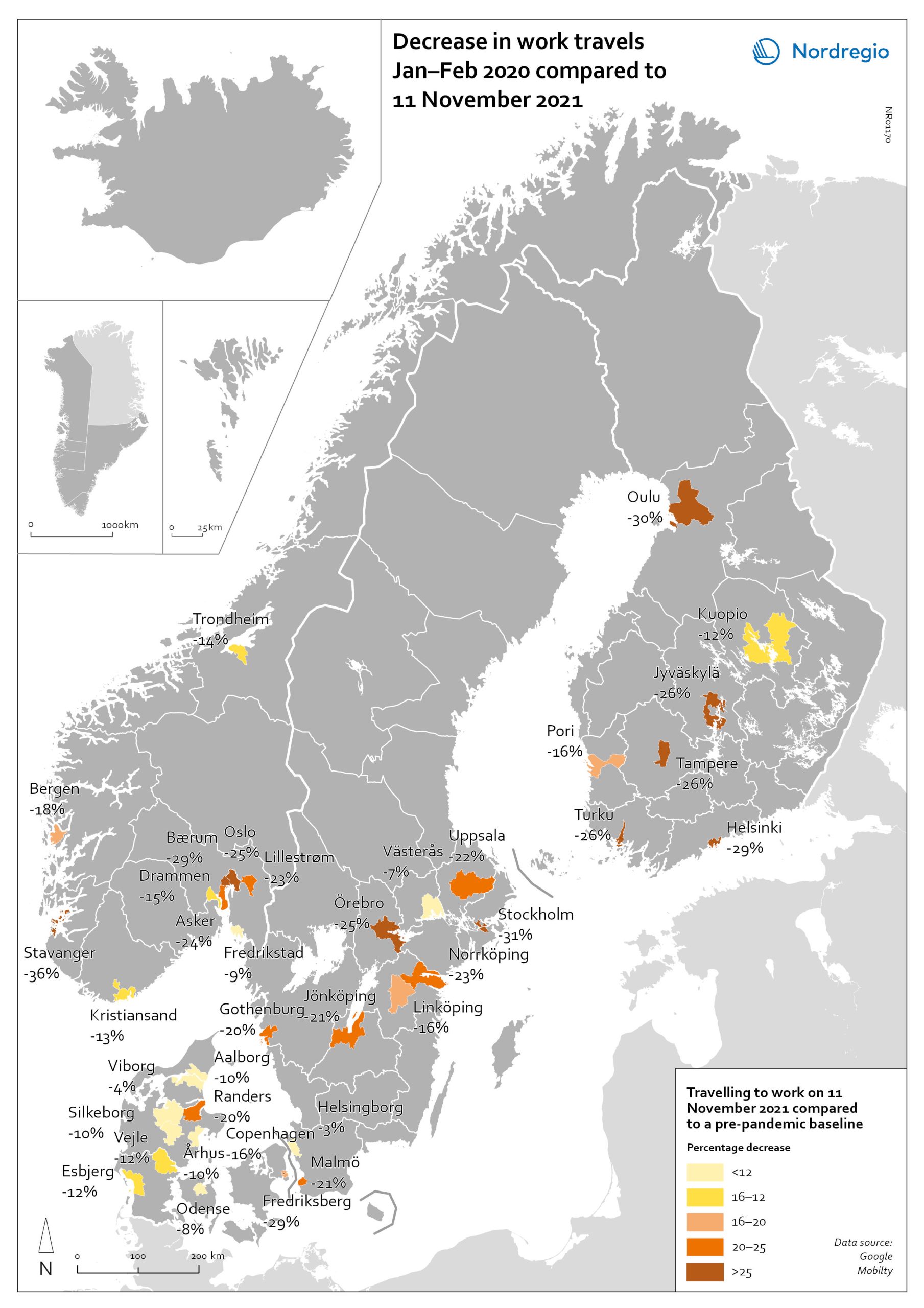
Change in work travels Jan-Feb 2020 compared to Nov 2021
The map shows changes in number of people travelling to work in the Nordic municipalities with the biggest populations comparing November 2021 to a pre-pandemic baseline. The map compares the average number of people who travelled to work on a weekday in January and February 2020 with the number of people who travelled to work on 11 November 2021 in the ten largest cities of Denmark, Finland, Norway and Sweden. The date was selected as the reference date as it is considered to be a relatively typical Thursday. It also represents a point when few movement restrictions were in place in the Nordic countries. As can be seen from the map, all of the municipalities highlighted recorded a fall in work-related travel on 11 November compared to the pre-pandemic baseline. It was biggest in Stavanger (-36%), followed by Stockholm (-31%), Oulu (-30%), Bærum (adjacent to Oslo) (-29%), Frederiksberg (adjacent to Copenhagen) (-29%) and Helsinki (-29%). In general, the decrease was highest around the capital regions and larger cities, but there were exceptions, for example, Jyväskylä (-26%), Örebro (-25%), Jönköping (-21%), and Randers (-20%). Several large municipalities also stood out because their patterns did not change so much, for example, Helsingborg (-3%) and Västerås (-7%) in Sweden; Viborg (-3%) and Odense (-8%) in Denmark.
- 2022 March
- Labour force
- Nordic Region
- Transport
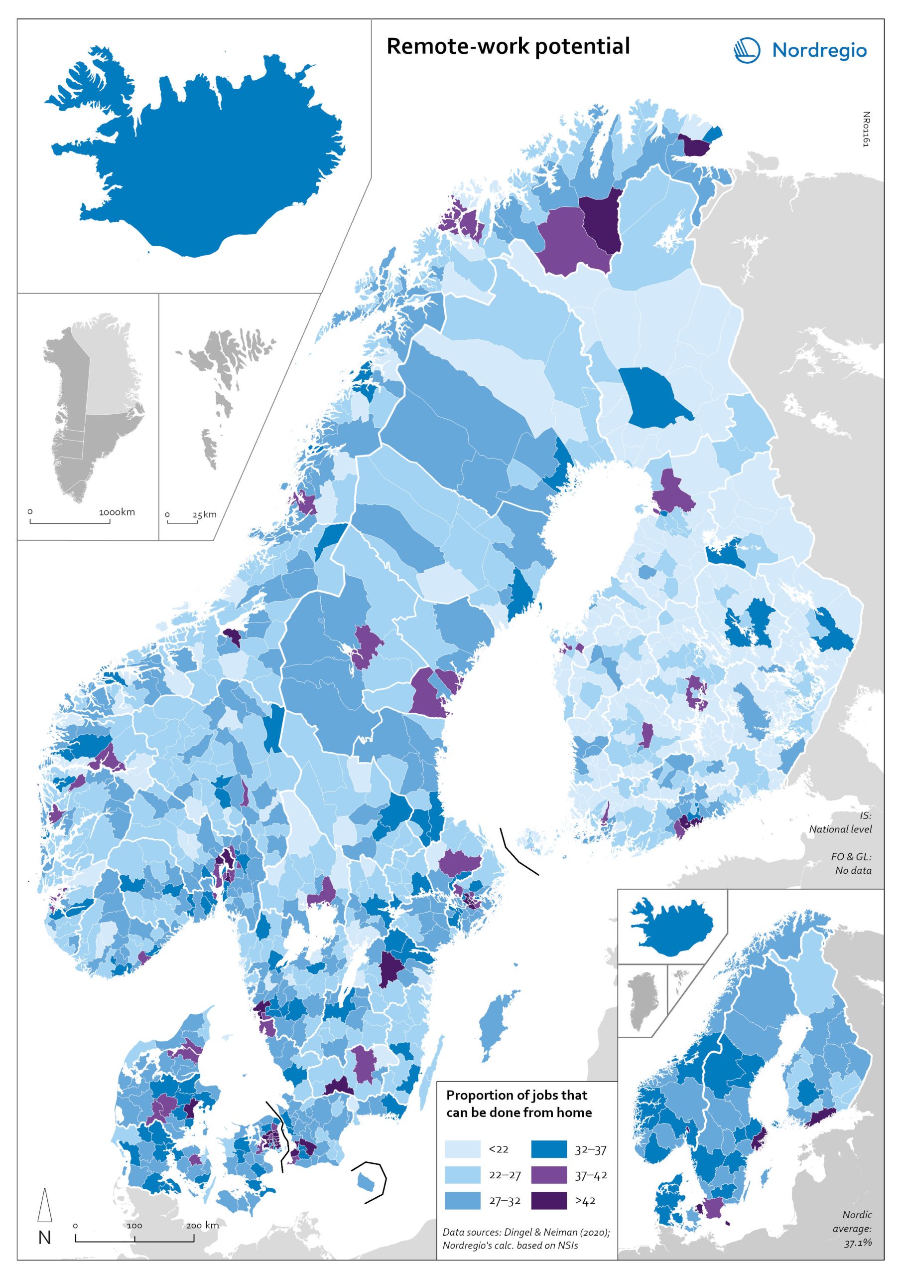
Remote work potential
The map shows the share of jobs that can potentially be done from home. At the municipal level it shows that the highest proportion is in, or in the proximity of, the largest urban conurbations. The purple areas show the municipalities that has a remote-work potential above the Nordic average (37%) and the blue areas the municipalities with remote-work potential below the Nordic average. The indicator is based on the methodology of Dingel & Neiman (2020). This method estimates the proportion of jobs that can theoretically be performed from home based on the tasks included in different occupations. Dingel & Neiman’s US classification was translated to the European International Standard Classification of Operations (ISCO-08) codes. The data is based on the 4-digit ISCO-08 and includes 437 occupations. The result was that every 4-digit ISCO occupation was coded as either 1: possible to work from home or not possible to work from home. For more information about the method please look at the State of the Nordic Region 2022 publication. The ten municipalities with the highest proportions are all in capital regions, with seven out of 10 in either Copenhagen (Hovedstaden) or Stockholm Region. In general, people in urban municipalities are more likely to be able to work from home (46.2%) than those in intermediate municipalities (32.3%) and rural municipalities (27.8%). It seems to be the case that the higher proportion of jobs that can be done from home in urban areas relates to the differences in industrial and occupational profiles between urban and rural areas, in particular, a higher concentration of knowledge-intensive occupations in urban areas. These differences are also evident when comparing countries. For example, Denmark has a rather large number of municipalities with high proportions of jobs that can be done from home. This may be due to…
- 2022 March
- Labour force
- Nordic Region
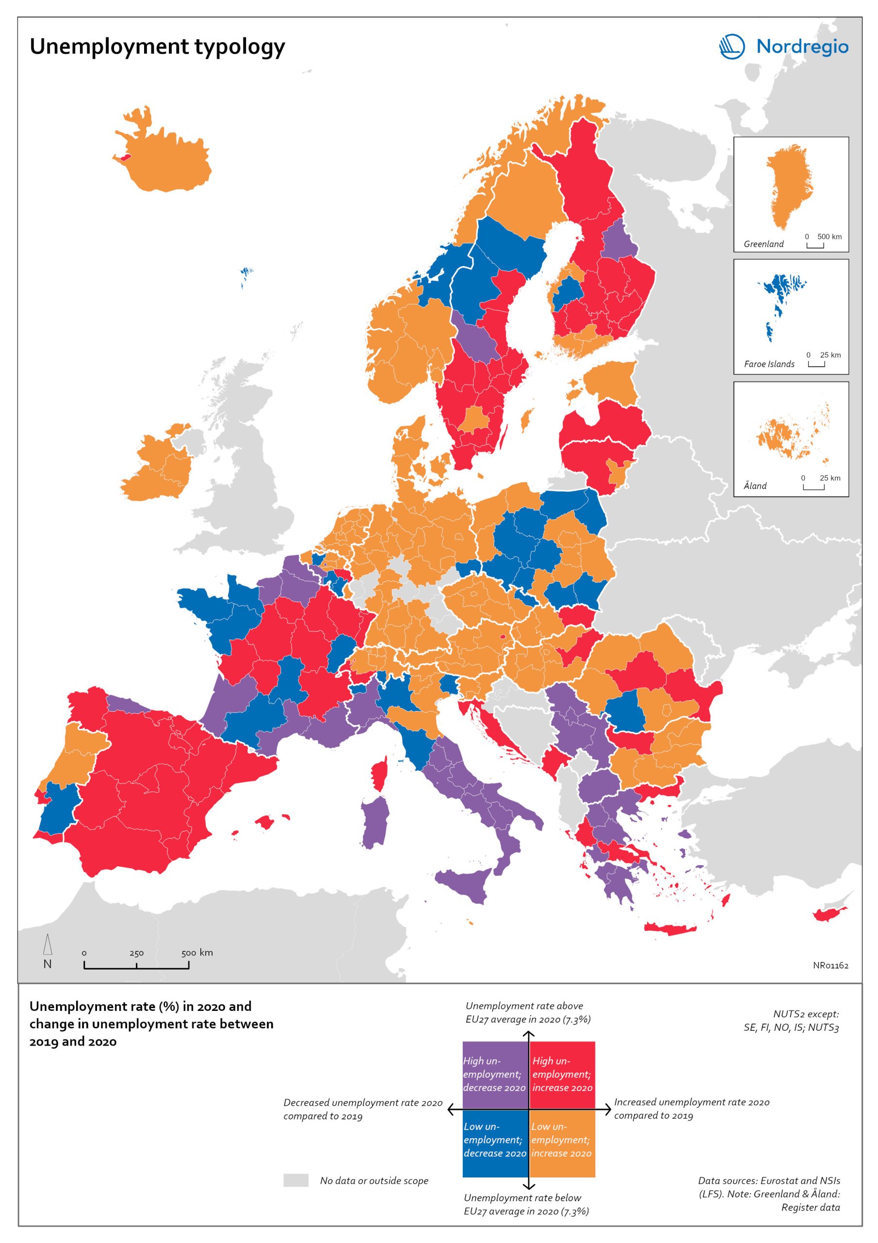
Unemployment typology
The map shows a typology of European regions by combining information on pre-pandemic unemployment rates with unemployment rates in 2020, based on the annual Labour Force Survey (LFS) that is measured in November. On one axis, the typology considers the extent of the change in the unemployment rate between 2019 and 2020. On the other axis, it considers whether the unemployment rate in 2020 was above or below the EU average of 7.3%. Regions are divided into four types based on whether the unemployment rate decreased or increased and how it relates to the EU average. Regions falling into the first type, shown in red on the map, had an increase in the unemployment rate in 2020 as well as an above-average unemployment rate in general in 2020. These regions were most affected by the pandemic. They are mainly found in northern and central parts of Finland, southern and eastern Sweden, the capital area of Iceland, Latvia, Lithuania, Spain and central parts of France. Regions falling into the second type, shown in orange on the map, had an increase in the unemployment rate in 2020 but a below-average unemployment rate in general in 2020. These regions had low pre-pandemic unemployment rates and so were not as badly affected as the red regions, despite the rising unemployment rates. They are located in Denmark, Iceland, Norway, Åland, southern and western Finland, Sweden (Gotland, Jönköping, and Norrbotten), Estonia, Ireland, northern Portugal and central and eastern parts of Europe.
- 2022 March
- Europe
- Labour force
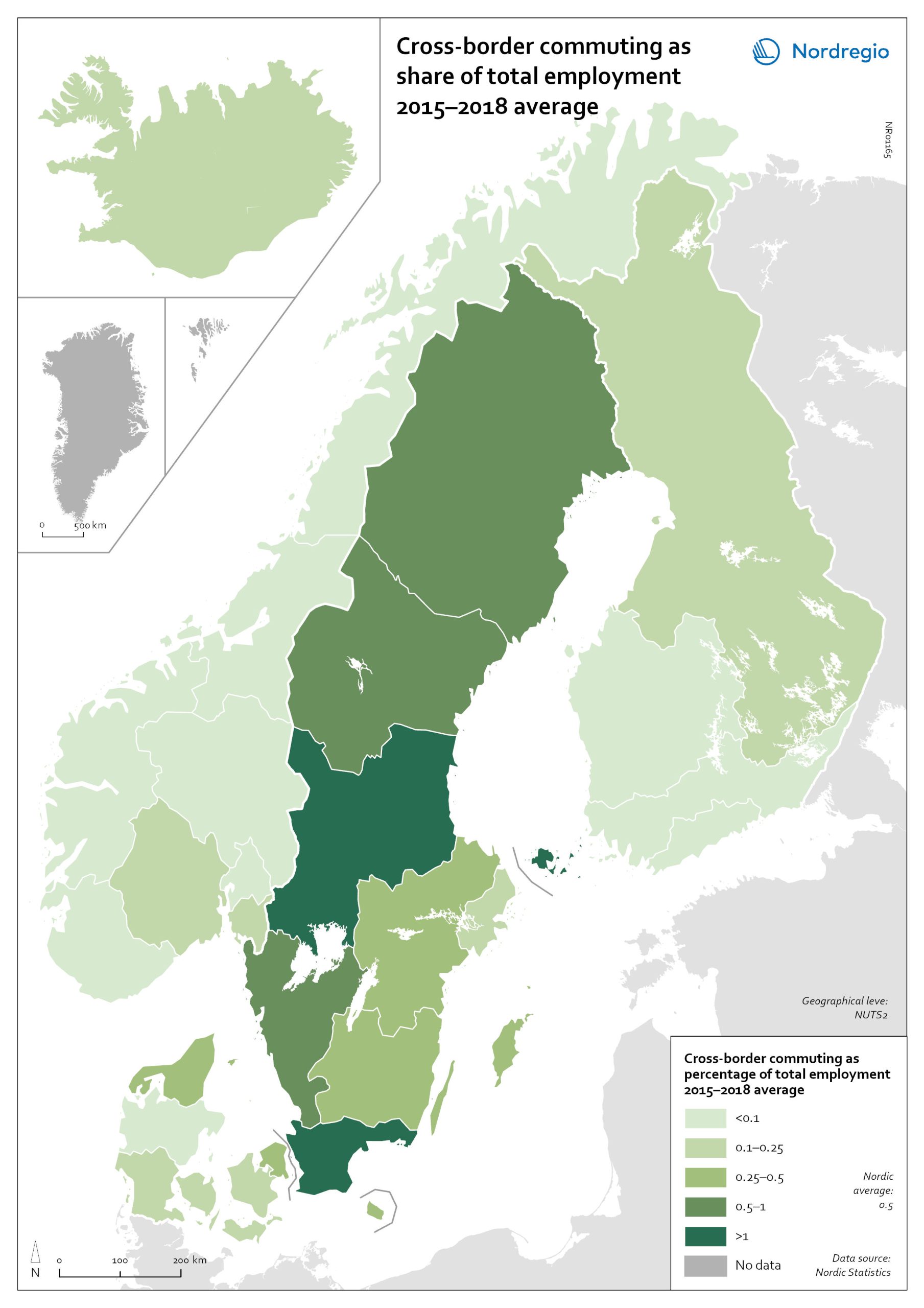
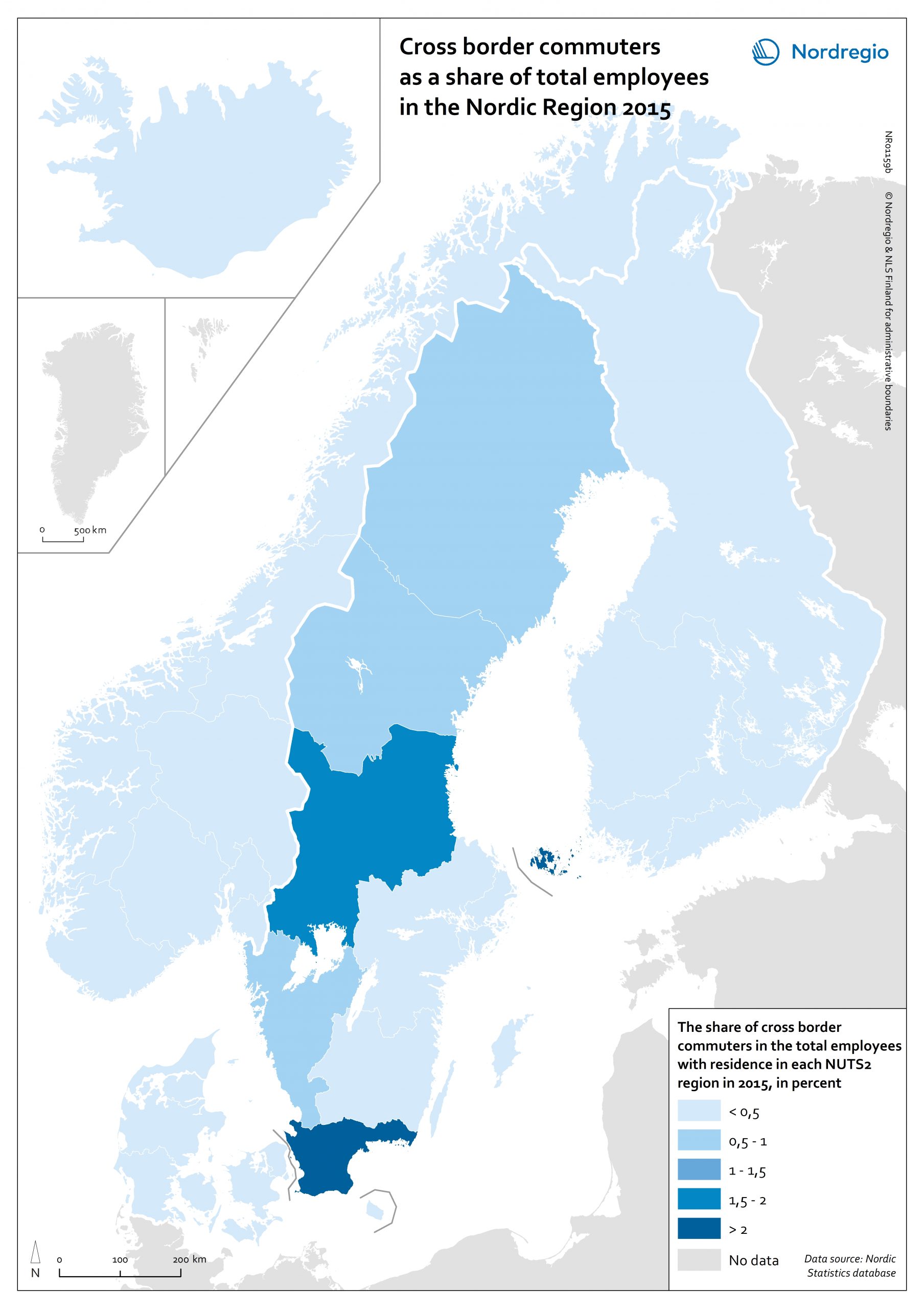
Cross-border commuting as share of employment
The map illustrates the average share of employees who commuted to another Nordic country between between 2015 and 2018 in Nordic regions (NUTS 2). Between 2015 and 2018, an average of approximately 49,000 people held a job in a Nordic country in which they were not residents. This indicates that, on average, 0.5% of the Nordic working-age population commuted to a job in another Nordic country. This is below the EU27 average of 1%, with the highest numbers found in Slovakia (5.1%), Luxembourg (2.8%) and Estonia (2.6%). Some of these people cross borders daily. Others work in another country by means of remote working combined with occasional commuting across borders. Within the Nordic Region, the largest cross-border commuter flows are in the southernmost parts of Sweden, regions in the middle of Sweden and in Åland, where more than 1% of the working population commutes to another Nordic country. However, there may be individual municipalities where cross-border commuting is substantially higher. For example, the employment rate in Årjäng Municipality, Sweden, increases by 15 percentage points when cross-border commuting is taken into account. These municipalities are not reflected on NUTS 2 level when averages are calculated. In terms of absolute numbers in 2015, the highest numbers of commuters were from Sweden: Sydsverige (16,543), Västsverige (7,899) and Norra Mellansverige (6,890). The highest number of commuters from a non-Swedish region were from Denmark’s Hovedstaden (2,583). Due to legislative barriers regarding the exchange of statistical data on cross-border commuting between the Nordic countries, more recent data is not available.
- 2022 March
- Labour force
- Nordic Region
- Transport
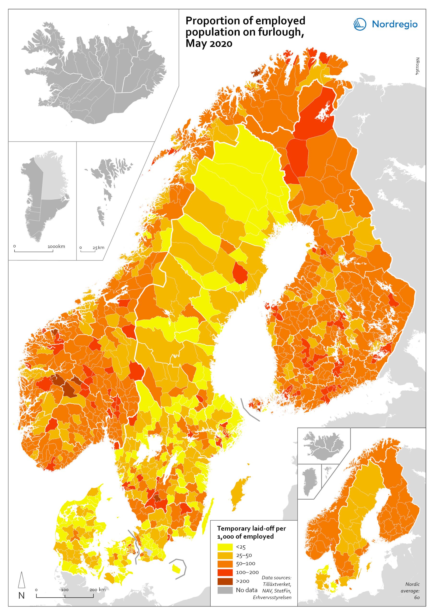
The share of laid-off employees at municipal and regional level
The map shows the share of employees laid off temporarily at municipal and regional levels in May 2020. According to the map, the highest proportion was in municipalities with a high proportion of people working in manufacturing, tourism and transport. These include the municipality of Sykkylven in Norway, which is home to several large furniture factories, the municipalities of Gnosjö and Oxelösund in Sweden, which both have multiple industries and a high proportion working in manufacturing, and the municipality of Taipalsaari in Finland, which is close to a large paper mill. Municipalities with significant tourism and a high proportion of employees laid off include Aurland, Hemsedal, Hol, and Trysil in Norway and Kittilä in Finland. The highly affected municipalities of Tårnby in Denmark and Härryda in Sweden are close to large airports, and in the municipality of Lemland in Finland, many people may work in the cruise industry. At regional level, the largest proportion of laid-off employees per 1,000 employed was in Oslo. All the other regions of Norway, all regions of Finland, and the regions of Halland, Jönköping, Kronoberg, Stockholm, Södermanland and Västra Götaland in Sweden and Hovedstaden in Denmark also had relatively high shares. The lowest proportions were found in the regions of Nordjylland and Sjælland in Denmark.
- 2022 March
- Labour force
- Nordic Region
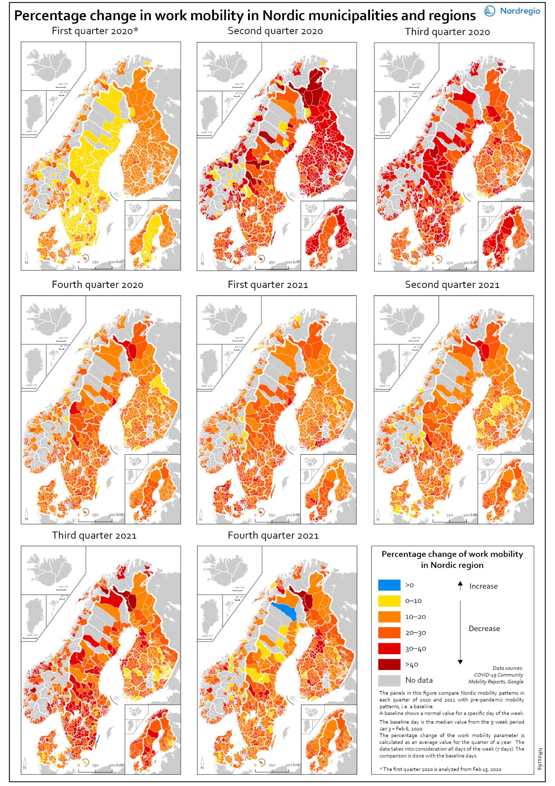
Work mobility per municipality and region by quarter
The map shows the percentage change for work mobility in Nordic regions and municipalities compared to a pre-pandemic baseline. The maps compare Nordic mobility patterns in each quarter of 2020 and 2021 with a pre-pandemic baseline. Based on Google data, the panels illustrate the impact of national restrictions and how those restrictions hampered work mobility. As the restrictions were both national and regional in nature, some regions and municipalities were more affected than others. The darker areas in the map show that work mobility decreased the most Q2 and Q3 2020 and in Q3 2021. The panels also show that mobility decreased later in Sweden than in the other Nordic countries. However, the decrease in Q3 in both 2020 and 2021 may partly be explained by the summer vacation months, when work mobility tends to decrease anyway. In Q4 2021, the overall situation seems to improve, although the pattern is mixed. In a few municipalities the situation is almost back to pre-pandemic baseline while in most municipalities, there is still less mobility in the labour market compared to the pre-pandemic situation.
- 2022 March
- Labour force
- Nordic Region
- Transport
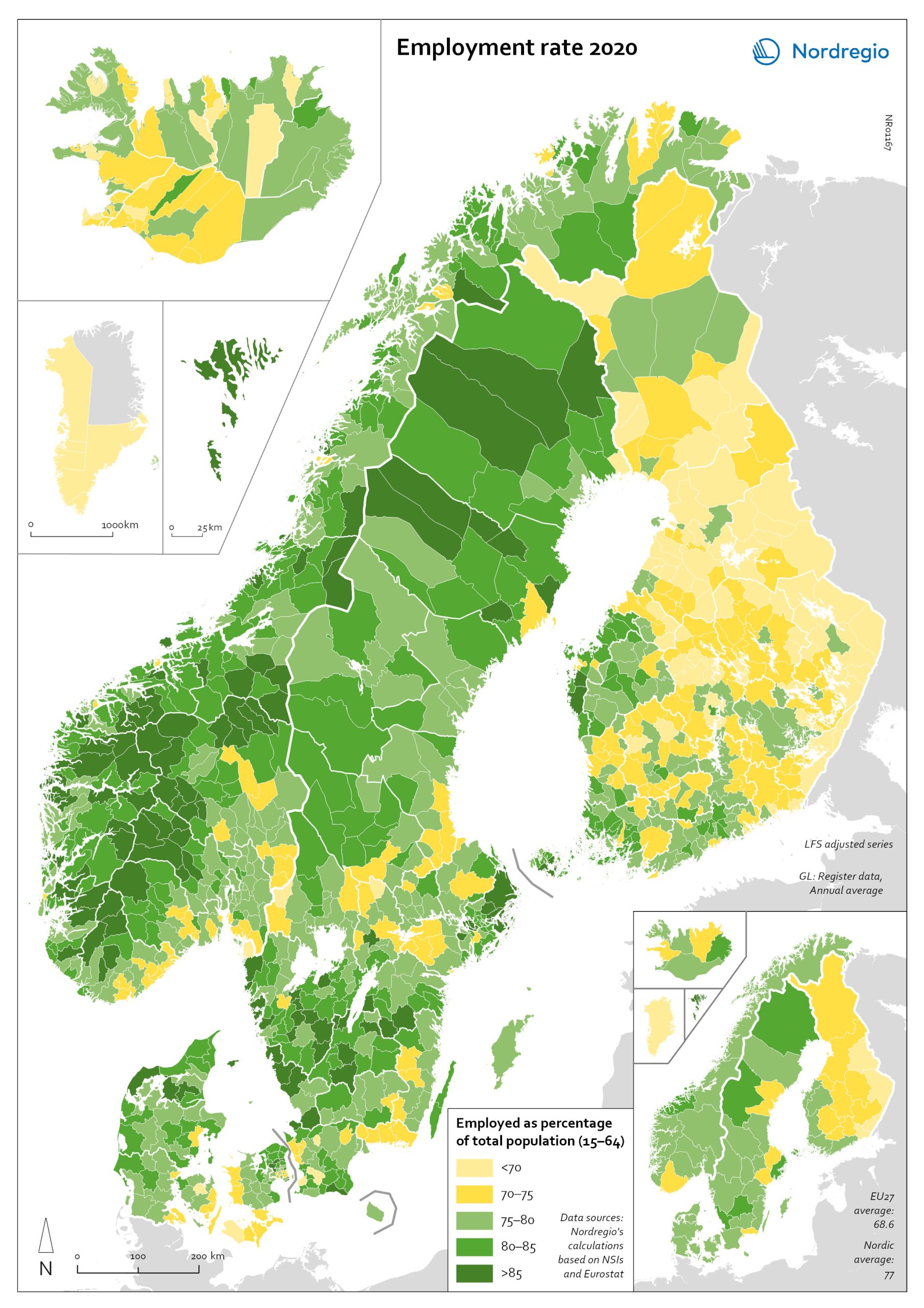
Employment rate 2020
The map shows the employment rate for all Nordic municipalities and regions in 2020. Full employment is one of the cornerstones of what is known as the Nordic model and, historically, the Nordic countries have enjoyed comparably high employment rates, particularly for women and older workers. The employment rate measures the number of people in work as a proportion of the working-age population (aged 15–64) as a whole. The green tones indicate municipalities with employment rates above 75% in 2020, with the darker green representing higher employment rate. The yellow tones indicate municipalities with employment rates below 75% in 2020. The light-yellow colour indicates municipalities with employment rates below 70% in 2020. The highest employment rates were found in the Faroe Islands and in many smaller municipalities in Norway and Sweden, whereas the lowest employment rates were in Greenland and several municipalities in Finland. At regional level, the Faroe Islands, the regions of Halland, Jämtland, Jönköping, Norrbotten and Stockholm in Sweden, and the region of Møre og Romsdal in Norway had an employment rate above 80%. Employment rates below 70% were recorded in Greenland and the regions of Etelä-Karjala, Kainuu, Kymenlaakso and Pohjois-Karjala in Finland.
- 2022 March
- Labour force
- Nordic Region