73 News
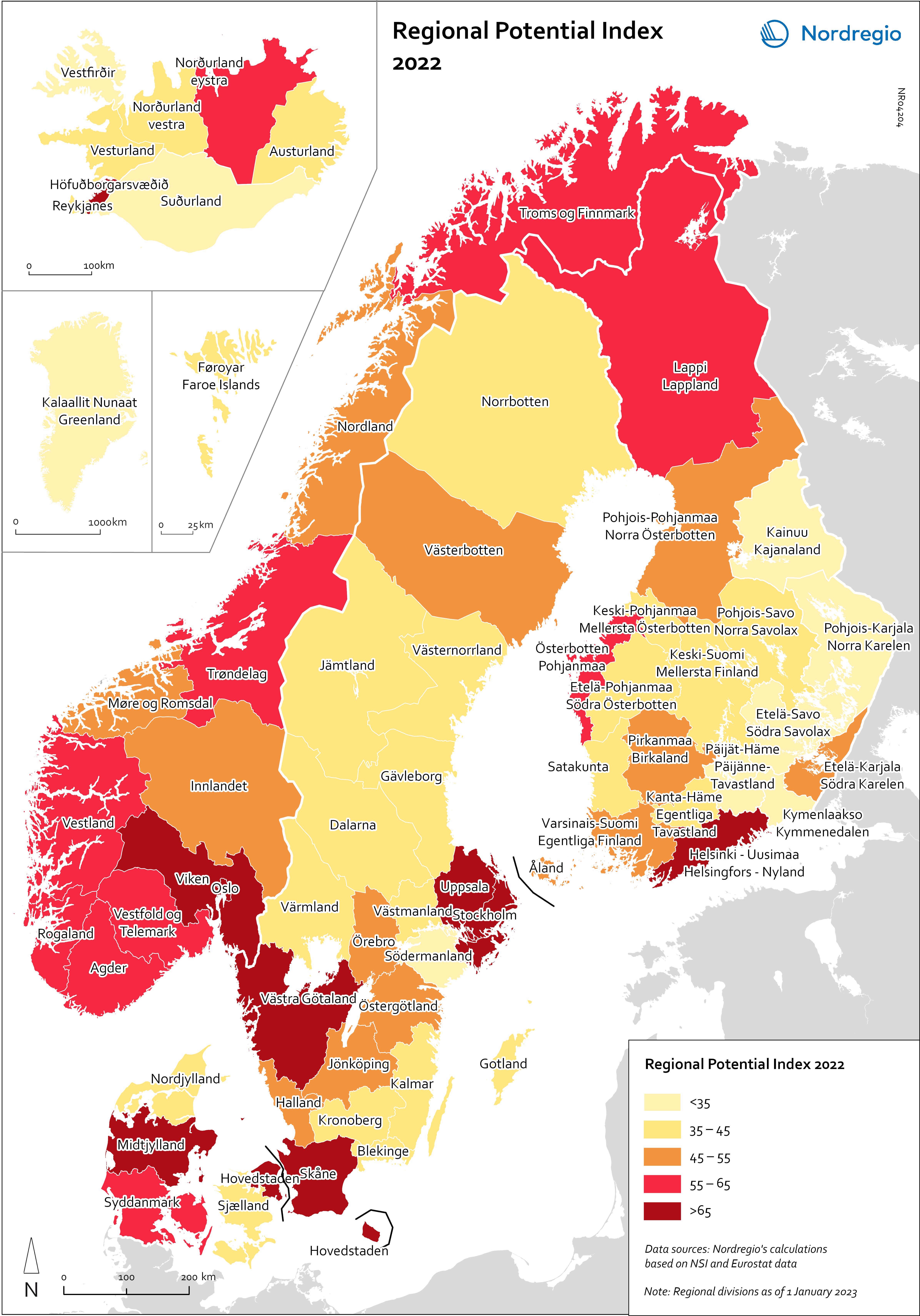
Regional Potential Index 2022
This map shows the result of Nordregio’s Regional Potential Index in 2024 (data from 2022). Nordregio’s Regional Potential Index (RPI) enables cross-regional comparison of development potential and illustrates the regional balance between the Nordic countries and has been part of the State of the Nordic Region report since 2018. The purpose of this multidimensional index is to summarise the current and past performance of the Nordic regions across major policy domains. The index helps to identify regions that have high potential and those in need of further support to boost their potential and meet existing challenges. It provides policy-makers with a comparative learning tool that informs the design of effective regional development strategies at Nordic level. Nordregio’s RPI is a multi-item measurement scale that incorporates information about the demographics, labour market and economic output of the Nordic countries’ 66 administrative regions. It consists of eight indicators classified into four main groups and eight subgroups. These components and indicators were originally selected on the basis of their relevance for regional development. The 2024 RPI is based on a new refined method that maintains a similar set of indicators but applies a more robust statistical process to the construction of the RPI. In brief, the new methodology consists of a pre-processing stage, in which the input data is prepared for analysis, and a processing stage, in which the indicators are weighted and aggregated. More information about the method can be found in the State of the Nordic Region 2024 report. The RPI was calculated retroactively for the 2015–2023 period. However, the focus in this section is on 2022 – the most recent year in our time series with full data coverage. The map shows the redesigned RPI for that period. In line with the principles of accumulation and agglomeration that drive the…
 2025 April
 - Demography
- Economy
- Labour force
- Nordic Region
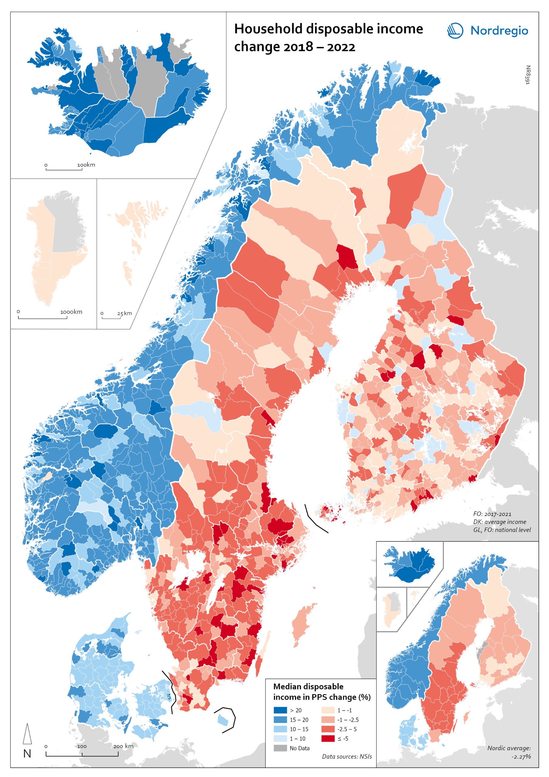
Household disposable income change 2018-2022
This map shows the percentage change in household disposable income between 2018 and 2022 in Nordic municipalities (big map) and regions (small map). Household disposable income per capita is a common indicator of the affluence of households and, therefore, of the material quality of life. It reflects the income generated by production, measured as GDP that remains in the regions and is financially available to households, excluding those parts of GDP retained by corporations and government. In sum, household disposable income is what households have available for spending and saving after taxes and transfers. It is ‘equivalised’ – adjusted for household size and composition – to enable comparison across all households. Purchasing Power Standards (PPS) is used to compare the countries’ economies and the cost of living for households. As shown in the map, between 2018 and 2022, household disposable income increased for all Danish, Icelandic, and Norwegian municipalities and decreased for Finnish and Swedish municipalities. On average, the city municipalities have higher incomes and increased most in Finland and Sweden in 2018–2022. In Sweden, a tendency towards larger falls in income was observed in several southern municipalities. In summary, absolute household income increased in all Nordic countries but not when measured in purchasing power. Based on this metric, on average, Norwegian households are the most well-off and Iceland the worst off, while Danish households benefited from a stronger currency in 2022. Single-parent households have had lower increases in household income than other families in Norway and parts of Sweden. Municipalities show a similar trend in Norway and Denmark, although Norwegian coastal municipalities fared slightly better in 2022. Disposable income is falling in all Swedish and Finnish municipalities.
- 2025 April
- Economy
- Nordic Region
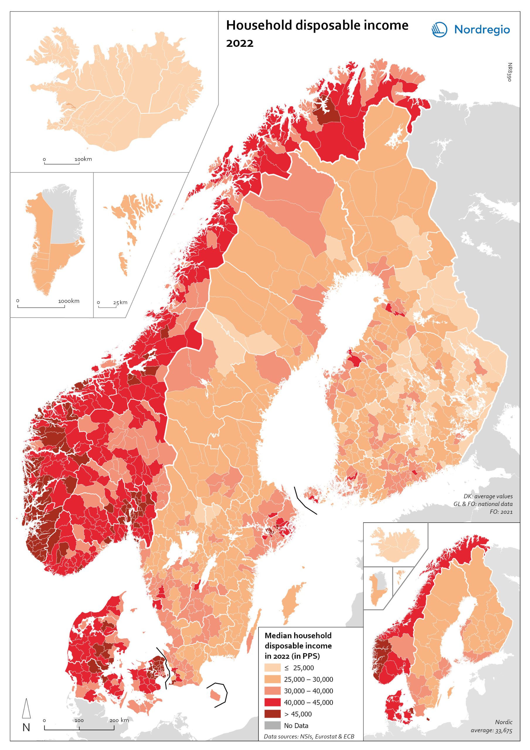
Household disposable income 2022
This map shows the median household disposiable income measured in purchasing power standard (PPS) in Nordic municipalities (big map) and regions (small map) in 2022. Household disposable income per capita is a common indicator of the affluence of households and, therefore, of the material quality of life. It reflects the income generated by production, measured as GDP that remains in the regions and is financially available to households, excluding those parts of GDP retained by corporations and government. In sum, household disposable income is what households have available for spending and saving after taxes and transfers. It is ‘equivalised’ – adjusted for household size and composition – to enable comparison across all households. Purchasing Power Standards (PPS) is used to compare the countries’ economies and the cost of living for households. The map shows the intra-municipal differences in household disposable income in PPS, which reveals the different patterns in the Nordic countries. Norwegian coastal municipalities have slightly higher household disposable income than inland municipalities, with some exceptions. Finnish, Icelandic, and Swedish municipalities generally have much lower household disposable income compared to Norwegian and Danish municipalities, except for the larger urban areas. In Denmark, most municipalities are at a similarly high level, except for remote islands in the south. The differences between the Icelandic municipalities are rather small, at a medium to lower level.
- 2025 April
- Economy
- Nordic Region
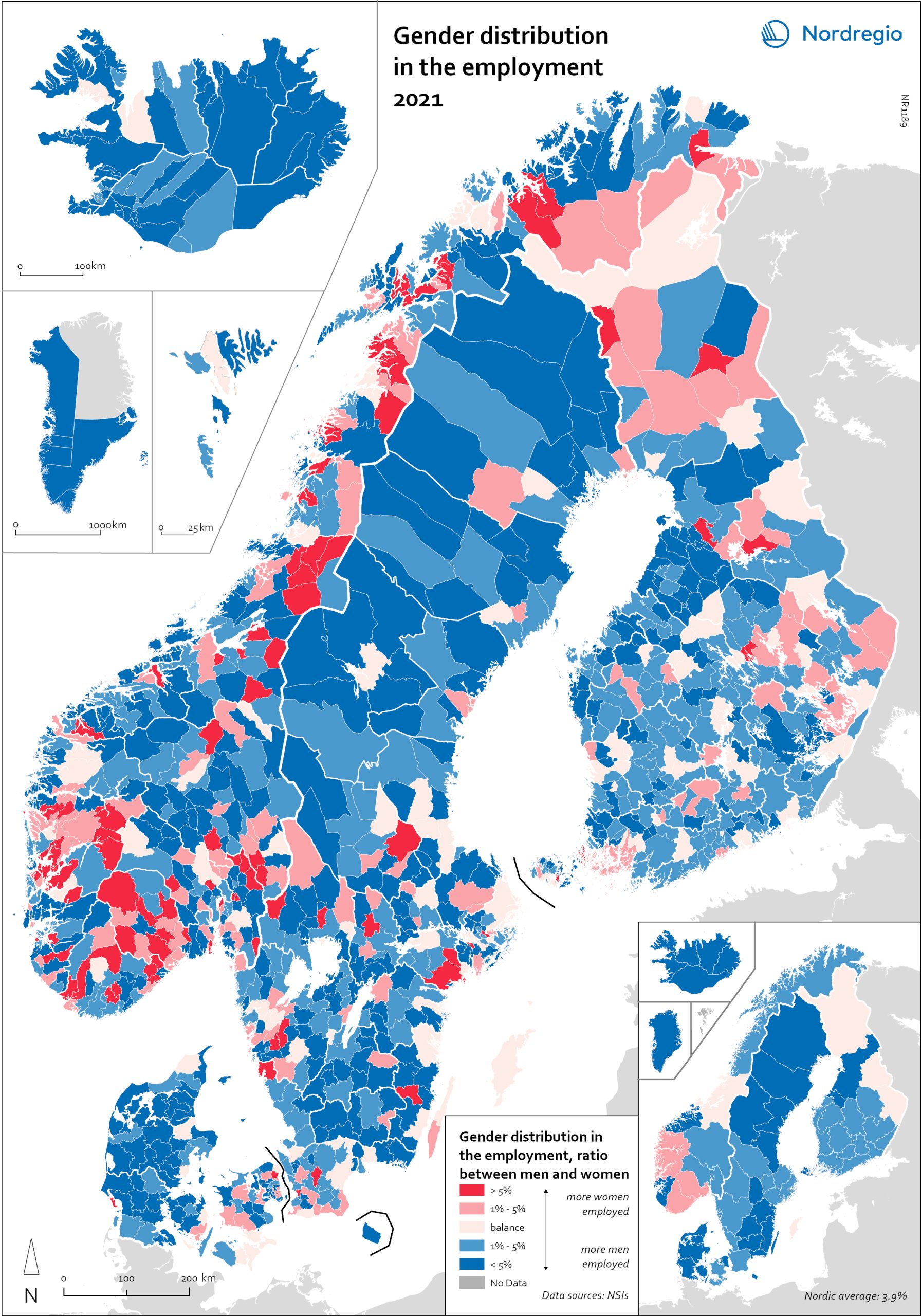
Gender distribution in employment 2021
This maps shows the gender distribution in employment at both municipal (big map) and regional levels (small map) in the Nordic Region in 2021 (measured in November). Blue shades indicate more men employed and red shades more women. Most regions had higher employment rates for men than women, with an average of 3.7% more men across the countries and sectors. In Finland, the rates were more balanced, with only 1.3% more men in employment. In three regions in Finland, employment rates were slightly higher for women: Etelä-Karjala – Södra Karelen, with 0.8% more women than men; Kainuu – Kajanaland, with 0.4%; and Uusimaa – Nyland with 0.1%. These are the only regions in the Nordic countries with a prevalence of employed women at the regional level. For the rest, employment rates were higher for men, with Icelandic regions having the largest share: Suðurnes had 11.3% more men than women, Vesturland 8.8%, Austurland 8.7%, and Suðurland 8.2%. The average for the Icelandic regions was 7.5%. For Denmark, this was 4.9%, for Sweden, 3.9%, and for Norway, 3.4%. At the municipal level, however, the situation was much more varied. Åland is one of the most extreme examples. Although the average was 2.5% more men employed than women, Åland has several municipalities with extremes at both ends. On the one hand, there are municipalities like Lumparland, with 16% more women than men, and Brändö, with 11.3%. On the other hand, Kökar had 64% more men than women. The variations between Ålandic municipalities can largely be attributed to the municipalities’ population size. The larger cities, like Trøndelag in Norway, may be more balanced at the regional level, but within the region, there are municipalities with a 20% prevalence of women in employment (Namsskogan, Meråker, Holtålen), as well as some with 18% (or higher) more…
- 2025 April
- Economy
- Labour force
- Nordic Region
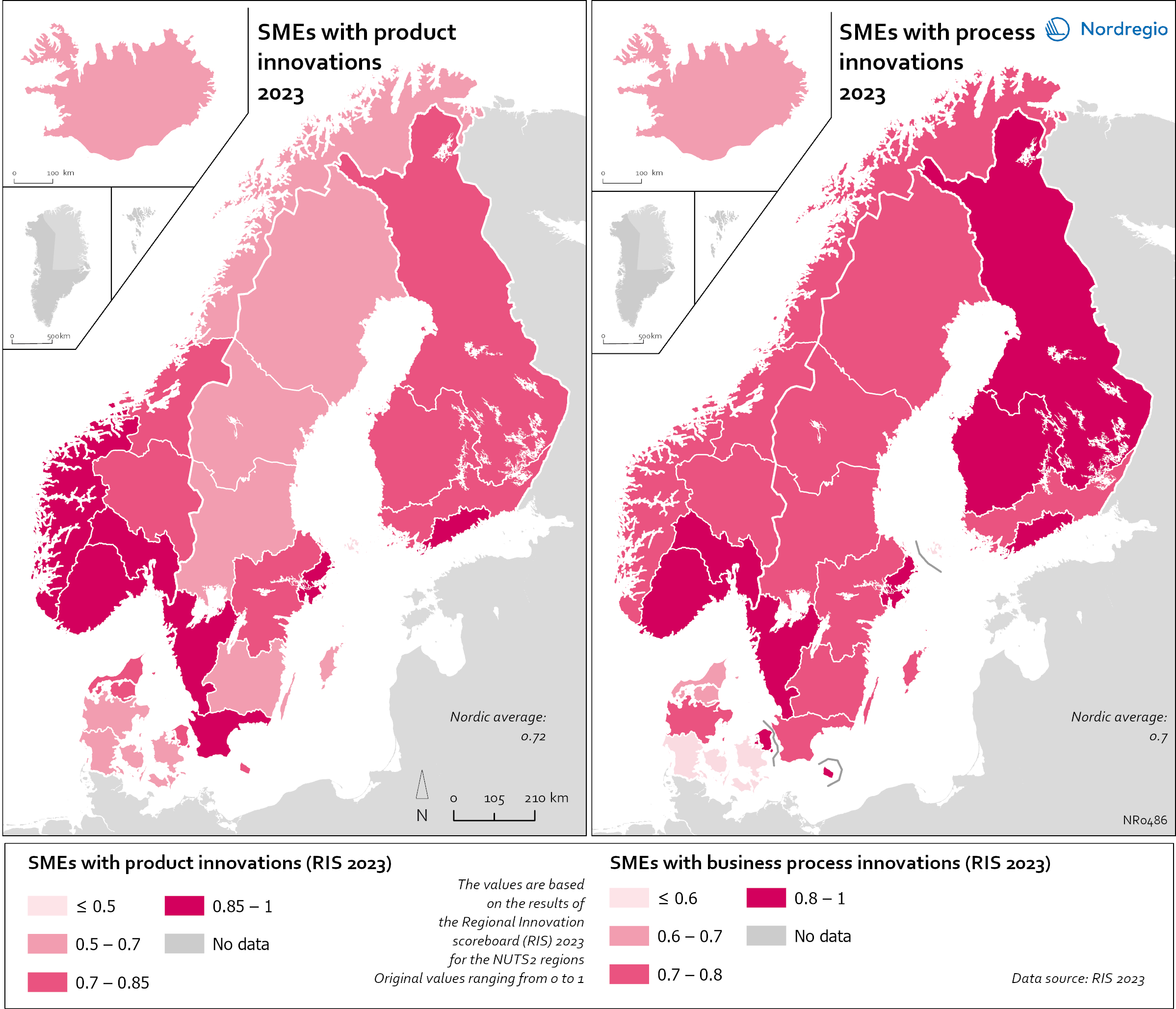
Small and Medium Sized Enterprises (SMEs) with product and business process innovation in 2023
These maps depicts Small and medium sized enterprises (SMEs) with product innovation (left map) and process innovation (right map) in 2023. The data is displayed at the NUTS2 level and the data comes from the Regional Innovation Scoreboard 2023. The left map depicts SMEs introducing product innovations as a percentage of SMEs in the Nordic regions, calculated as the share of SMEs who introduced at least one product innovation. The values for the map are normalised from 0–10. In this context, a product innovation is defined as the market introduction of a good or service that is new or significantly improved with respect to its capabilities, user-friendliness, components, or sub-systems. Rural regions tend to have lower levels of SMEs with product innovations, while urban regions have the highest levels. In 2023, Åland (0.235) had the lowest number of SMEs with product innovations in the Nordic Region, while Oslo had the highest (1.0). Etelä-Suomi and Stockholm regions were slightly behind, with 0.954 and 0.948, respectively. In Denmark, the leading regions were the Capital Region (Hovedstaden) and Northern Jutland (Nordjylland), with 0.719 and 0.715, respectively. Southern Denmark (Syddanmark) had the lowest level in Denmark, at 0.545. In Norway, the lowest value was in Northern Norway (Nord-Norge), 0.67, while in Sweden it was Middle Norrland (Mellersta Norrland), with 0.53. Taken as an average across the Nordic countries, Norway has a significantly higher number of SMEs with product innovations than the other countries. The right map shows the share of SMEs introducing at least one business-process innovation, which includes process, marketing, and organisational innovations. In general, Nordic SMEs are more likely to innovate in products rather than processes. The highest shares of process-innovating SMEs are found in most of the Finnish regions ranging from 0,79 in Länsi-Suomi to 0,91 in Etelä-Suomi, except of Åland…
- 2025 April
- Economy
- Nordic Region
- Research and innovation
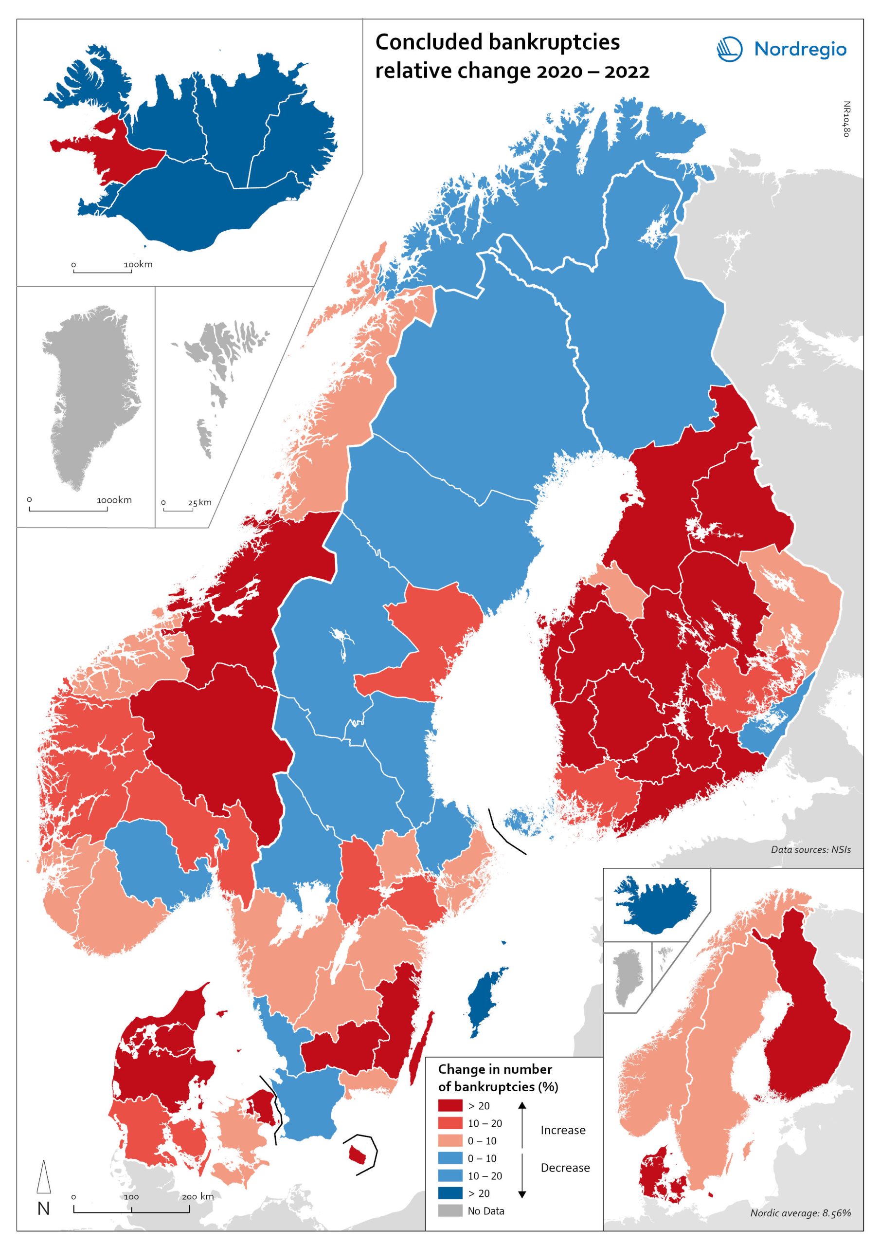
Change in the number of business bankruptcies (2020–2022)
This map depicts the change in total number of bankruptcies in the Nordic regions between 2020 and 2022. The red shades indicates an increase in numbers of bunkruptcies and blue shades a decrease. The big map shows the regional level and the small map the national level. The rate of business bankruptcies is a core indicator of the robustness of the economy from the business perspective. Nordic and international businesses have been impacted by both the COVID-19 pandemic and rising inflation in recent years. In terms of the level of bankruptcies, data from Eurostat (2024) shows that the Nordic countries fared relatively well compared to other high-income countries between 2020 – 2022. In the years during and after the COVID-19 pandemic, the most densely populated regions saw the highest levels of bankruptcies. This finding is partly to be expected, as these regions also tend to be those with the highest number of companies. However, some variation can be seen across the countries. Overall, Iceland and Finland experienced the lowest rate of bankruptcies in 2020 and 2022. Denmark had the highest level of bankruptcies during COVID-19. Potential explanations for the national variations may include the countries’ varying strategic approaches to the pandemic. Denmark enforced more restrictive lockdowns compared to, for example, Sweden, where the less restrictive approach has been linked to the more limited impact on business bankruptcies in the early part of the pandemic. Furthermore, there is a large consensus that the many jobretention schemes across the Nordic Region also served to limit the number of bankruptcies. However, new data from early 2024 shows that after the job-retention schemes ended, and while high inflation and interest rates were increasing the pressure on Nordic companies, the level of bankruptcies increased. In 2023, 8,868 companies went bankrupt in Sweden the highest number…
- 2025 April
- Economy
- Nordic Region
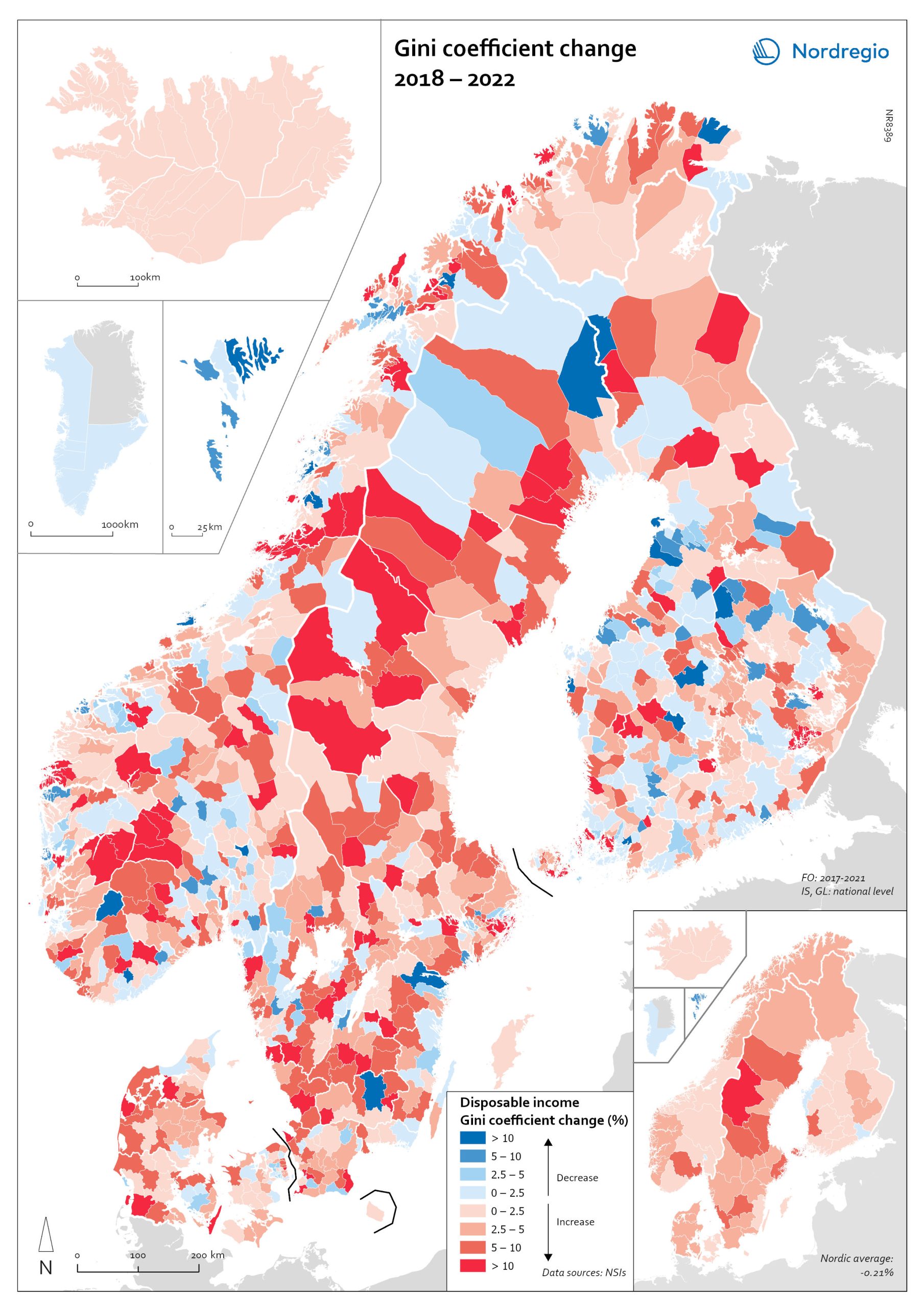
Gini coefficient change 2018-2022
This map shows the percentage change in the Gini coefficient between 2018 and 2022. The big map shows the change on municipal level and the big map at regional level. Blue shades indicate a decrease in income inequality, while red areas indicate an increase in income inequality The Gini coefficient index is one of the most widely used inequality measures. The index ranges from 0–1, where 0 indicates a society where everyone receives the same income, and 1 is the highest level of inequality, where one individual or group possesses all the resources in the society, and the rest of the population has nothing. The map illustrates significant variations in the change in income inequality across Nordic municipalities and regions. Between 2018 and 2022, income inequality increased in predominantly rural municipalities, notably in Jämtland, Gävleborg, Dalarna and Västerbotten in Sweden, as well as Telemark in Norway. For Denmark, the rise in inequality is mainly for the municipalities in Western Jutland. At the same time, approximately one third of municipalities in the Nordic Region experienced a decrease in income inequality during the same period, primarily in Finland and Åland. For example, in Finland, the distribution of inequality was more varied. This trend aligns with the ongoing narrowing of the household income gap observed in many Finnish municipalities since 2011, which is mainly attributed to the economic downturn of the early 2010s, as well as demographic shifts such as outmigration and ageing.
- 2025 April
- Economy
- Nordic Region
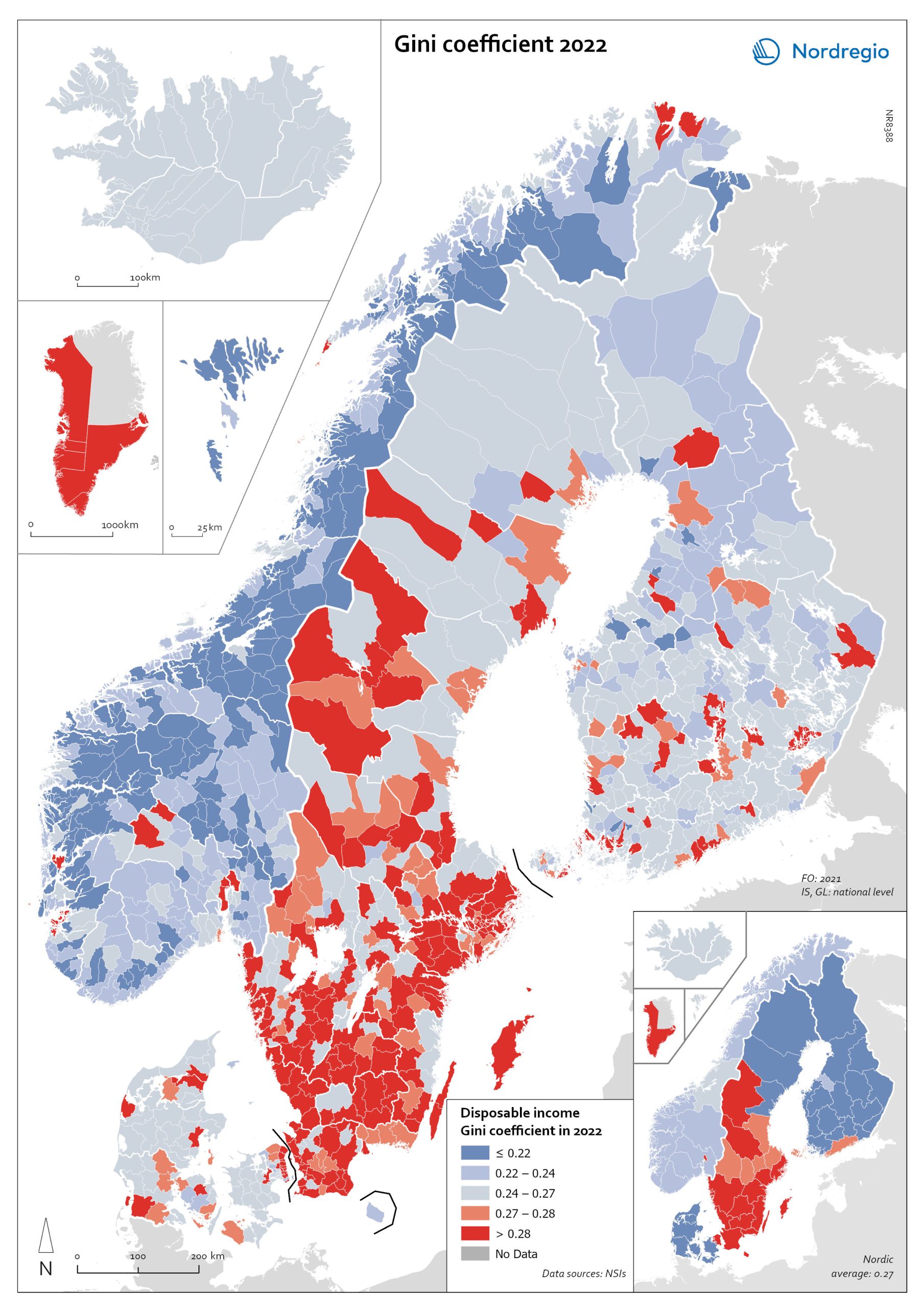
Gini coefficient for disposable income in 2022
This map shows the Gini coefficient in Nordic municipalities (big map) and regions (small map) in 2022 (no data was available for Iceland). Blue shades indicate a Gini coefficient below the Nordic average. Red areas indicate a Gini coefficient above the Nordic average (0.27, excluding Greenland, as a statistical outlier). The data for the Faroe Islands is for 2021. The Gini coefficient index is one of the most widely used inequality measures. The index ranges from 0–1, where 0 indicates a society where everyone receives the same income, and 1 is the highest level of inequality, where one individual or group possesses all the resources in the society, and the rest of the population has nothing. In 2022, the highest municipality income disparities were observed in the capital city regions of Denmark, Finland and Sweden, each of which had Gini coefficients around 0.6. Danderyd (0.64), Lidingö (0.52), and Gentofte (0.51) had the highest Gini coefficients. These municipalities also have some of the highest incomes in their respective countries.
- 2025 April
- Economy
- Nordic Region
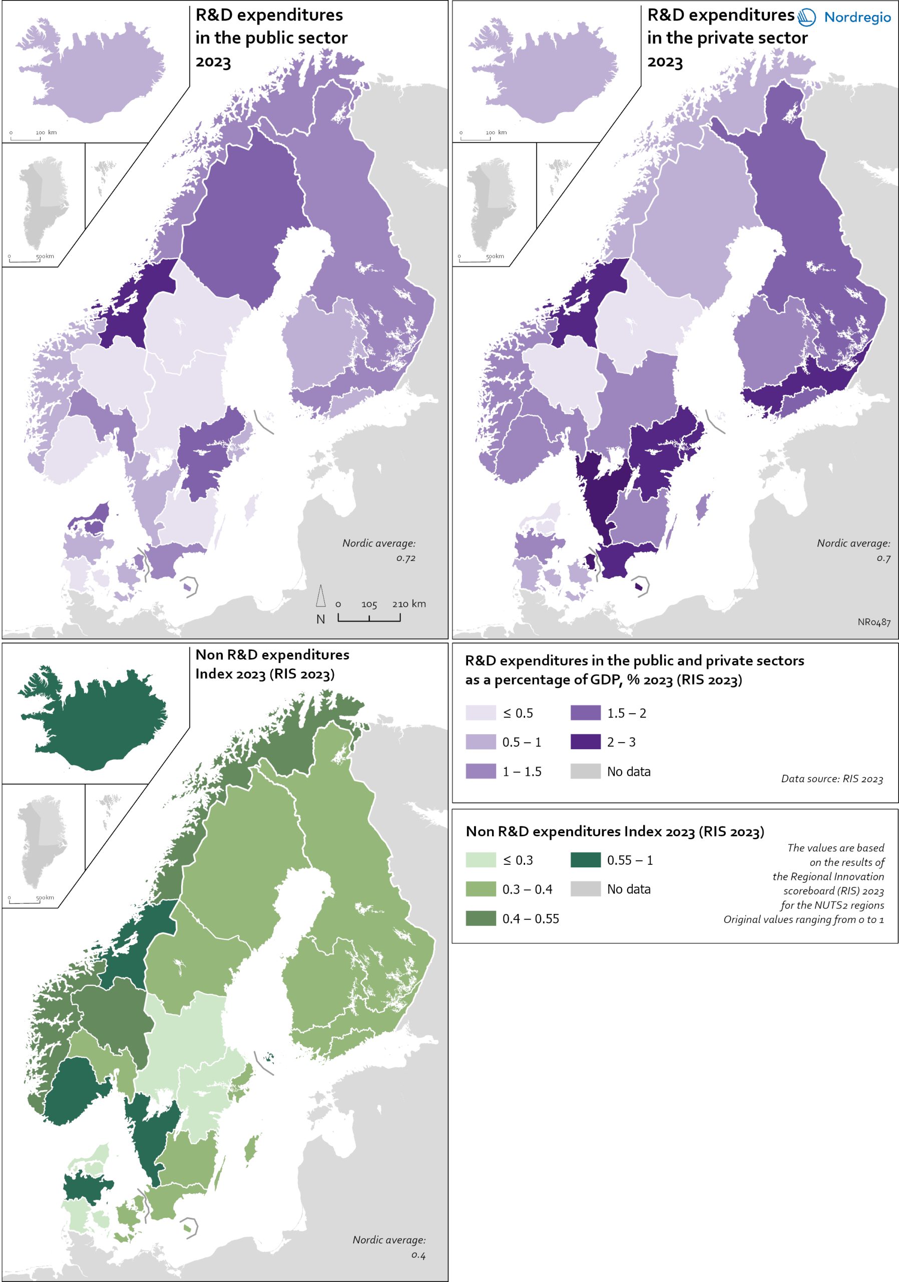
R&D and non-R&D expenditures in the public and private sector
These maps shows the expenditure on Research and Development (R&D) in the public and business sectors as a percentage of regional GDP, along with non-R&D innovation expenditure in Small and Medium Enterprises (SMEs) as a percentage of turnover. Together, these metrics offer a comprehensive understanding of the innovation landscape and provide insights into governments’ and higher education institutions’ commitment to foundational research, as well as the competitiveness and dynamism of the business environment and SMEs’ innovation capacity. By considering investment in both R&D and non-R&D activities, these indicators illustrate a broad spectrum of innovation drivers, from basic research to market-driven initiatives, and underscore the diverse pathways through which innovation fosters economic growth and social progress First, the top left map showcases R&D expenditure in the public sector as a percentage of GDP in the Nordic countries in 2023. In that year, the European level of R&D expenditure in the public sector, as a percentage of GDP, was 0.78%. By comparison, the Nordic average was 0.9%. While the more urban regions, in general, lead the Nordic regions, this is not always the case, as shown by the variation between the frontrunners. The leading region is Trøndelag (including Norway’s third-largest city, Trondheim), with 2.30% of regional GDP. It is in third place in the EU as a whole. The next regions are Övre Norrland with 1.77%, Northern Jutland with 1.54%, Östra Mellansverige with 1.52%, and Hovedstaden with 1.49%. A common feature of most of the top-ranking regions is that they host universities and other higher education institutions known for innovation practices. Most Nordic regions have not seen significant increases or decreases in public R&D spending between 2016 and 2023. The top right map focuses on the private sector’s investment in research and development activities and depicts R&D expenditure in the business sector…
- 2025 April
- Economy
- Nordic Region
- Research and innovation
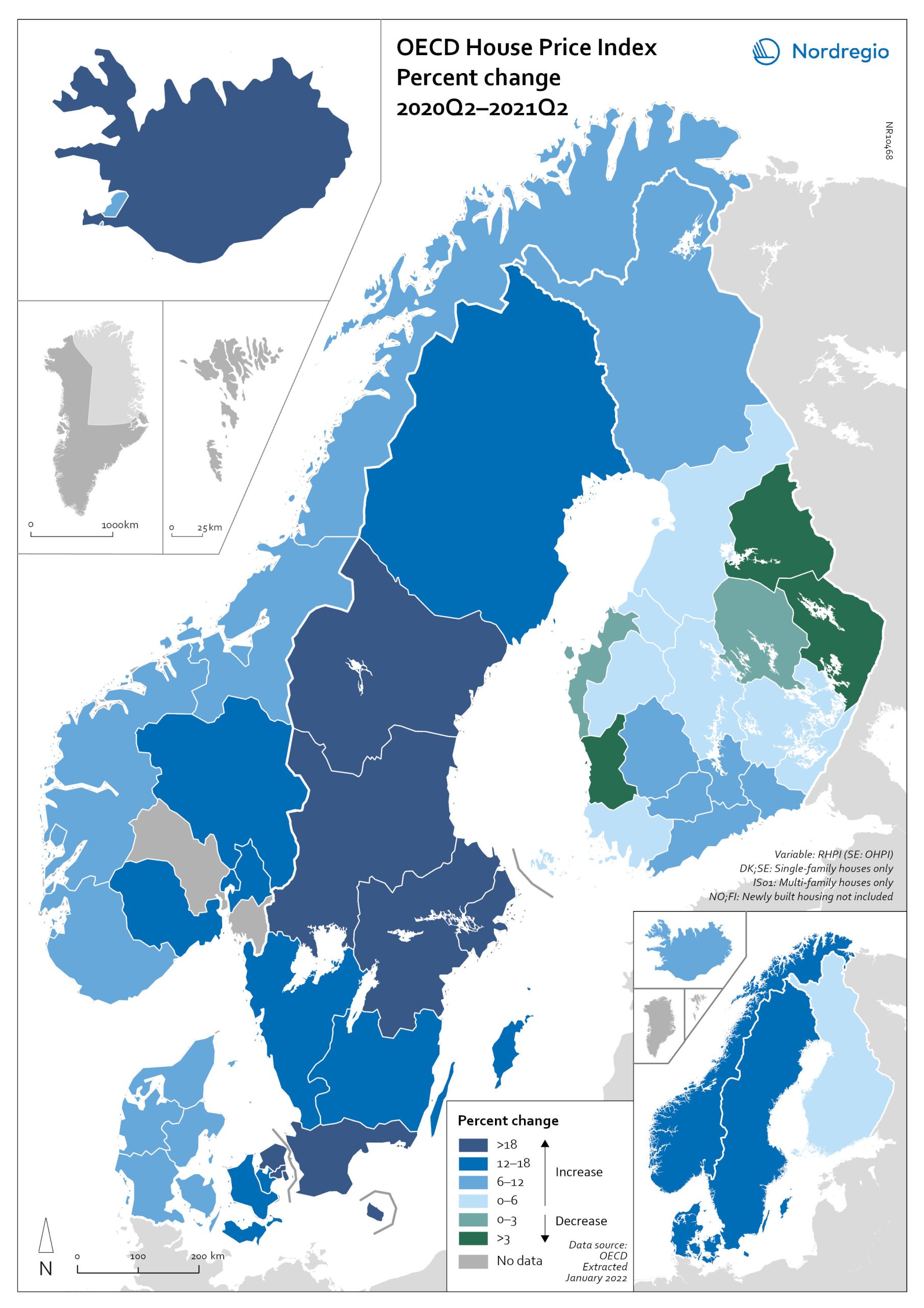
OECD House Price Index. Change 2020Q2–2021Q2
The map shows the relative change of the OECD House Price Index from Q2 2020 to Q2 2021. The map shows that the price development was not uniform within the countries. Iceland recorded the largest price increases overall, with the most marked price increases found outside of the capital region. All Swedish regions recorded increases above 20%, with the highest increases in the Stockholm and Malmö regions. All Norwegian regions showed price increases, though to a lesser extent than Swedish regions in most cases. In Denmark, Bornholm, Sjælland and the rural islands of Lolland and Falster recorded relatively high price increases, although many rural areas developed from low absolute prices in 2020. Finland was the only country where some regions saw property prices decrease. Moderate increases were still observed in some of the southern regions, where the major cities are located, and in the north.
- 2022 March
- Economy
- Nordic Region
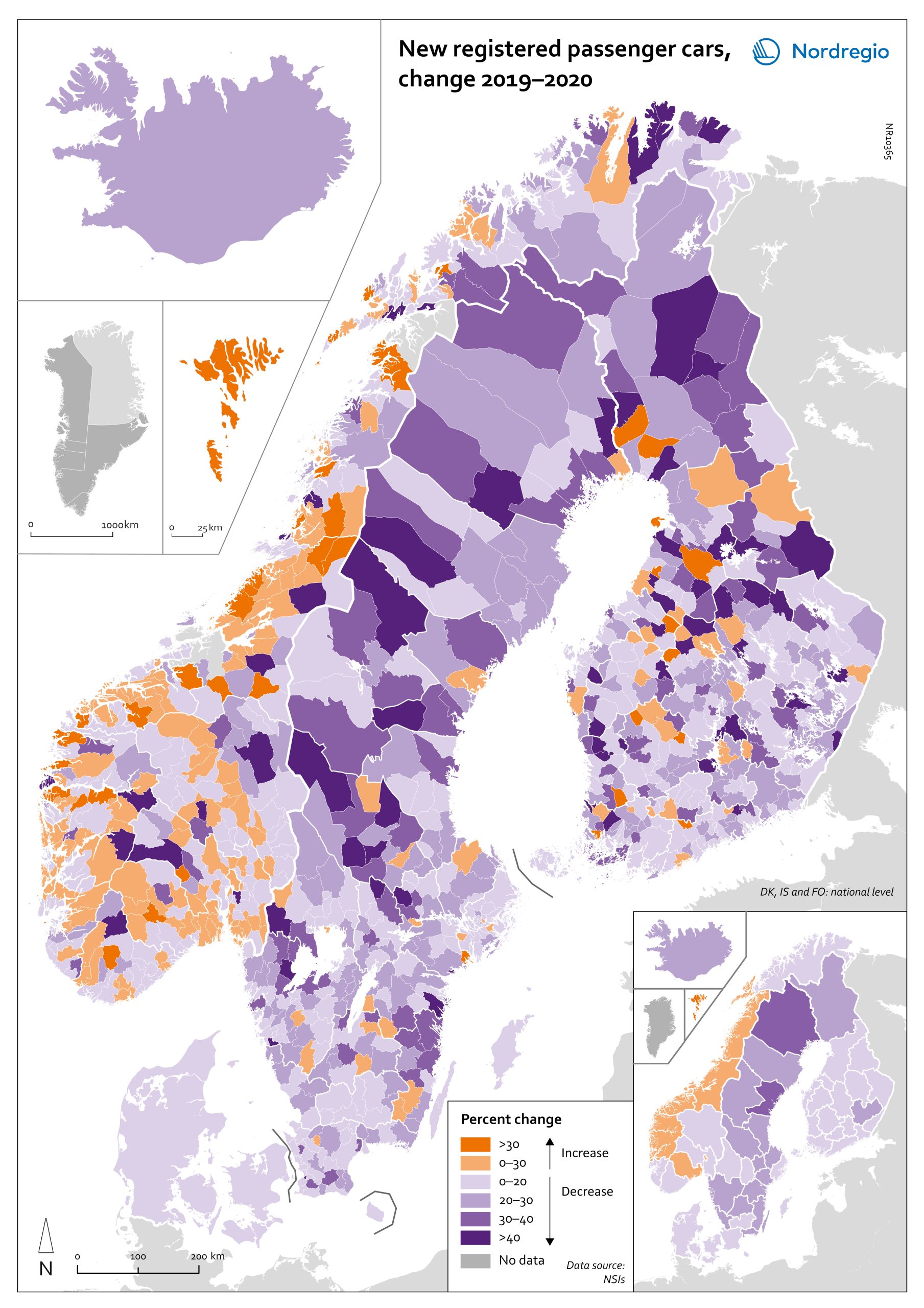
Change in new registered cars 2019-2020
The map shows the change in new registered passenger cars from 2019 to 2020. In most countries, the number of car registrations fell in 2020 compared to 2019. On a global scale, it is estimated that sales of motor vehicles fell by 14%. In the EU, passenger car registrations during the first three quarters of 2020 dropped by 28.8%. The recovery of consumption during Q4 2020 brought the total contraction for the year down to 23.7%, or 3 million fewer cars sold than in 2019. In the Nordic countries, consumer behaviour was consistent overall with the EU and the rest of the world. However, Iceland, Sweden, Finland, Åland, and Denmark recorded falls of 22%–11% – a far more severe decline than Norway, where the market only fell by 2.0%. The Faroe Islands was the only Nordic country to record more car registrations, up 15.8% in 2020 compared to 2019. In Finland, Iceland, Norway, and Sweden, there were differences in car registrations in different parts of the country. In Sweden and Finland, the position was more or less the same in the whole of the country, with only a few municipalities sticking out. In Finland and Sweden, net increases in car registrations were concentrated in rural areas, while in major urban areas, such as Uusimaa-Nyland in Finland and Västra Götaland and Stockholm in Sweden, car sales fell between 10%–22%. Net increases in Norway were recorded in many municipalities throughout the whole country in 2020 compared to 2019.
- 2022 March
- Economy
- Nordic Region
- Transport
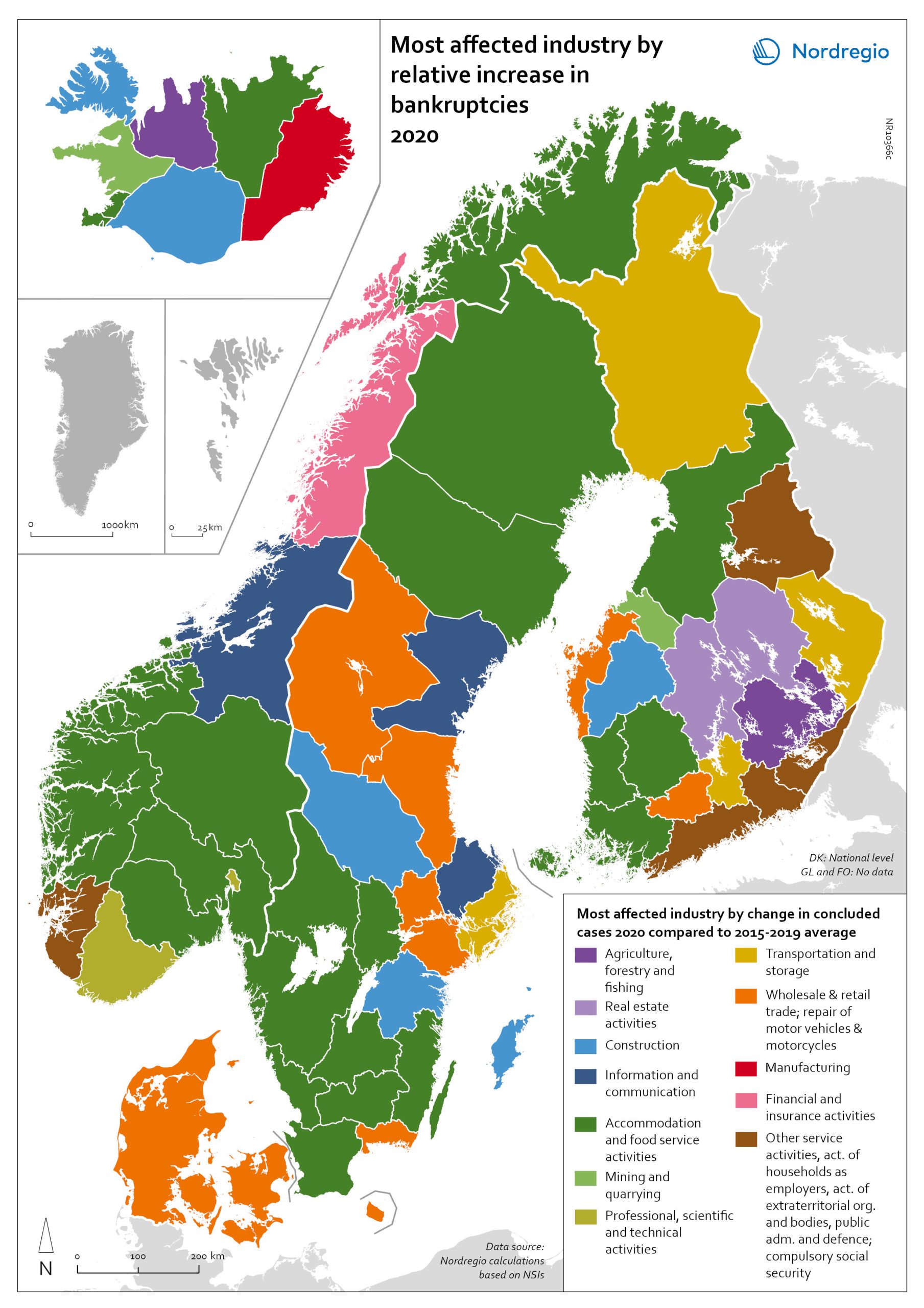
Bankruptcies in 2020 by industry and region
The map shows the most affected industry by relative increase in concluded business bankruptcies 2020 compared to 2015–2019 average. Regional patterns in business failures are linked to factors ranging from the effectiveness of the measures adopted by the various governments to the exposure of regional economies to vulnerable sectors. Regions with higher numbers of bankruptcies tend to reflect the concentration of economic activity in sectors particularly affected by the pandemic. It comes as little surprise that Accommodation and food service activities were the industries with the largest increase in business bankruptcies in 2020 compared to the 2015–2019 baseline. In the Nordic Region as a whole, the number rose by 28.6%. This pattern is also discernible at the regional level. Hotels and restaurants were the activities with the biggest increase in the number of bankruptcies in a significant number of Swedish, Norwegian and Finnish regions. Other sectors suffering higher-than-average numbers of business bankruptcies are service industries, particularly those requiring closer social interaction, like Education (16.5% increase), Other service activities (12.0% increase) and Administrative and support service activities (7.9% increase). The logistics sector was also greatly affected, with major impact localised around logistics centres and transport nodes in the different countries. In the capital regions of Oslo, Stockholm and Helsinki, Transportation and storage was the sector with the largest increase in bankruptcies. Wholesale and retail trade; repair of motor vehicles and motorcycles was the industry to suffer the most in Denmark and several Finnish and Swedish regions.
- 2022 March
- Economy
- Nordic Region
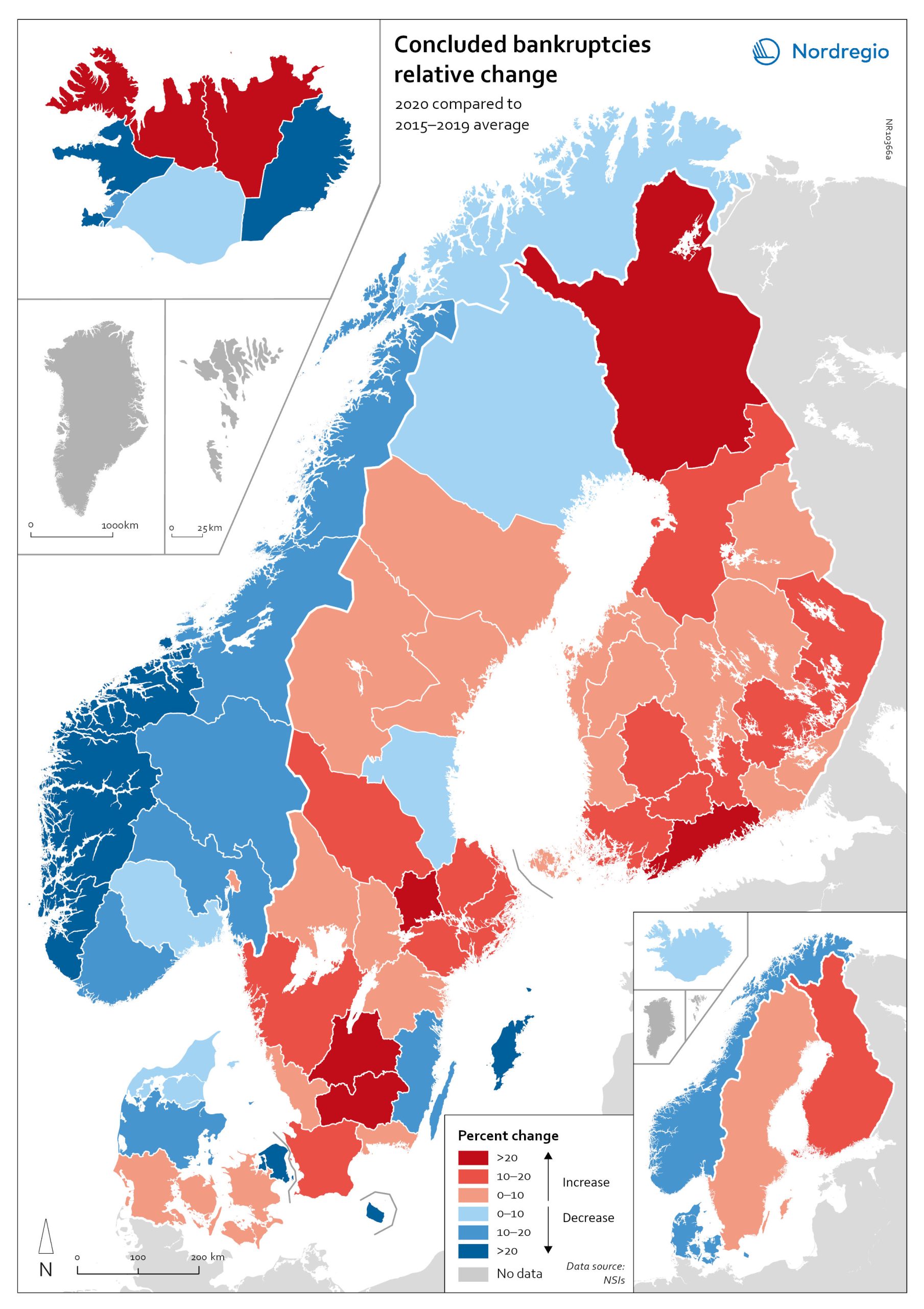
Relative change in the number of business bankruptcies
The map shows the relative change in the number of concluded business bankruptcies by region, 2015–2019 average compared to 2020. At sub-national levels, the distribution of business bankruptcies does not show a clear territorial pattern. In Iceland and Denmark, businesses in the most urbanised areas, including the capital regions, seem to have been those that benefited most from the economic mitigation measures (-23.9% in Höfuðborgarsvæðið and -24.4% in Region Hovedstaden). By contrast, Oslo is the only Norwegian region where there were more business bankruptcies in 2020 compared to the 2015–2019 baseline (1.9% increase). Most Norwegian regions did, in fact, have fewer bankruptcies in 2020, particularly in the western regions. One plausible explanation for this could be that the number of business failures during the baseline period was especially high in western Norway due to the fall in oil prices in 2014–2015. In Sweden the situation is even more mixed. Here, businesses in urban areas seem to have been more exposed to the distress caused by the Covid-19 pandemic. The most urbanised regions in the Stockholm-Gothenburg-Malmö corridor registered a greater increase in liquidations (Jönköping, Kronoberg and Södermanland regions saw surges of around 20%). However, predominantly rural regions in Sweden, such as Västerbotten and Jämtland, also recorded higher numbers of bankruptcies than average (9.8% and 8.8% increase, respectively). In Finland, the impact was greater in Lapland (26.9%) and around Helsinki (Uusimaa, 25.9%) than in the central parts of the country. Åland also experienced a moderate rise in business bankruptcies in 2020 (4.0%), mostly related to the tourism sector.
- 2022 March
- Economy
- Nordic Region
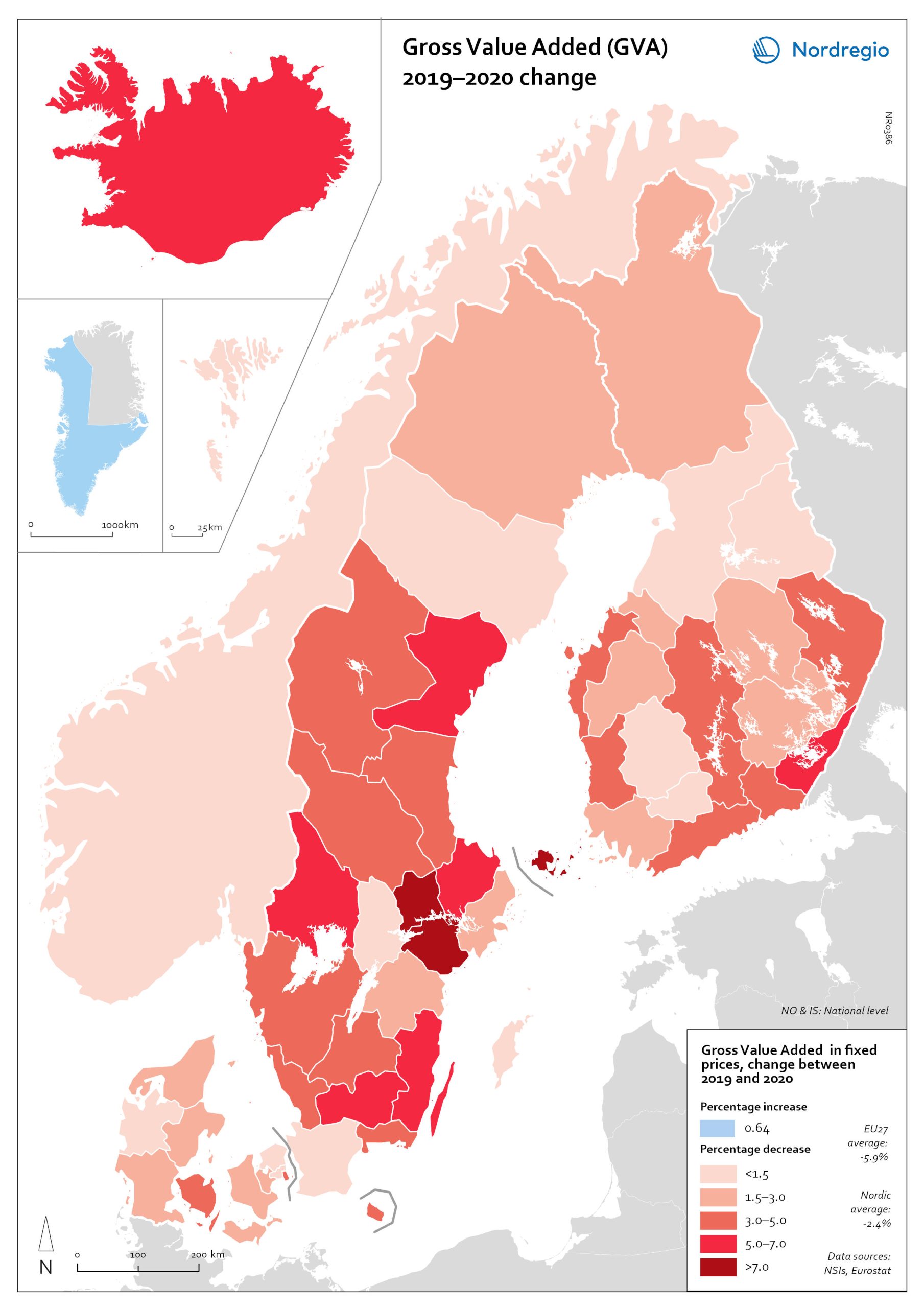
Gross Value Added (GVA) change 2019-2020
The map shows the change in regional Gross Value Added (GVA) from 2019 to 2020 (in fixed prices). As shown in the map, aggregated production levels, in terms of Gross Value Added (GVA), contracted in nearly all of the Nordic regions between 2019 and 2020. In general, the variability was comparatively smaller within each country than it was between countries, even when comparing regions with similar economic profiles from different countries. On average, the impact was greater on regions in Sweden and Finland than those in Denmark. Still, some relevant territorial patterns emerge from the changes to regional GVA shown in the map. The contraction was larger in regions with higher dependence on tourism services and hospitality (Åland and some municipalities in South Karelia, Finland, and Bornholm, Denmark), as well as on mass-market retail and logistics, particularly in the areas surrounding the capital regions (Södermanland and Västmanland in Sweden and Greater Copenhagen in Denmark). In Sweden and Finland, a remarkable regional divide can also be traced between territories specialised in transformation sectors with limited vulnerability to the impact of Covid-19, including forestry and specific types of processing (e.g. pulp, cement), like Nord Ostrobothnia, Kainuu and Pirkanmaa in Finland, and Gotland, Västerbotten and Örebro in Sweden. Aggregated output in these regions fell less than in regions with greater exposure to industrial manufacturing, like Kymenlaakso in Finland and Kronobergs in Sweden. Similarly, the impact on the financial centres in Denmark (Greater Copenhagen) and Sweden (Stockholm) was less than regions with mid-sized cities and diversified urban economies, like Vestjylland (Århus) in Denmark and Upsala in Sweden. Interestingly, the shock to the Finnish economy was greater in the Helsinki metropolitan area (-3.6% Uusimaa) than it was for the Tampere region (-0.5% in Pirkanmaa). This may be due to the relatively higher concentration…
- 2022 March
- Economy
- Nordic Region
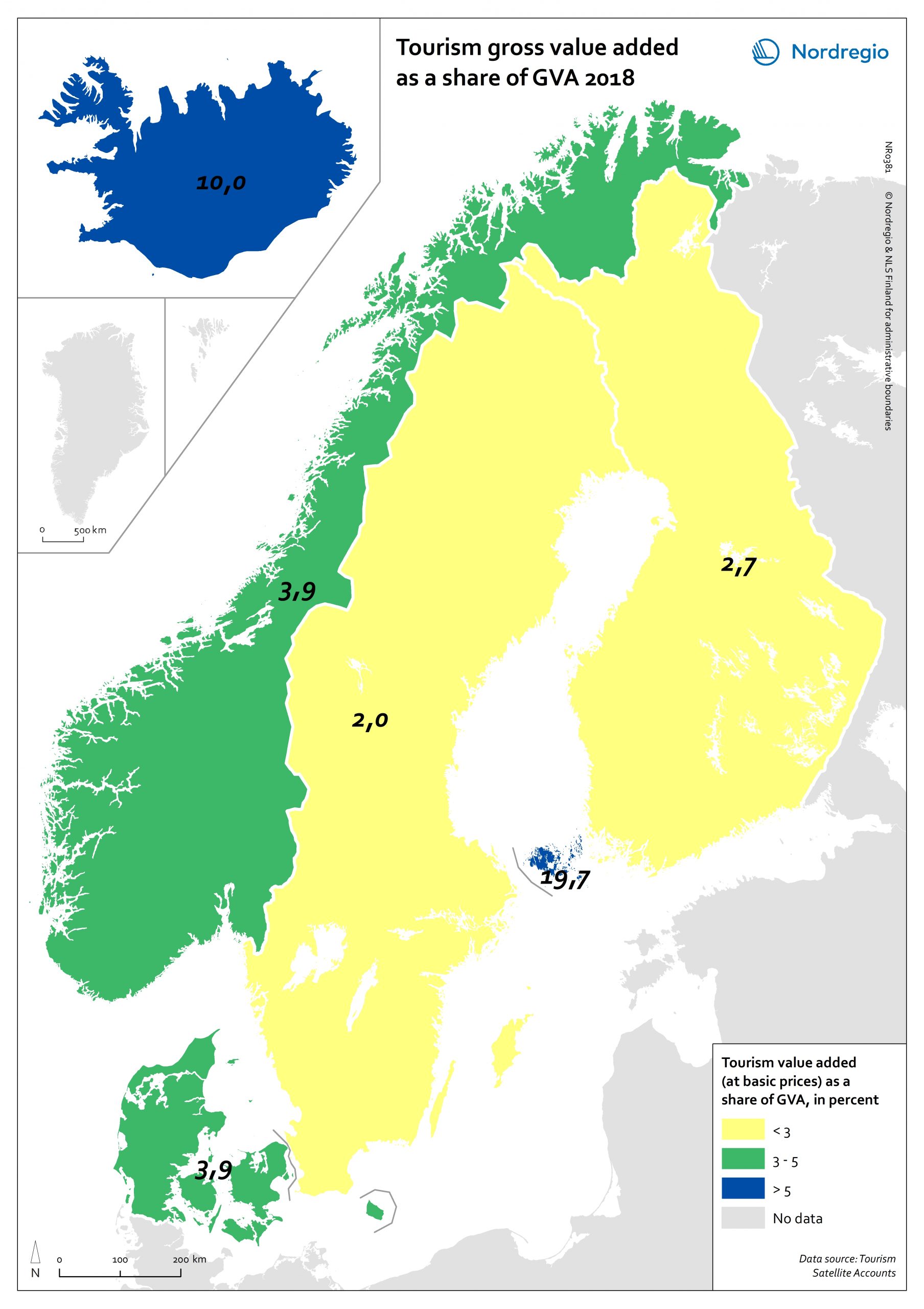
Tourism gross value added as a share of GVA 2018
Tourism gross added value (GVA) corresponds to the part of GVA generated by all industries in contact with visitors. This indicator is measured as a percentage of total GVA at basic prices in 2018 (No data for Greenland and Faroe Islands; data for Finland includes Åland). Data were retrieved from each country’s tourism satellite account. Åland and Iceland stand out as the country or territory where tourism added value accounts for over 10% of the total GVA. For Åland, tourism is so important an industry that added value related to tourism is equivalent to nearly 20% of the total GVA in Åland. The share of tourism related GVA is close to 4% of the total GVA in Norway and Denmark, and lower than 3% in Finland and Sweden.
- 2021 February
- Economy
- Nordic Region
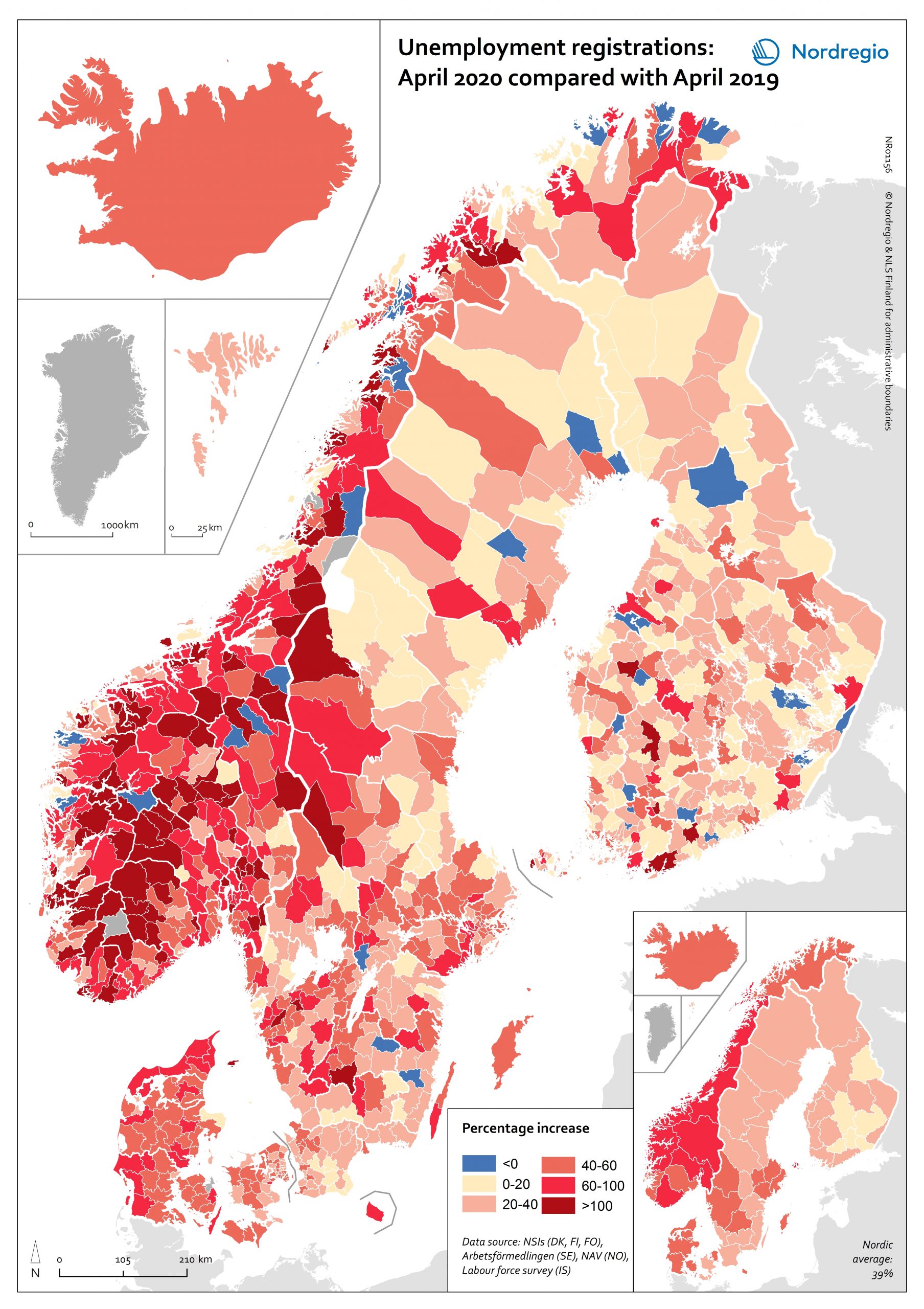
Labour market impacts of COVID-19
On May 17, 2020, 94% of the world’s workers were living in countries with some form of workplace closure measures in place (ILO, 2020). While it is too early to make predictions about the long-term consequences of this, it is possible to make some observations about the short-term labour market impacts in the Nordic Region. The map shows the number of people who registered as unemployed in April 2020 compared with the number of people who registered as unemployed in April 2019 at the municipal level for Denmark, Finland, Norway and Sweden and Åland Islands and at the national/territory level for Iceland and the Faroe Islands. The shading represents the increase in percent, with darker colours showing higher relative increases compared to the previous year and lighter colours lower relative increases. Municipalities shaded in blue on the map did not experience an increase in unemployment registrations in April 2020 compared to April 2019. Overall, the number of unemployment registrations across the Region was 38.9% higher in April 2020 than in April 2019. This increase equates to a total of 220 354 Nordic workers and has affected almost all Nordic municipalities and regions to some degree. Proportionally speaking, Norway saw the largest increase (69%), followed by Iceland (59%), Denmark (48%), Sweden (41%), and Finland (24%). Though between-municipality variation is evident, the greatest differences appears to be between countries. Interestingly, many Swedish municipalities along the southern coast between Sweden and Norway saw increases more consistent with the overall trend observed in Norway. This may be a reflection of the prevalence of cross-border commuting in these regions. It is important to note that the labour market situation in April 2019 has some baring on the results shown on the map. For example, the appearance of a sharper relative increase in Norway is primarily…
- 2020 October
- Economy
- Labour force
- Nordic Region
