65 Maps
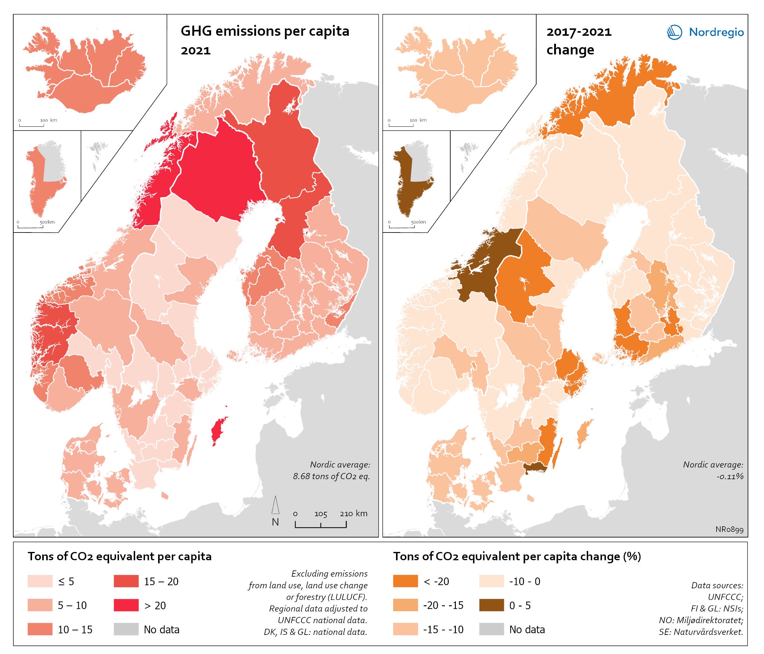
Regional GHG emissions per capita in 2021 and change 2017-2021 on a territorial basis
The data excludes emissions from land use, land use change or forestry (LULUCF). The regional data has been adjusted to UNFCCC national data. The data for Denmark, Iceland and Greenland is on national level. It should be noted that displaying emissions on a territorial basis may be skewed due to the inter-regional dynamics of energy processes, natural resource distributions and concentrations of industrial activities. From 2017 to 2021, the Nordic regions cut their per-capita GHG emissions by on average 11.3%, with an overall Nordic average fall of 8.7% over the same period. In regions historically reliant on fossil fuels for heat and power generation, emissions have continued to decline. This trend is evident in Denmark, as well as in Southern Sweden and Southern Finland – densely populated areas that have taken steps toward expanding district heating coverage and reducing carbon intensity. The largest decrease in GHG emissions per capita was found in Troms and Finnmark, with a 42.3% decrease, Satakunta with a 30.2% decrease and Päijät-Häme – Päijänne-Tavastland with a 29.2% decrease. Only three regions (Greenland, Trøndelag and Blekinge) saw an increase in GHG emissions per capita. At an aggregated level, industrial-related emissions decreased throughout the Nordic Region, but this trend does not hold true for regions in Norway with intensive offshore oil and gas operations. For instance, Nordland, Vestland, Møre og Romsdal, Vestfold and Telemark exhibited the highest per capita emissions in 2021. Between 2017 and 2021, emissions were increasing in many Norwegian regions with intensive offshore oil and gas activity, but also in Norrbotten in Sweden (21.2 tonnes of CO2 equivalent per capita) and Gotland (33.6 tonnes of CO2 equivalent per capita) due to intensive activity in the metal and cement industries, respectively, as well as in several Finnish regions. At the other end of the scale, the…
 2025 April
 - Environment
- Nordic Region
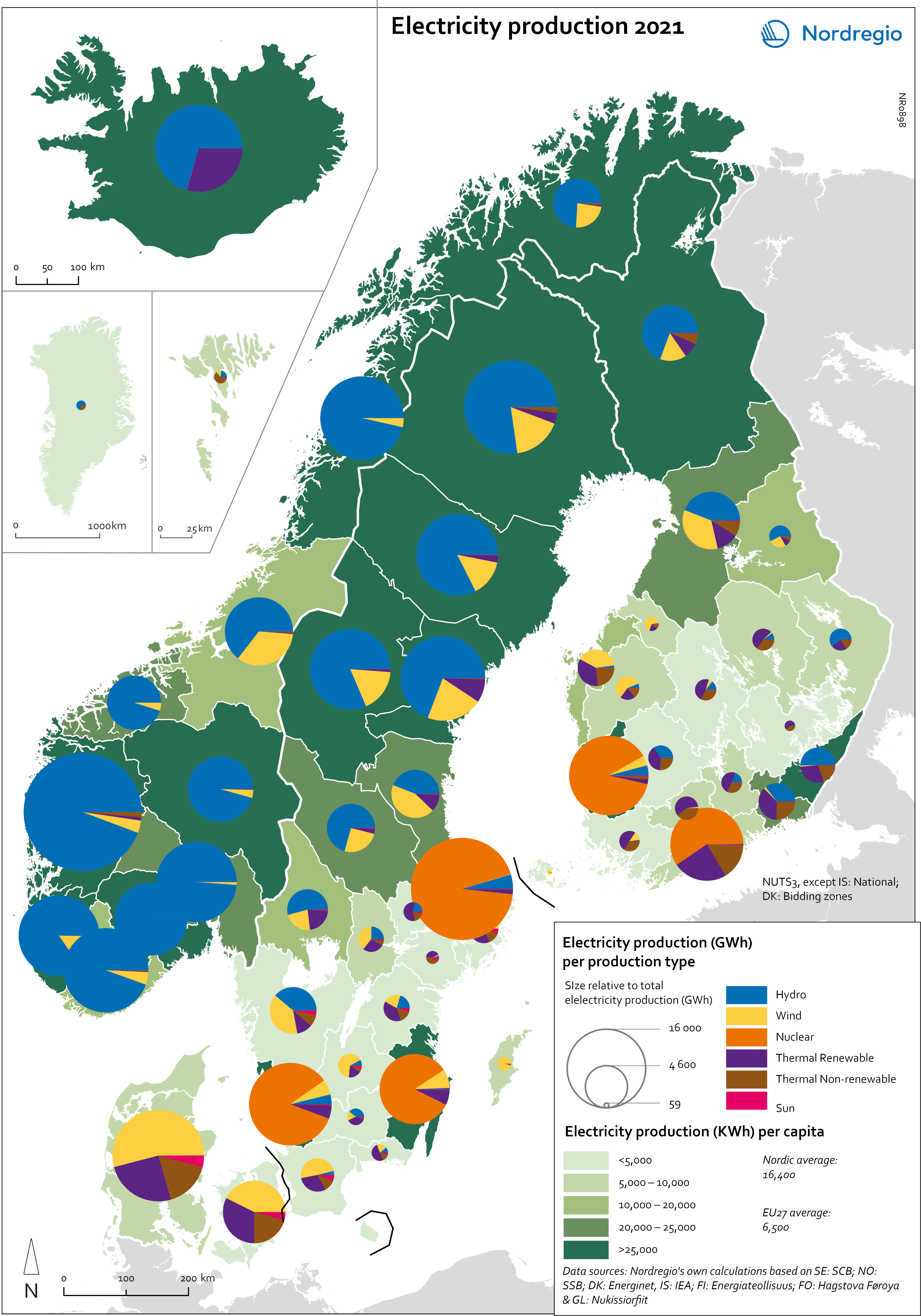
Electricity production 2021
This map shows the spatial distribution of Nordic electricity production per capita, by volume and source type in the Nordic Region in 2021. The data is presented at a regional level, except for Iceland (national level) and Denmark (bidding zones). The circles represent electricity production in GWh, while the green shades indicate electricity production per capita (kWh). Finally, the colour of the circles denotes the source of electricity. The Nordic Region overall has a high electricity production per capita; in fact, Iceland and Norway have the world’s highest electricity production per capita. The electricity mix in 2021 was 96% fossil-free – 73% from renewables (mainly hydropower) and 17% from nuclear power. In 2000 85% of the electricity production was fossile-free. Still there are clear spatial differences in the electricity production. Firstly, we see the high amount of electricity being produced for the five nuclear facilities in Sweden and Finland. Secondly, a substantial volume of hydro-electricity is produced in southern Norway, throughout Iceland, Northern Sweden and Northern Finland. As a result, over half of Nordic electricity is produced from hydropower. Wind power is the source of electricity that has been growing the most during the last two decades, from 1.2% in 2000 to 14% in 2021. The regions with the highest electricity production per capita are in Iceland, Northern Sweden, and Northern and Western Norway. Both Finland and Denmark are net importers of electricity, but both countries have rapidly transitioned away from fossil fuels. Cheap and fossil-free electricity is a prerequisite for the green transition and with growing industries within e.g. battery production, green steel and mining, the need for fossil-free electricity is expected to increase in the coming decades.
- 2025 April
- Environment
- Labour force
- Nordic Region
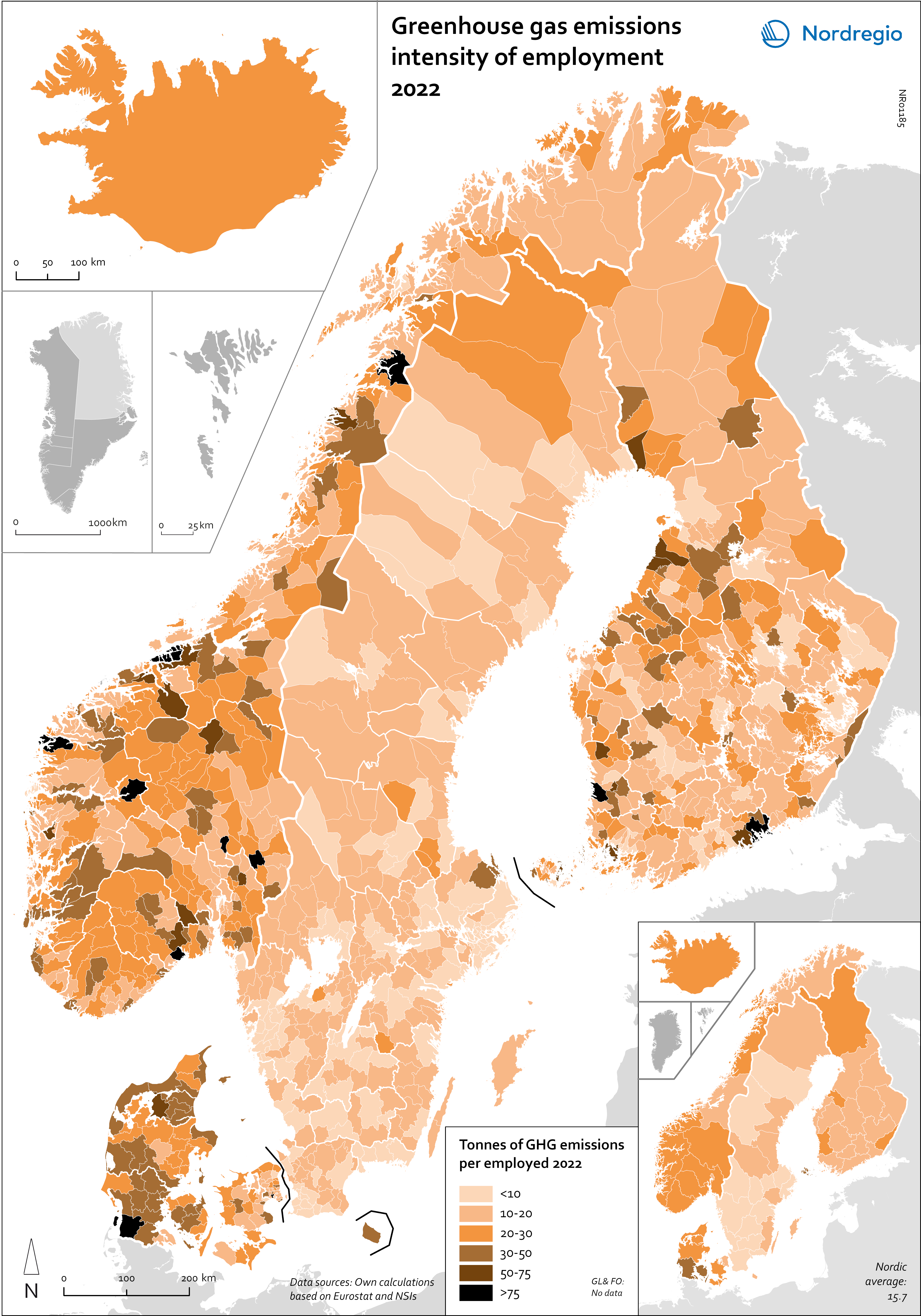
Greenhouse gas emissions intensity of employment in 2022
This map shows the tonnes of greenhouse gas emissions per person employed in Nordic municipalities (big map) and regions (small map) in 2022. The data for Iceland is presented at the national level, while no data was available for the Faroe Islands and Greenland. The map is based on data on emissions per sector and country from Eurostat and detailed employment by sector data from the Nordic statistical offices. By calculating the average emissions per person employed and per sector we could use municipal employment by sector data to assess the average emissions per person employed in each municipality. The results are an estimation based on the assumption that all jobs in the same sector have the same GHG emissions. In 2022, greenhouse gas (GHG) emissions per person employed in the Nordic Region were 15.7 tonnes. This is higher than the EU average of 13.5 tonnes. There are also fairly big differences between the Nordic countries, with higher emissions per person employed in Iceland (28.6), Denmark (23.1) and Norway (20.5) and lower emissions in Finland (15.7) and Sweden (8). On the other hand, the emissions per person employed have decreased faster in the Nordic Region than for the EU as a whole. In the last decade, emissions per person employed fell by 24% in the Nordic Region compared to the EU average of 22%. The biggest decrease (32%) was in Finland. The sectors with the highest emissions per worker vary slightly between the countries. In Sweden and Norway, the sector with by far the highest emissions per worker was the manufacture of petroleum coke and refined petroleum products. However, it should be noted that the number of workers in this sector is small. In Denmark, the highest emissions by person employed could be found in water transport; in Finland, in…
- 2025 April
- Environment
- Labour force
- Nordic Region
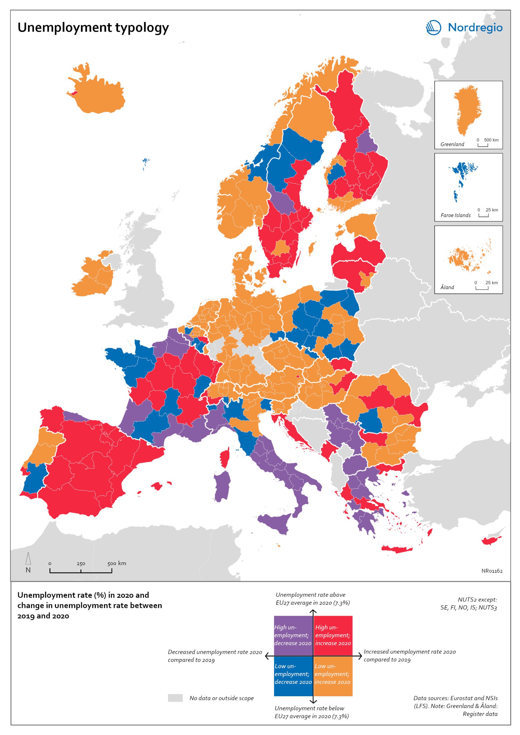
Unemployment typology
The map shows a typology of European regions by combining information on pre-pandemic unemployment rates with unemployment rates in 2020, based on the annual Labour Force Survey (LFS) that is measured in November. On one axis, the typology considers the extent of the change in the unemployment rate between 2019 and 2020. On the other axis, it considers whether the unemployment rate in 2020 was above or below the EU average of 7.3%. Regions are divided into four types based on whether the unemployment rate decreased or increased and how it relates to the EU average. Regions falling into the first type, shown in red on the map, had an increase in the unemployment rate in 2020 as well as an above-average unemployment rate in general in 2020. These regions were most affected by the pandemic. They are mainly found in northern and central parts of Finland, southern and eastern Sweden, the capital area of Iceland, Latvia, Lithuania, Spain and central parts of France. Regions falling into the second type, shown in orange on the map, had an increase in the unemployment rate in 2020 but a below-average unemployment rate in general in 2020. These regions had low pre-pandemic unemployment rates and so were not as badly affected as the red regions, despite the rising unemployment rates. They are located in Denmark, Iceland, Norway, Åland, southern and western Finland, Sweden (Gotland, Jönköping, and Norrbotten), Estonia, Ireland, northern Portugal and central and eastern parts of Europe.
- 2022 March
- Europe
- Labour force
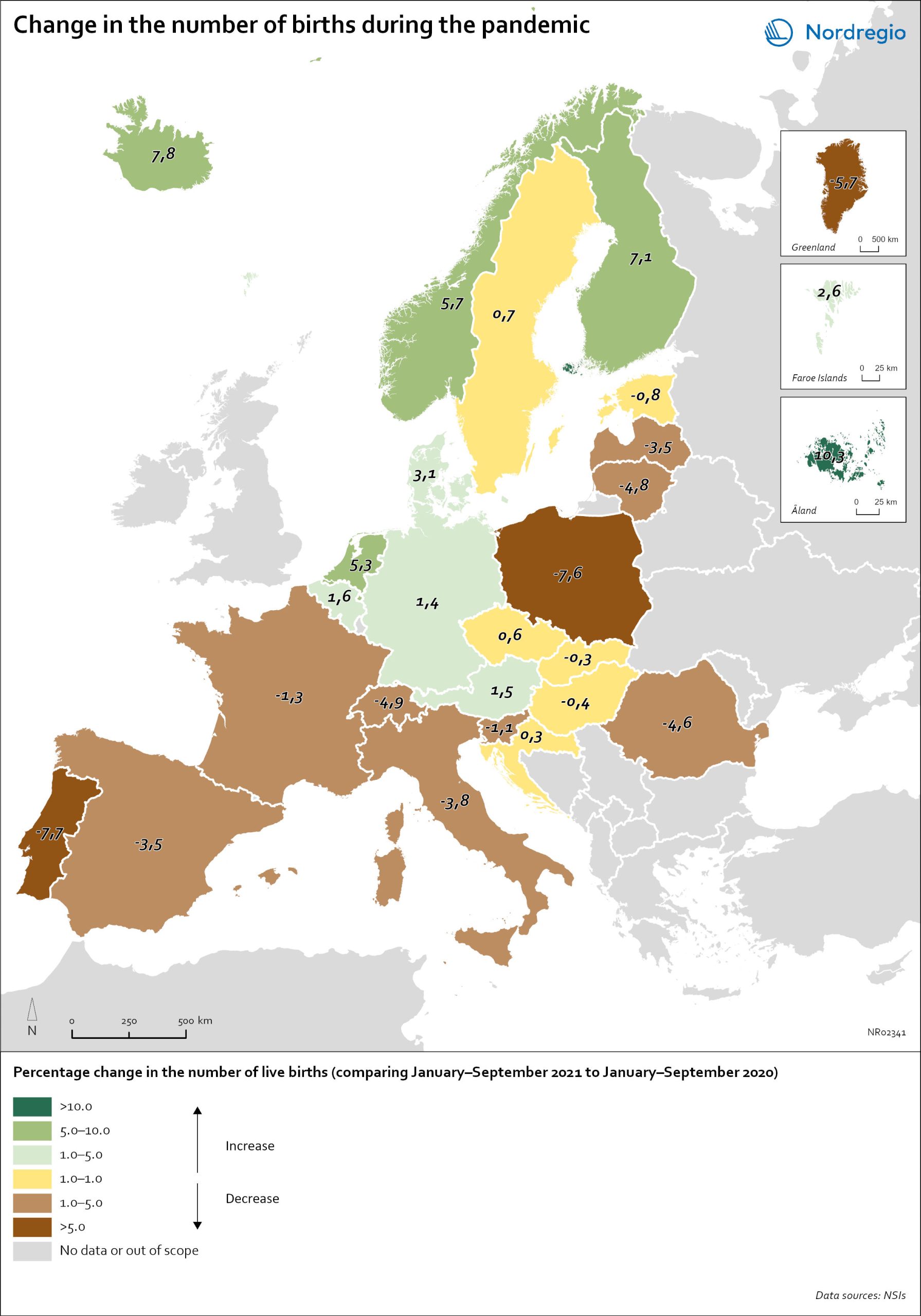
Change in the number of births in Europe
The map shows the number of births during the first nine months of 2021 (January to September) compared to the number of births during the same months in 2020. The babies born during the first nine months of 2021 were conceived between the spring and winter of 2020 when the first waves of the pandemic affected Europe. Babies born during the first nine months of 2020 were conceived in 2019 (i.e., before the pandemic). The map therefore compares the number of births conceived before and during the pandemic. At the time of writing, it seems as if both baby boom and baby bust predictions have been correct, with developments playing out differently across countries. In many Southern and Eastern European countries, such as Spain, Italy or Romania, the number of births declined by more than 1% during the first nine months of 2021. In Portugal and Poland, but also Greenland, drops in the number of births were particularly sharp with more than 5% fewer babies born in 2021. In several of these “baby bust” countries, these decreases in fertility came on top of already low fertility rates. Spain, Italy, Portugal and Poland, for instance, all already had a total fertility rate (TFR) of less than 1.5 children per woman before the crisis. These values are substantially below the so-called ‘replacement ratio’ of 2.1 children per woman, which is necessary to maintain population size. In these countries, existing demographic challenges have thus been aggravated during the pandemic.
- 2022 March
- Demography
- Europe
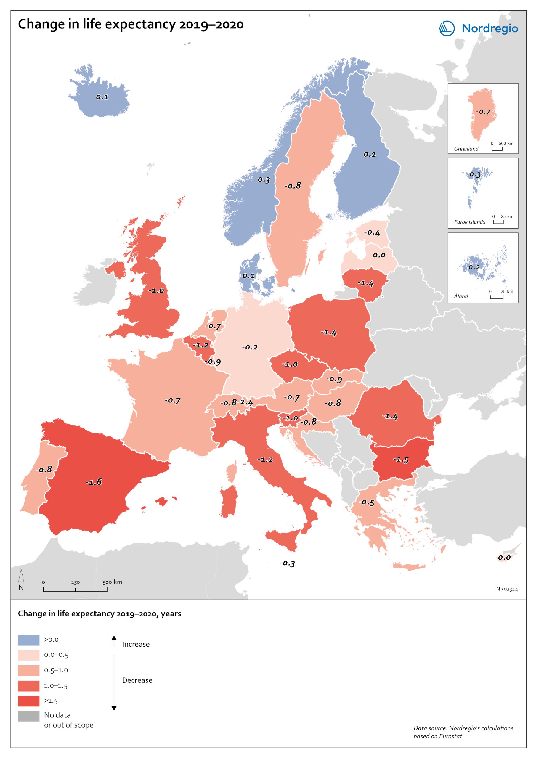
Change in life expectancy 2019–2020 by country in Europe
The excess mortality has affected overall life expectancy at birth across Europe. In 2019, prior to the start of the pandemic, Spain, Switzerland, and Italy had the highest life expectancy in Europe, followed closely by Sweden, Iceland, France, and Norway. Finland and Denmark had slightly lower levels but were still at or above the EU average (Eurostat, 2021). Life expectancy across the EU as a whole and in nearly all other countries has been steadily increasing for decades. Declines in life expectancy are rare, but that is indeed what happened in many countries in Europe during the pandemic in 2020. One study of upper-middle and high-income countries showed that life expectancy declined in 31 of 37 countries in 2020. The only countries where life expectancy did not decline were New Zealand, Taiwan, Iceland, South Korea, Denmark and Norway. The largest falls were in Russia and the United States. The high excess mortality in Sweden in 2020 has had an impact on life expectancy. In Iceland, Norway, Finland, Denmark and the Faroe Islands, life expectancy went up for both sexes in 2020 (data not yet available for Greenland and Åland). In Sweden, life expectancy fell by 0.7 years for males from 81.3 years to 80.6 and for females by 0.4 years from 84.7 to 84.3 years. The steeper decline in life expectancy for males is consistent with the larger number of excess deaths among males. Thus, compared to other Nordic countries, the adverse mortality impact of the pandemic has been greater in Sweden. However, when comparing Sweden to the rest of Europe, it is the Nordic countries, other than Sweden, which are exceptional. The trend among countries in Europe is for a fall in life expectancy in 2020. The largest declines were in countries in southern and eastern Europe. Italy and…
- 2022 March
- Demography
- Europe
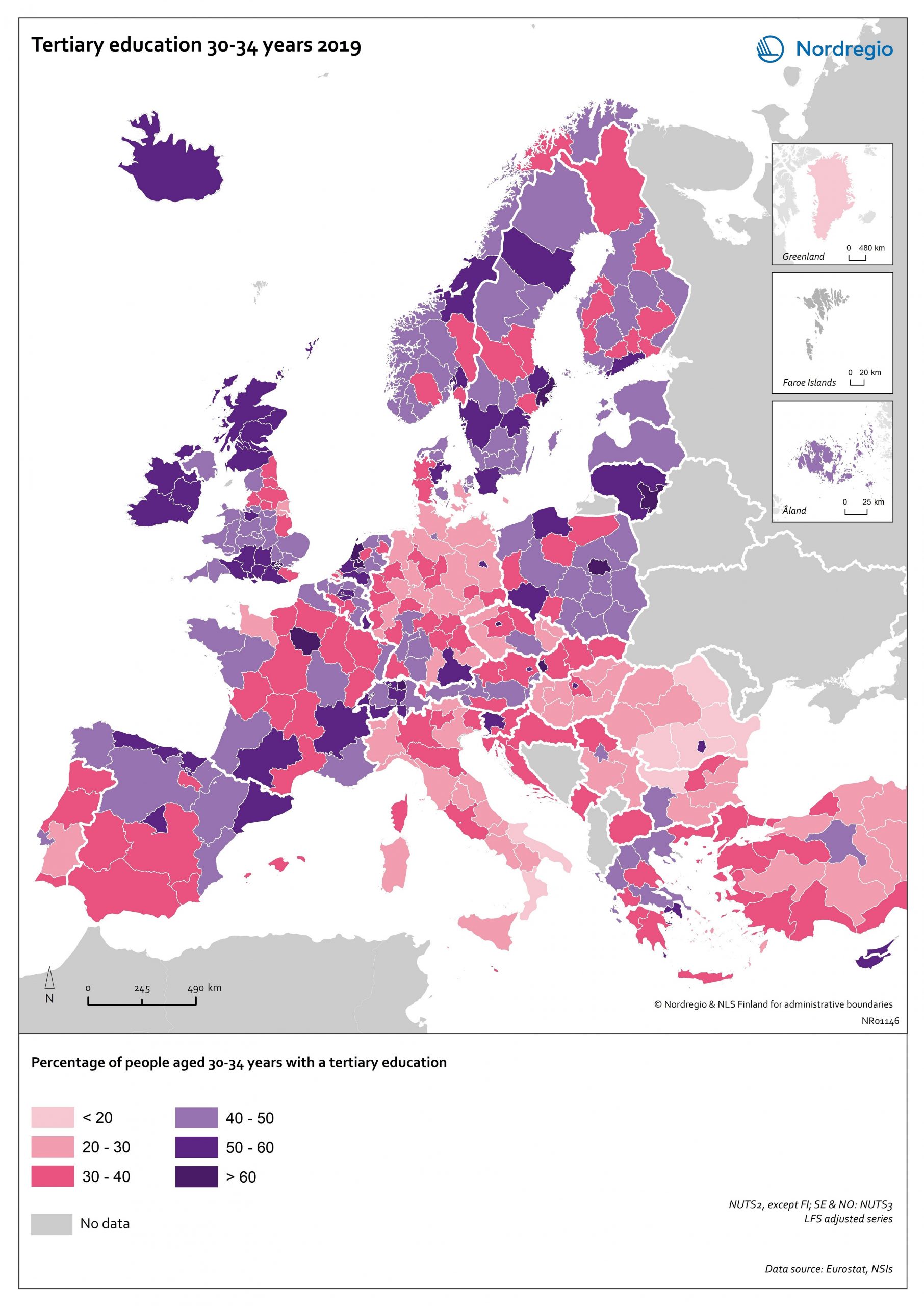
Tertiary education attainment level of 30- to 34-year-olds 2019
The map shows the proportion of the population aged 30-34 years old, who had a tertiary education at the European level in 2019. Purple shades indicate higher proportions, and pinkish shades reflect lower proportions. It is common to show the education attainment for the age group 30-34 since it is an age group where most people have finalised their studies. The focus on this age group makes it easier to see recent trends and outcomes of policies. Overall, over 40% of Europeans aged 30-34 years old had a tertiary education in 2019. Young people in the Nordic countries are among the most educated, with approximately half of 30 to 34-year-olds achieving a tertiary education across all Nordic countries. The highest proportions can be found in the capital regions. Stockholm is particularly noteworthy, with over 60% of 30 to 34-year-olds having had a tertiary education. Regions with prominent universities also stand out – for example, Skåne, Uppsala, Västerbotten and Västra Götaland (Sweden), Trøndelag (Norway) and Østjylland (Denmark).
- 2020 October
- Baltic Sea Region
- Demography
- Europe
- Nordic Region
- Others
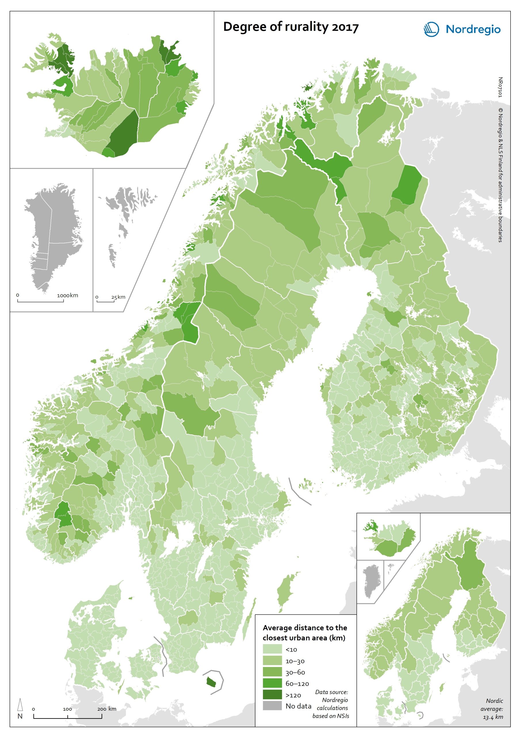
Degree of rurality at the municipal and regional level in 2017
This map shows the average distance to the edge of the closest urban area for the population living outside urban areas in the Nordic municipalities and regions. These figures are of particular interest in the analysis of urban-rural patterns and the Nordic populations’ access to local services in sparsely population areas. The darker shades on the map indicate longer average distances to the edge of the nearest urban area, and the lighter shades indicate shorter average distances. While almost all Danish municipalities have an average distance of below 10 km from rural grid cells to the nearest urban area, a large share of the municipal populations of the remaining Nordic countries need to contend with longer average distances to local services. The largest distances can be found in several municipalities of Iceland and Norway (Árneshreppur 230 km, Hasvik 154 km), whereas the largest average distances for Finnish and Swedish municipalities are considerably shorter (Enontekiö 103 km, Storuman 52 km). Regarding within-country variation, shorter average distances can generally be found in southwestern Finland and southern Sweden, in comparison with the more remote parts of these countries. Both Norway and Iceland provide a rather more mixed picture, since there are municipalities with shorter average distances scattered across different parts of each country. Method used to calculate the degree of rurality In order to take into account access to services such as grocery stores, pharmacies, schools, community centres and public transport, the European definition of urban grid cells was used to create this map, i.e. a population density threshold of 300 inhabitants per km2 applied to grid cells of 1 km2. The closest distance was calculated from each rural grid cell centroid to the nearest urban grid cell centroid along the existing road network traversable by car, including car ferries, based on population…
- 2020 October
- Environment
- Nordic Region
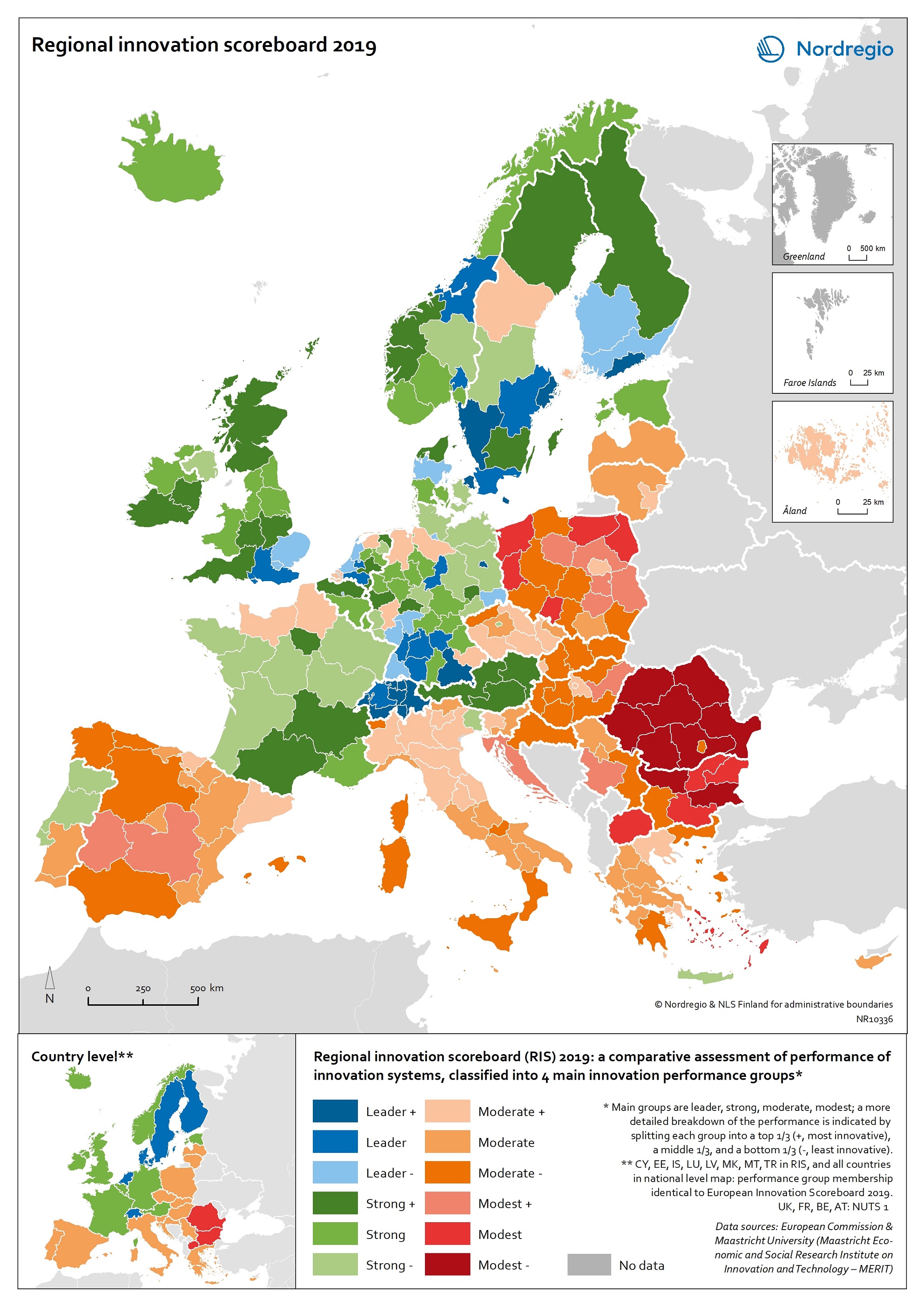
Regional innovation scoreboard 2019
This map shows the regional innovation scoreboard (RIS) in the European regions in 2019. The small map shows the innovation scoreboard at national level. The index shows the performance of innovation systems, classified into four main performance groups (leader, strong, moderate and modest). The European innovation scoreboard provides a comparative assessment of the research and innovation performance in European countries. It assesses the relative strengths and weaknesses of national innovation systems and helps countries identify areas they need to address. The Regional innovation scoreboard (RIS), a regional extension of the European innovation scoreboard, assesses the innovation performance of European regions on a limited number of indicators. The RIS 2019 covers 238 regions across 23 EU countries, as well as Norway, Serbia and Switzerland. Cyprus, Estonia, Latvia, Luxembourg and Malta are also included at country level. The RIS 2019 is a comparative assessment of regional innovation based on the European innovation scoreboard methodology, using 18 of the latter’s 27 indicators. It provides a more detailed breakdown of the performance groups with contextual data that can be used to analyse and compare structural economic, business and socio-demographic differences between regions. The Nordic regions are doing well in an overall RIS comparison regarding innovation performance. There are, however, considerable differences in innovation performance between the Nordic regions. For example, the capital regions have higher levels of innovation performance than more rural and peripheral regions, according to RIS 2019. This is often due to the critical mass of companies and the spatial significance of the proximity of firms and entrepreneurs, enabling knowledge-sharing and spill-over effects. Read the digital publication here.
- 2020 February
- Economy
- Europe
- Research and innovation
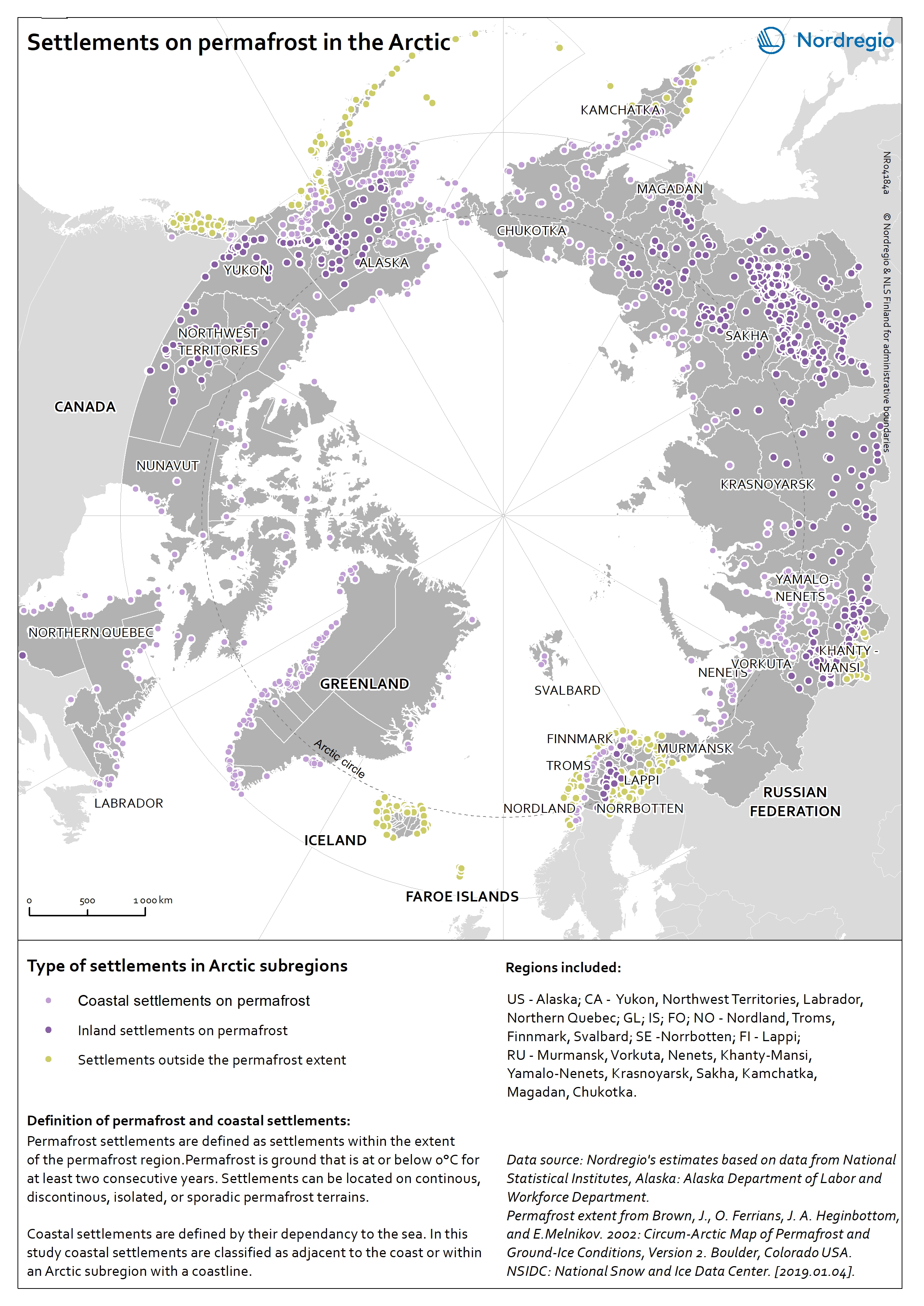
Settlements on permafrost in the Arctic
The map shows the distribution of coastal and inland settlements on permafrost in the Arctic in 2017. Permafrost is ground that is at or below 0°C for at least 2 consecutive years. The purple tones indicate settlements located on permafrost and distinguishes between coastal (light purple) and inland (dark purple) settlements. Settlements located outside the permafrost extent are in yellow. Among all Arctic settlements, 66,1% are located on permafrost. Settlements are classified as permafrost settlements if they are located within the permafrost extent, comprising zones of continuous, discontinuous, sporadic, or isolated permafrost. Among all permafrost settlements 46,0% are coastal. Coastal settlements are defined by their dependency to the sea. They are either adjacent to the coast, located inland along large rivers with a free connection to the open sea, or located within a short distance to the sea (0-200 km). In this map, coastal settlements comprise all settlements that are located within an Arctic subregion adjacent to the coast. Most of the settlements located outside the permafrost extent area are in the Nordic countries (Iceland, Norway, the Faroe Islands, Sweden, and Finland) as well as in the southern part of Alaska (USA) and the western part of the Russian Arctic. Almost all Arctic settlements in the Russian Federation and in Canada are located on permafrost. The increase in air surface temperature observed in the Arctic causes dramatic changes in the permafrost thermal regime leading to the destabilisation of infrastructure built on permafrost.
- 2019 March
- Arctic
- Demography
- Environment
Land Cover in the Arctic
The terrestrial ecosystem of the Arctic is characterized by low tundra vegetation, composed of shrubs, herbaceous plants, mosses, and lichens. Arctic vegetation is becoming more productive due to increasing air temperature. One of the main trends shows an increase in tall shrub cover. On the contrary, the cover of lichen and moss has declined in response to regional warming.
- 2019 January
- Arctic
- Environment
Components of the cryosphere in the Arctic
This map shows the main components of the cryosphere in the Arctic: sea-ice, permafrost, ice-sheets, and glaciers. Sea-ice covers most of the Arctic Ocean during winter. The sea-ice extent reaches its maximum in March, when it covers approximately 14-16 million km2. Since 1979, the Arctic ice extent in winter has decreased by 3% per decade relative to the 1981-2010 average, and this trend accelerates. Similarly, ice-sheets and glaciers, which cover globally over 15 million km2 are melting. In the Arctic, the main ice-sheet is the Greenlandic ice sheet. Most of the land surface in the Arctic is underlay by permafrost, ground that is at or below 0°C for at least 2 consecutive years. The purple tones on the map indicates the extent of the northern circumpolar permafrost. Permafrost can occur as continuous (dark purple, 90-100% coverage), discontinuous (purple, 50-90% coverage), sporadic (light purple, 10-50%), or isolated patches (magenta, 0-10% coverage). Permafrost is thawing due to increased air temperatures and precipitations in the Arctic. Permafrost temperature increased by 0.29 ± 0.12°C between 2007 and 2016.
- 2019 January
- Arctic
- Environment
Protected areas in the Arctic
Within the northern circumpolar permafrost region, there are ca. 1300 protected areas. Most of these areas are terrestrial (1069), while 126 are coastal – defined as partially within the marine environment – and 62 are marine. The World Database on Protected Areas (WDPA)[1] includes a wide range of protected areas, including national protected areas recognized by the government, areas designated under regional and international conventions, privately protected areas and indigenous peoples’ and community conserved territories and areas. Greenland is one of the countries with the largest protected terrestrial area (41,0%). [1] IUCN and UNEP-WCMC (2019), The World Database on Protected Areas (WDPA) [On-line], [January 2019]. Cambridge, UK: UNEP-WCMC. Available at: www.protectedplanet.net.
- 2019 January
- Arctic
- Environment
EU Regional Social Progress Index 2016
This map shows the regional social progress index in the regions of the European Union (EU) in 2016. Social progress is defined in this index as the capacity of a society to meet the basic human needs of its citizens, establish the building blocks that allow citizens and communities to enhance and sustain the quality of their lives and create the conditions for all individuals to reach their full potential. The EU Regional Social Progress Index is an aggregate index of 50 social and environmental indicators capturing three dimensions of social progress and its underlying components: basic human needs, foundation of well-being, and opportunity. This index is a complement to other indexes which are being developed currently to reflect similar dimensions of social situations or development. The blue tones indicate different levels of social progress index in the EU regions in 2016. The darker the tone the higher the social progress index. The grey colour indicates no data. All the Nordic regions perform well in terms of social progress. High scores are observed in all categories of the index. For some dimensions the Nordic regions are the top regions throughout Europe. At the regional scale the Nordic regions are among the top performers and only really challenged by some Dutch, UK, Austrian and German regions. The very top regions are found in Finland, northern and central Sweden, and in northern Denmark. Övre Norrland in Sweden is the top region in Europe, closely followed by the Danish capital region Hovedstaden, Helsinki-Uusimaa in Finland, Midtjylland in Denmark and Åland.
- 2018 February
- Demography
- Economy
- Europe
- Others
