57 Maps
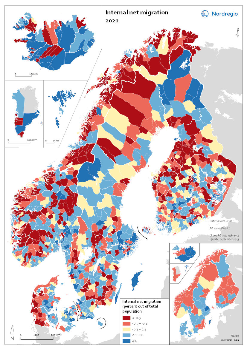
Internal Migration 2021
This map shows the internal net migration in 2021 as a percentage of the total population. This map shows the internal net migration in 2021 as a percentage of the total population. The small map shows the result on a regional level, and the big map on the municipal level. Internal (sometimes referred to as domestic) net migration refers to migration between municipalities and regions within the same country. International migration is excluded. In 2021, internal net migration was positive (indicated by shades of blue) or at least balanced (shown in yellow) in many of the municipalities in central and northern Sweden and in central and eastern Finland – areas that traditionally were more likely to lose population due to internal migration. Conversely, several municipalities in the capital regions – such as Stockholm, Oslo, and Copenhagen – exhibited negative internal net migration. Iceland, Greenland, and Åland exhibited mixed internal migration flows, with some municipalities experiencing positive net migration while others faced negative net migration. The Faroe Islands stand as an exception, maintaining only positive internal migration at the municipal level for this year.
 2025 April
 - Demography
- Migration
- Nordic Region
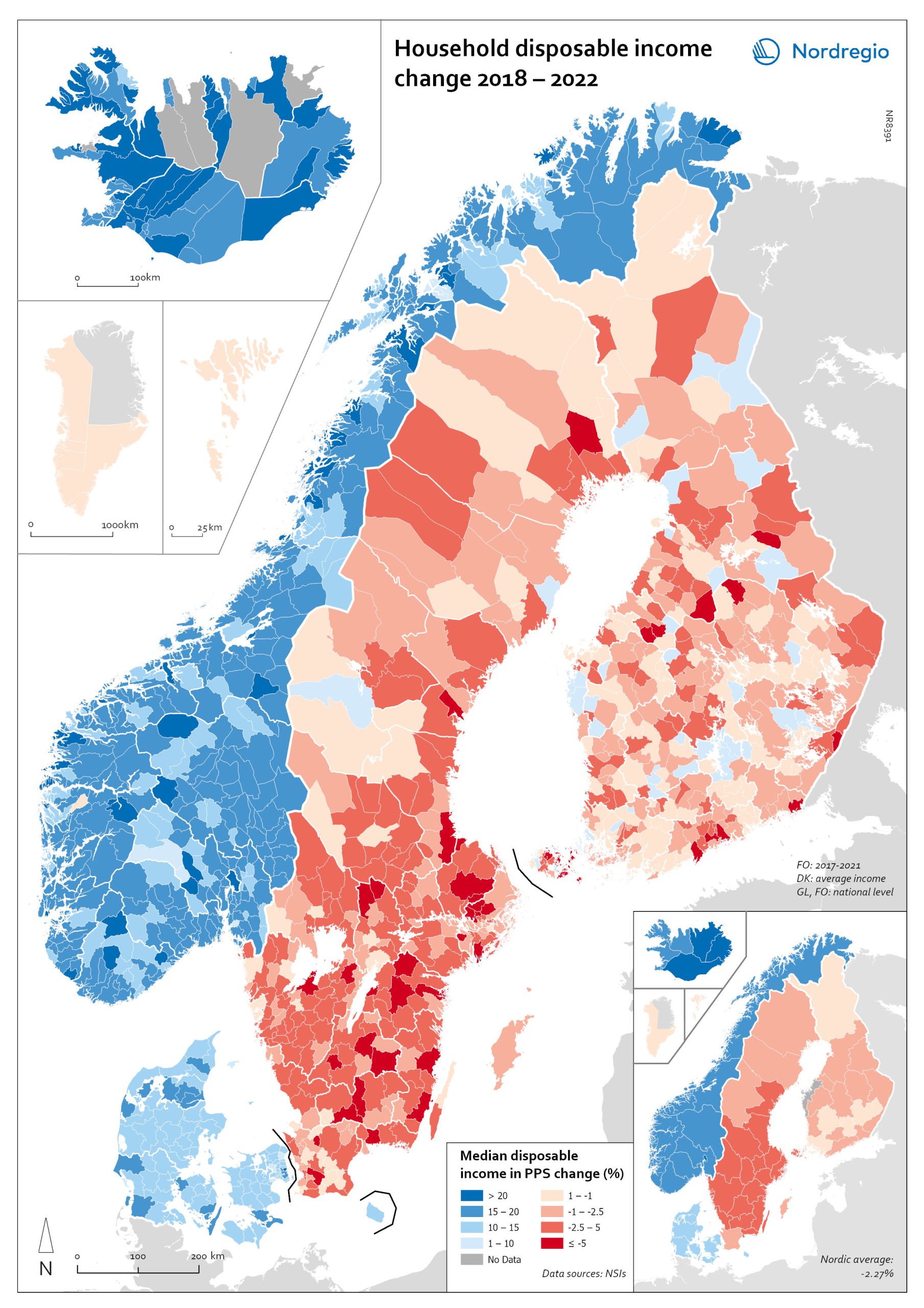
Household disposable income change 2018-2022
This map shows the percentage change in household disposable income between 2018 and 2022 in Nordic municipalities (big map) and regions (small map). Household disposable income per capita is a common indicator of the affluence of households and, therefore, of the material quality of life. It reflects the income generated by production, measured as GDP that remains in the regions and is financially available to households, excluding those parts of GDP retained by corporations and government. In sum, household disposable income is what households have available for spending and saving after taxes and transfers. It is ‘equivalised’ – adjusted for household size and composition – to enable comparison across all households. Purchasing Power Standards (PPS) is used to compare the countries’ economies and the cost of living for households. As shown in the map, between 2018 and 2022, household disposable income increased for all Danish, Icelandic, and Norwegian municipalities and decreased for Finnish and Swedish municipalities. On average, the city municipalities have higher incomes and increased most in Finland and Sweden in 2018–2022. In Sweden, a tendency towards larger falls in income was observed in several southern municipalities. In summary, absolute household income increased in all Nordic countries but not when measured in purchasing power. Based on this metric, on average, Norwegian households are the most well-off and Iceland the worst off, while Danish households benefited from a stronger currency in 2022. Single-parent households have had lower increases in household income than other families in Norway and parts of Sweden. Municipalities show a similar trend in Norway and Denmark, although Norwegian coastal municipalities fared slightly better in 2022. Disposable income is falling in all Swedish and Finnish municipalities.
- 2025 April
- Economy
- Nordic Region
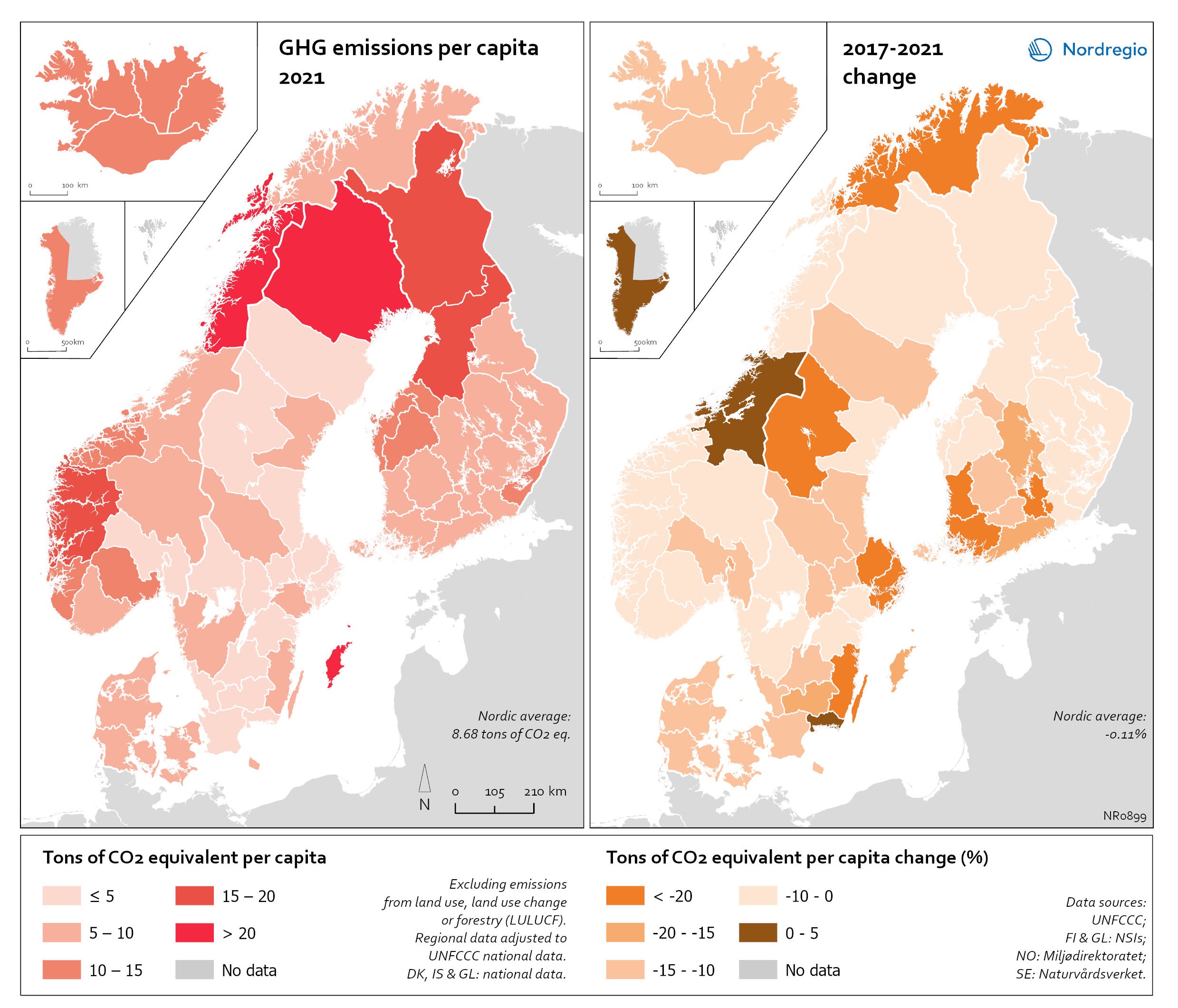
Regional GHG emissions per capita in 2021 and change 2017-2021 on a territorial basis
The data excludes emissions from land use, land use change or forestry (LULUCF). The regional data has been adjusted to UNFCCC national data. The data for Denmark, Iceland and Greenland is on national level. It should be noted that displaying emissions on a territorial basis may be skewed due to the inter-regional dynamics of energy processes, natural resource distributions and concentrations of industrial activities. From 2017 to 2021, the Nordic regions cut their per-capita GHG emissions by on average 11.3%, with an overall Nordic average fall of 8.7% over the same period. In regions historically reliant on fossil fuels for heat and power generation, emissions have continued to decline. This trend is evident in Denmark, as well as in Southern Sweden and Southern Finland – densely populated areas that have taken steps toward expanding district heating coverage and reducing carbon intensity. The largest decrease in GHG emissions per capita was found in Troms and Finnmark, with a 42.3% decrease, Satakunta with a 30.2% decrease and Päijät-Häme – Päijänne-Tavastland with a 29.2% decrease. Only three regions (Greenland, Trøndelag and Blekinge) saw an increase in GHG emissions per capita. At an aggregated level, industrial-related emissions decreased throughout the Nordic Region, but this trend does not hold true for regions in Norway with intensive offshore oil and gas operations. For instance, Nordland, Vestland, Møre og Romsdal, Vestfold and Telemark exhibited the highest per capita emissions in 2021. Between 2017 and 2021, emissions were increasing in many Norwegian regions with intensive offshore oil and gas activity, but also in Norrbotten in Sweden (21.2 tonnes of CO2 equivalent per capita) and Gotland (33.6 tonnes of CO2 equivalent per capita) due to intensive activity in the metal and cement industries, respectively, as well as in several Finnish regions. At the other end of the scale, the…
- 2025 April
- Environment
- Nordic Region
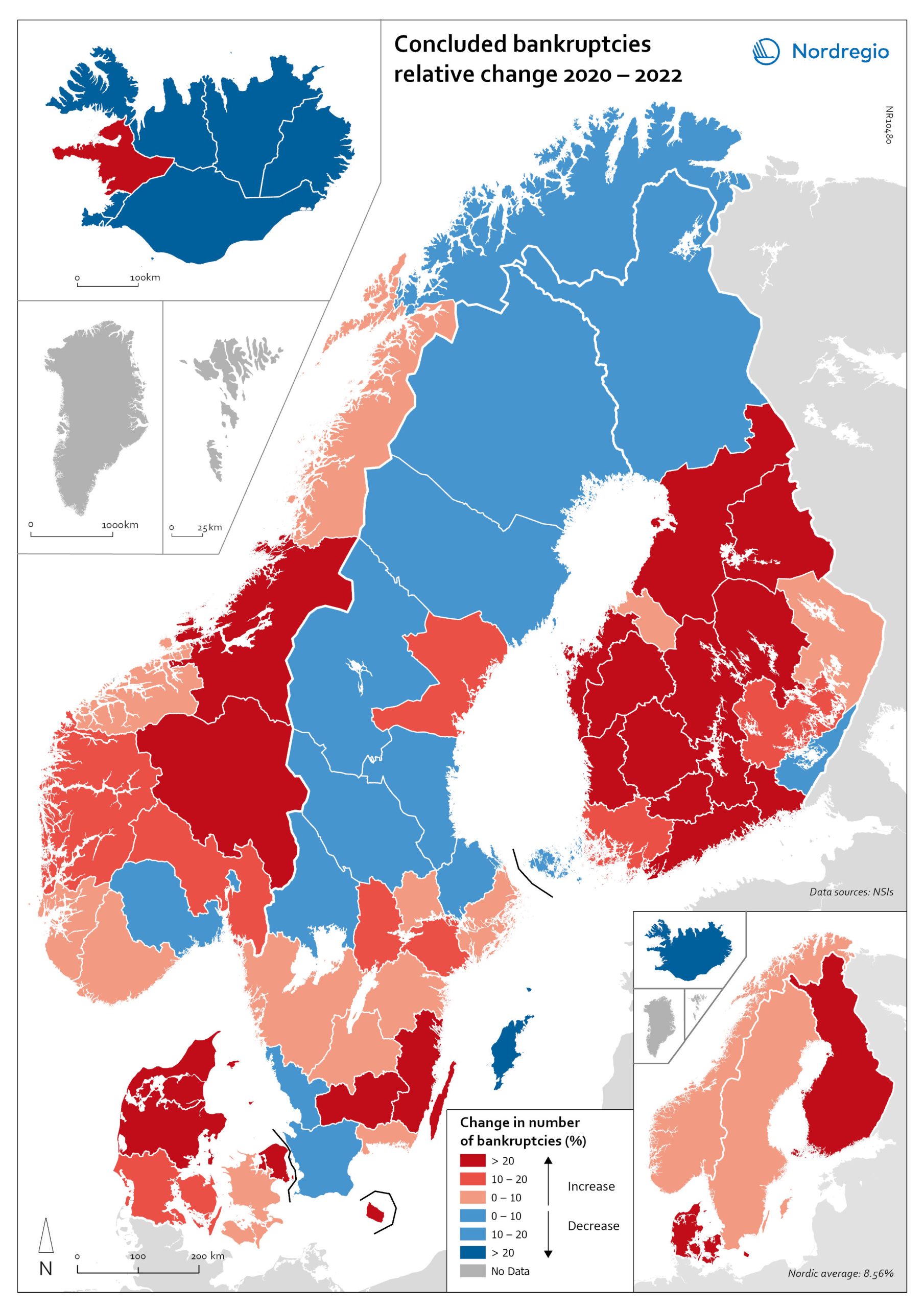
Change in the number of business bankruptcies (2020–2022)
This map depicts the change in total number of bankruptcies in the Nordic regions between 2020 and 2022. The red shades indicates an increase in numbers of bunkruptcies and blue shades a decrease. The big map shows the regional level and the small map the national level. The rate of business bankruptcies is a core indicator of the robustness of the economy from the business perspective. Nordic and international businesses have been impacted by both the COVID-19 pandemic and rising inflation in recent years. In terms of the level of bankruptcies, data from Eurostat (2024) shows that the Nordic countries fared relatively well compared to other high-income countries between 2020 – 2022. In the years during and after the COVID-19 pandemic, the most densely populated regions saw the highest levels of bankruptcies. This finding is partly to be expected, as these regions also tend to be those with the highest number of companies. However, some variation can be seen across the countries. Overall, Iceland and Finland experienced the lowest rate of bankruptcies in 2020 and 2022. Denmark had the highest level of bankruptcies during COVID-19. Potential explanations for the national variations may include the countries’ varying strategic approaches to the pandemic. Denmark enforced more restrictive lockdowns compared to, for example, Sweden, where the less restrictive approach has been linked to the more limited impact on business bankruptcies in the early part of the pandemic. Furthermore, there is a large consensus that the many jobretention schemes across the Nordic Region also served to limit the number of bankruptcies. However, new data from early 2024 shows that after the job-retention schemes ended, and while high inflation and interest rates were increasing the pressure on Nordic companies, the level of bankruptcies increased. In 2023, 8,868 companies went bankrupt in Sweden the highest number…
- 2025 April
- Economy
- Nordic Region
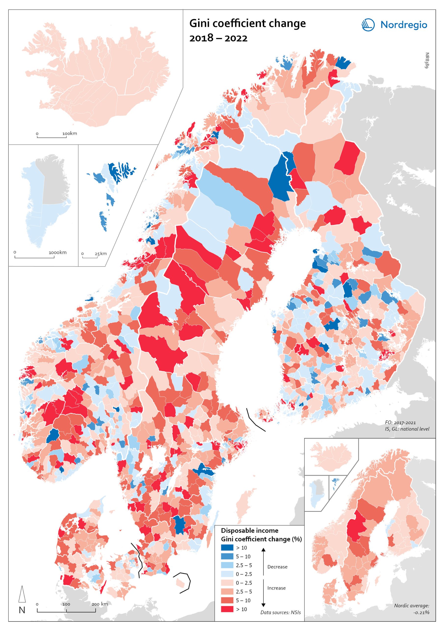
Gini coefficient change 2018-2022
This map shows the percentage change in the Gini coefficient between 2018 and 2022. The big map shows the change on municipal level and the big map at regional level. Blue shades indicate a decrease in income inequality, while red areas indicate an increase in income inequality The Gini coefficient index is one of the most widely used inequality measures. The index ranges from 0–1, where 0 indicates a society where everyone receives the same income, and 1 is the highest level of inequality, where one individual or group possesses all the resources in the society, and the rest of the population has nothing. The map illustrates significant variations in the change in income inequality across Nordic municipalities and regions. Between 2018 and 2022, income inequality increased in predominantly rural municipalities, notably in Jämtland, Gävleborg, Dalarna and Västerbotten in Sweden, as well as Telemark in Norway. For Denmark, the rise in inequality is mainly for the municipalities in Western Jutland. At the same time, approximately one third of municipalities in the Nordic Region experienced a decrease in income inequality during the same period, primarily in Finland and Åland. For example, in Finland, the distribution of inequality was more varied. This trend aligns with the ongoing narrowing of the household income gap observed in many Finnish municipalities since 2011, which is mainly attributed to the economic downturn of the early 2010s, as well as demographic shifts such as outmigration and ageing.
- 2025 April
- Economy
- Nordic Region
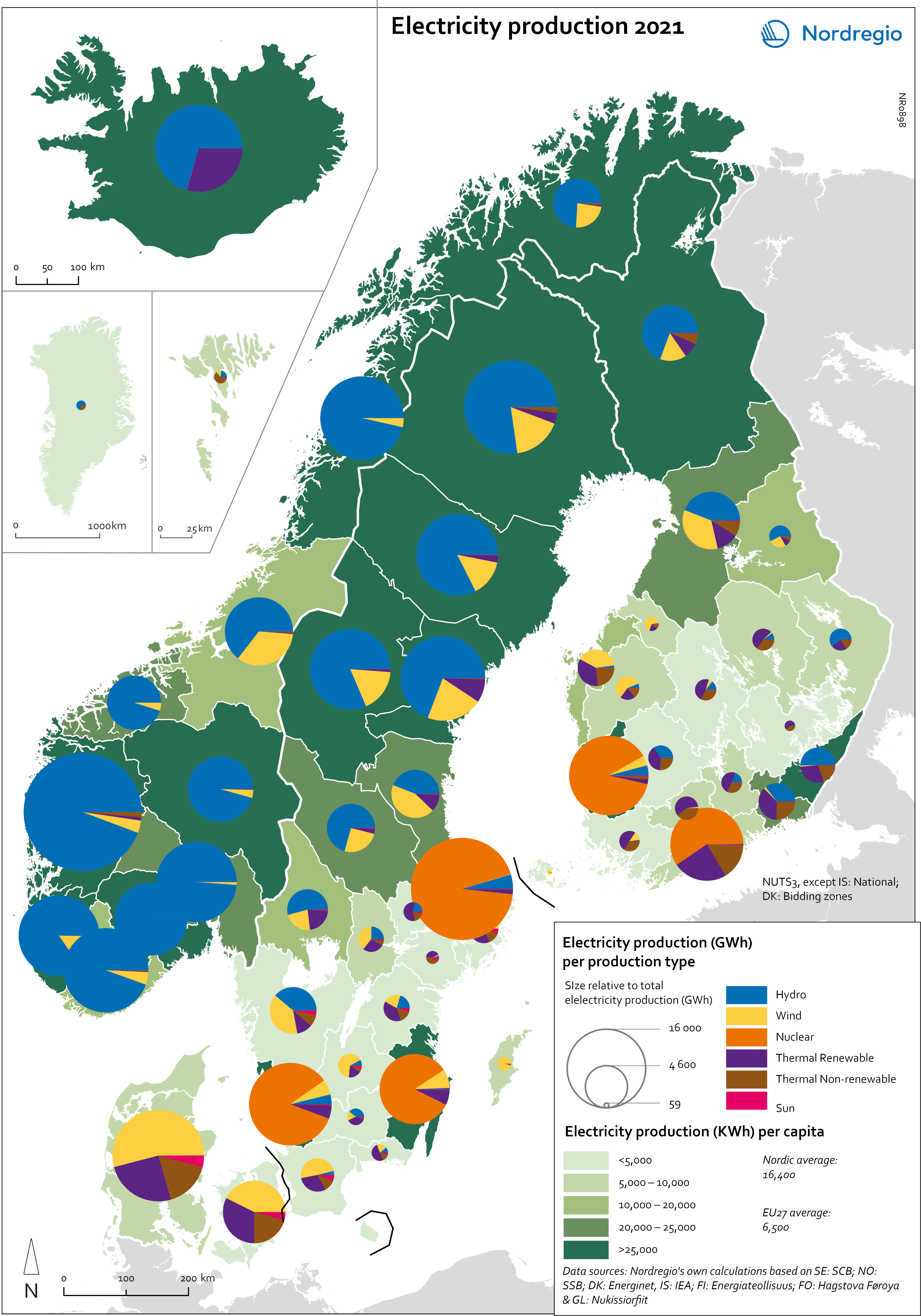
Electricity production 2021
This map shows the spatial distribution of Nordic electricity production per capita, by volume and source type in the Nordic Region in 2021. The data is presented at a regional level, except for Iceland (national level) and Denmark (bidding zones). The circles represent electricity production in GWh, while the green shades indicate electricity production per capita (kWh). Finally, the colour of the circles denotes the source of electricity. The Nordic Region overall has a high electricity production per capita; in fact, Iceland and Norway have the world’s highest electricity production per capita. The electricity mix in 2021 was 96% fossil-free – 73% from renewables (mainly hydropower) and 17% from nuclear power. In 2000 85% of the electricity production was fossile-free. Still there are clear spatial differences in the electricity production. Firstly, we see the high amount of electricity being produced for the five nuclear facilities in Sweden and Finland. Secondly, a substantial volume of hydro-electricity is produced in southern Norway, throughout Iceland, Northern Sweden and Northern Finland. As a result, over half of Nordic electricity is produced from hydropower. Wind power is the source of electricity that has been growing the most during the last two decades, from 1.2% in 2000 to 14% in 2021. The regions with the highest electricity production per capita are in Iceland, Northern Sweden, and Northern and Western Norway. Both Finland and Denmark are net importers of electricity, but both countries have rapidly transitioned away from fossil fuels. Cheap and fossil-free electricity is a prerequisite for the green transition and with growing industries within e.g. battery production, green steel and mining, the need for fossil-free electricity is expected to increase in the coming decades.
- 2025 April
- Environment
- Labour force
- Nordic Region
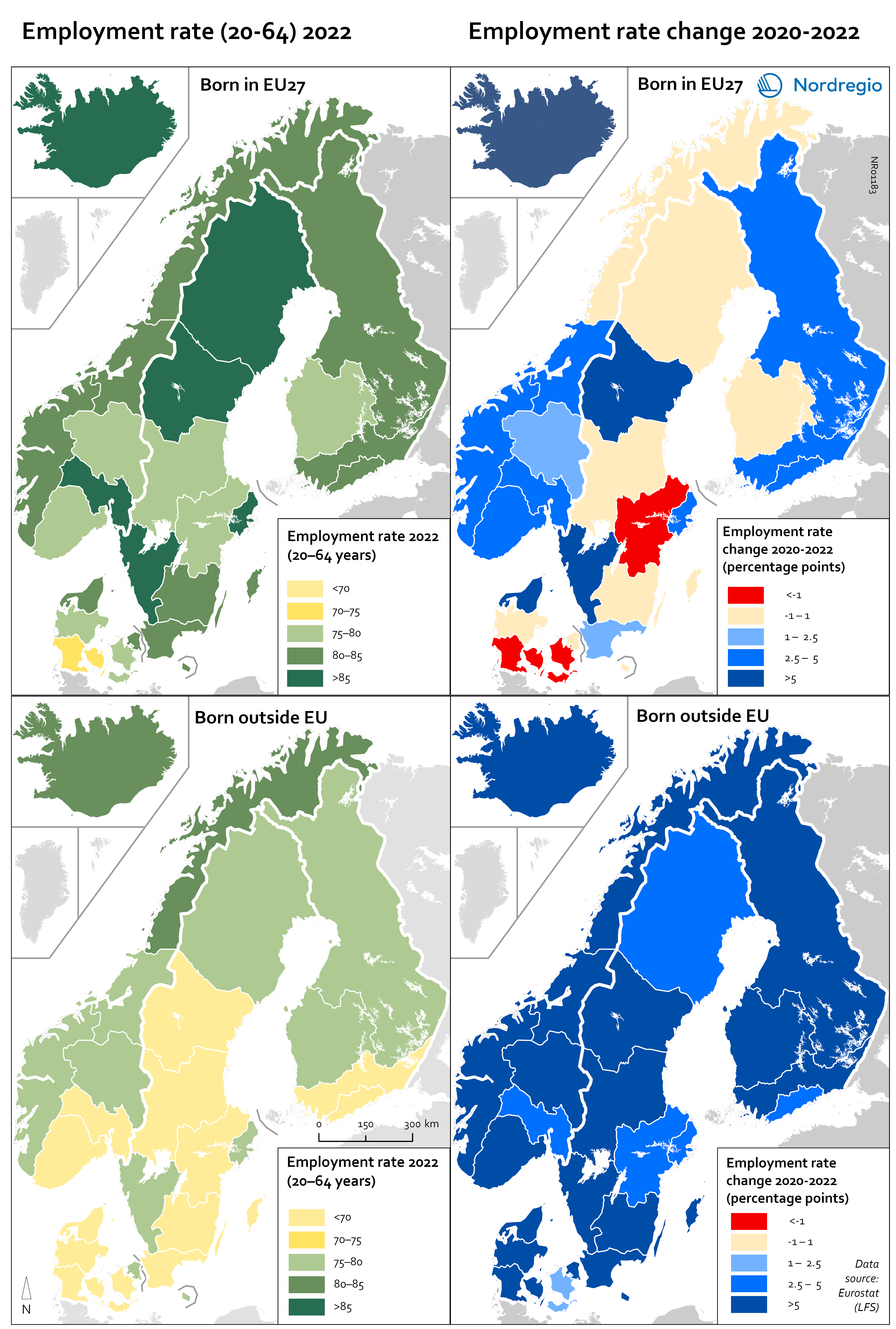
Employment rate 2022 and Employment rate change 2020-2022 among foreign-born
These maps shows the employment rate in 2022 for those born in a EU country (top left) and those born outside of the EU (bottom left), as well as the change in employment rate between 2020 and 2022 for those born in the EU (upper right) and outside the EU (lower right). The data is displayed at NUTS 2 level and comes from the labour force survey (LFS). The category ‘foreign-born’ is quite heterogeneous and consists of everything from labour migrants to refugees – two groups who face quite different conditions and have different connections to the labour market. The employment rate for people born in another EU country – a group that includes a large proportion of labour migrants – has been on par with the employment rate for native-born people for a long time. As can be seen in the top-left figure in the map, in 2022 all NUTS2 regions except Southern Denmark had an employment rate of 75% or more for this group. The highest employment rate was observed in the Swedish NUTS2 regions of Middle Norrland, Stockholm and Western Sweden, followed by Oslo in Norway and Iceland. The employment rate for people born outside of the EU (a group that largely consists of refugees) has been lower for a long time than that of native-born people and those born in the EU. While the employment rate for people born in non-EU countries is still lower than for natives (a 15 percentage point difference (pp) in Sweden, 11 pp in Norway, 7 pp in Denmark and Finland, and 2 pp in Iceland), this gap has been closing in the last couple of years since the pandemic. Between 2020 and 2022, the employment rate for those born outside of the EU rose almost eight percentage points in Denmark…
- 2025 April
- Labour force
- Nordic Region
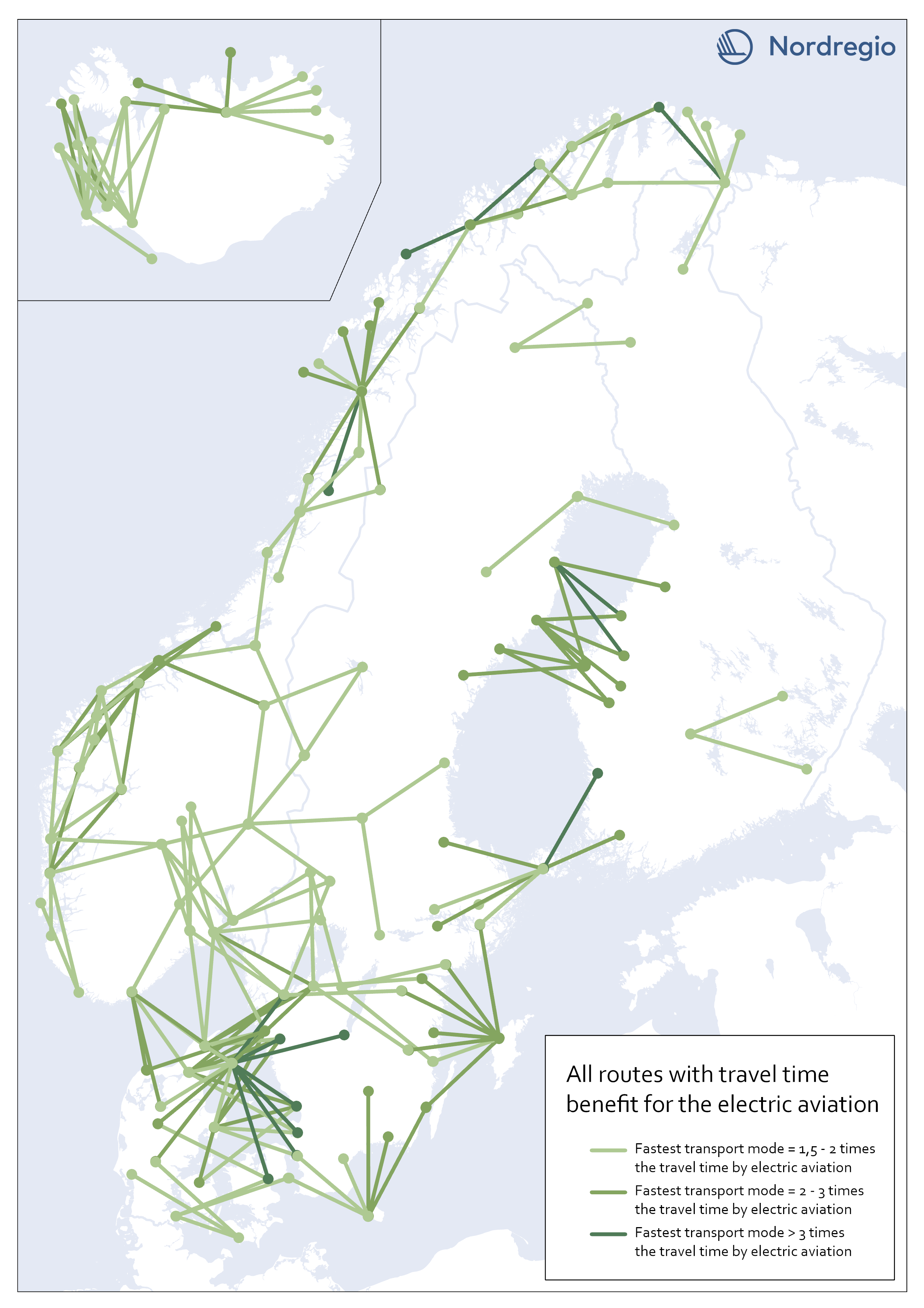
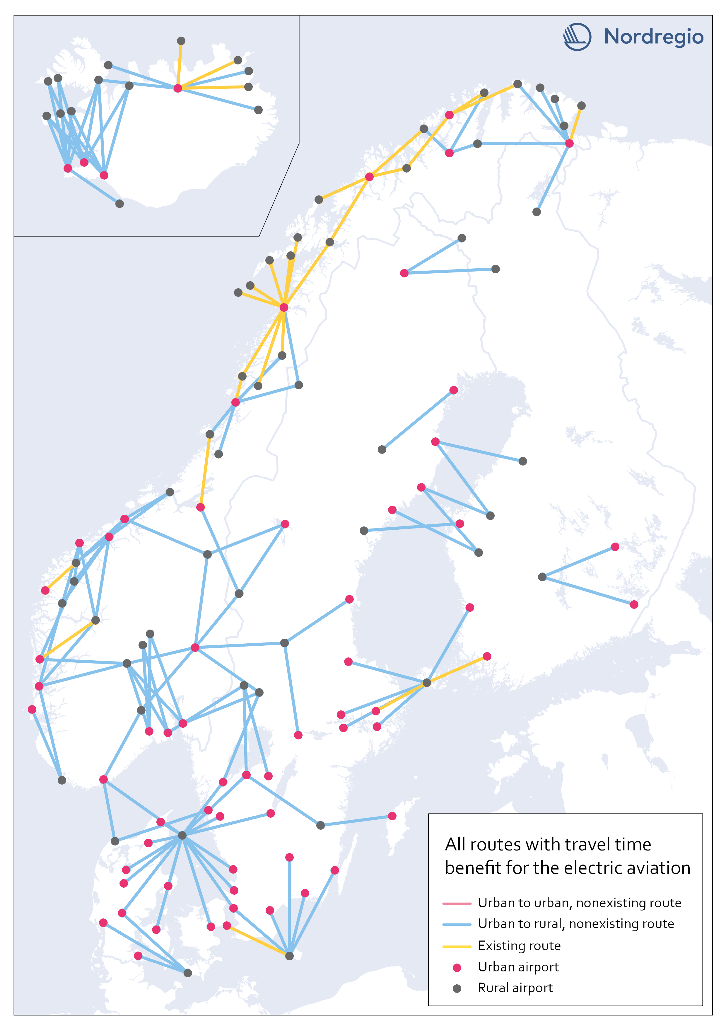
All routes with time benefit for electric aviation
The map shows all routes in our sample with significant travel time benefit for electric aviation. They are 203 in total. A route has a significant travel time benefit if the travel time for both car and public transportation exceeded 1,5 times the travel time for electric aviation. I.e., if one of the existing transport modes is faster or up to 1,5 times the travel time for electric aviation, electric aviation does not have the potential to improve accessibility between the two destinations, according to our analysis.
- 2023 February
- Nordic Region
- Transport
Electric aviation time benefits between urban and rural areas
The map shows all routes between urban and rural areas where electric aviation has significant time benefits compared to other traffic modes. Yellow lines are already served by aviation, while blue color indicates non-existent routes where electric flight would reduce the travel time between destinations. Our motivation for focusing on urban-rural routes was based on the assumption that electric aviation can increase the access for rural areas to public facilities and job opportunities, as well as the possibility of connecting remote areas with national and international transport systems. The result, though, can only be understood in terms of travel time benefits between the areas, and thus reveals little about accessibility to mentioned opportunities. The following are examples of themes to be investigated further within the main project. Identify regional hubs Among others, the project FAIR (2022) has addressed the need to update the flight system to a more flexible aviation network, that meet travelers’ needs with smart mobility. This can be done by identifying demands and establishing regional hubs for electric aviation, which can serve remote and regional areas. The potential of Hamar and Bodö in Norway as regional hubs should be studied more closely.
- 2023 January
- Nordic Region
- Transport
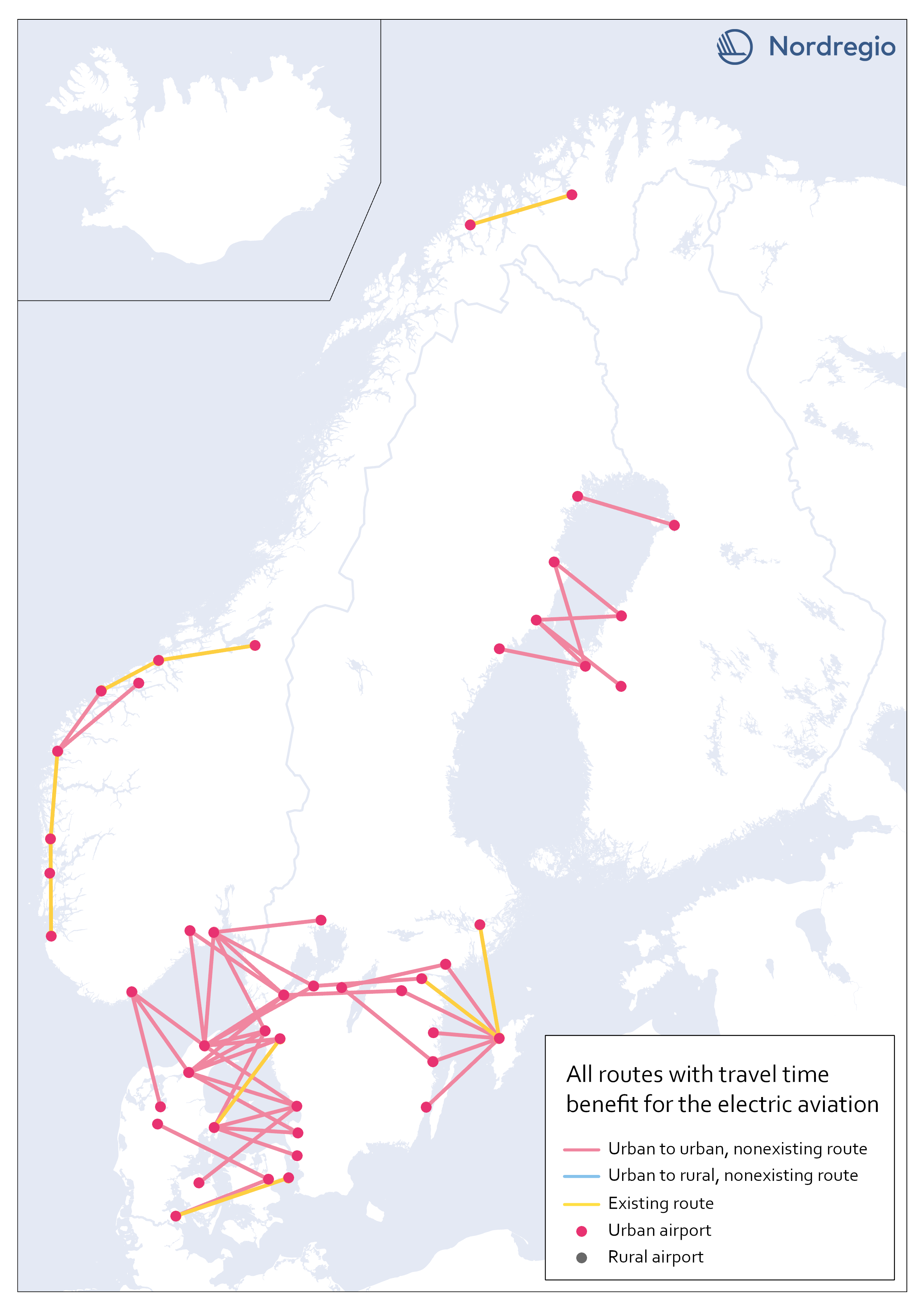
Electric aviation time benefits between urban areas separated by water
The map shows all routes between urban areas separated by water, and where electric aviation has significant time benefits compared to the fastest traffic mode. Yellow lines are already served by aviation, while red color indicates non-existent routes where electric flight would reduce the travel time between destinations. The result is in line with our assumptions, that there is a lack of fast connections between potential labor markets in urban areas, which are geographically close but separated by open water.
- 2023 January
- Nordic Region
- Transport
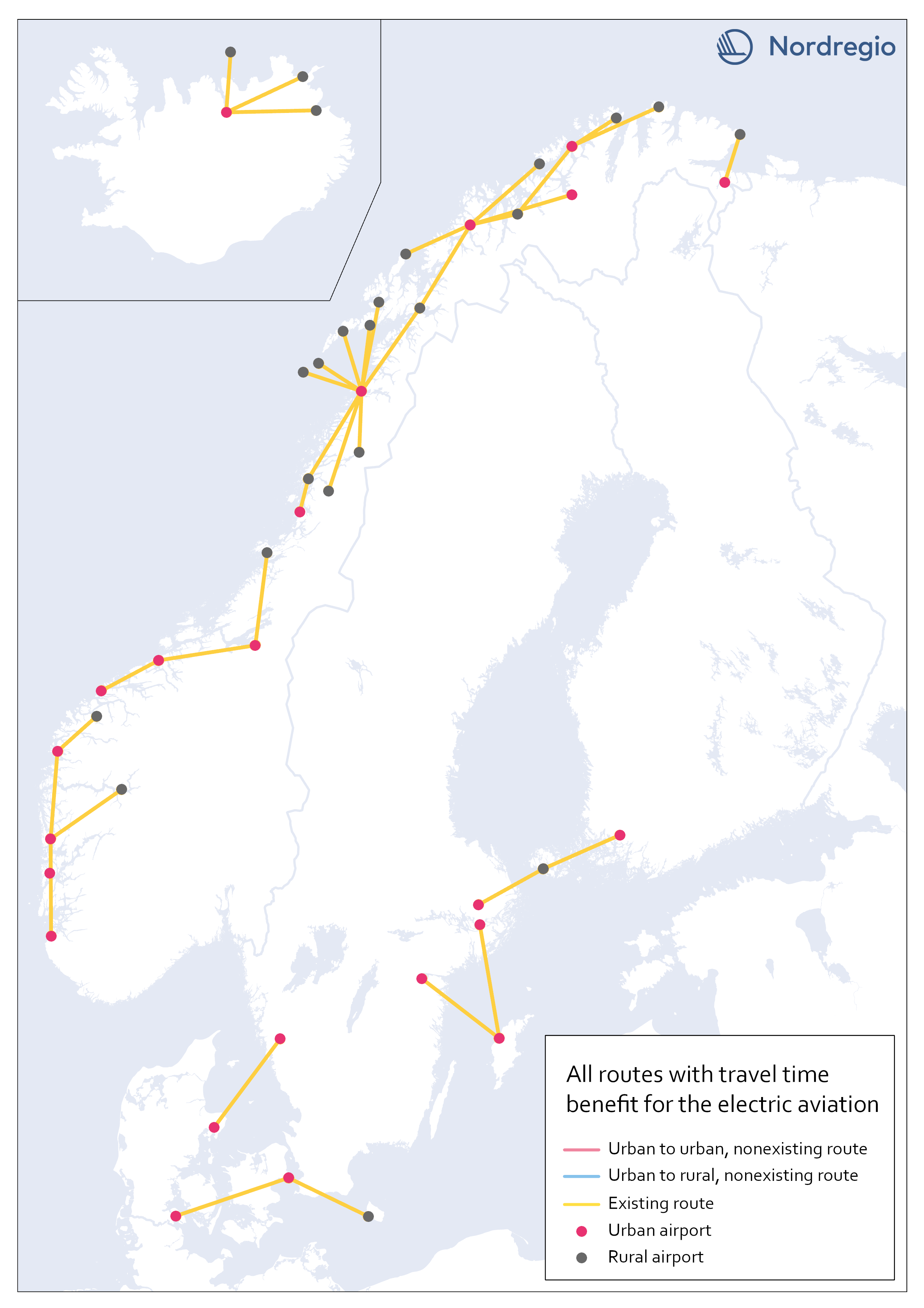
Existing routes with time benefit for electric aviation
The map visualizes all routes with significant travel time benefit, which are already served with commercial flights. Information on existing routes has been obtained from the report Nordic Sustainable Aviation (Ydersbond et al, 2020) and applies to the year 2019. Since then, routes may have been added or removed, which is important to bear in mind in future investigations. However, choosing a later year risk giving equally misleading results, as flights decreased drastically during the pandemic. Statistics for 2019 provide a picture of the demand that existed before the pandemic, which is the latest stable levels that can be obtained. Whether air traffic will ever return to the same levels as before the pandemic is too early to say. The majority of routes are found in Norway, along the coastline, which confirms earlier knowledge that Norway has a more extensive and coherent aviation network than the rest of the Nordic region.
- 2023 January
- Nordic Region
- Transport
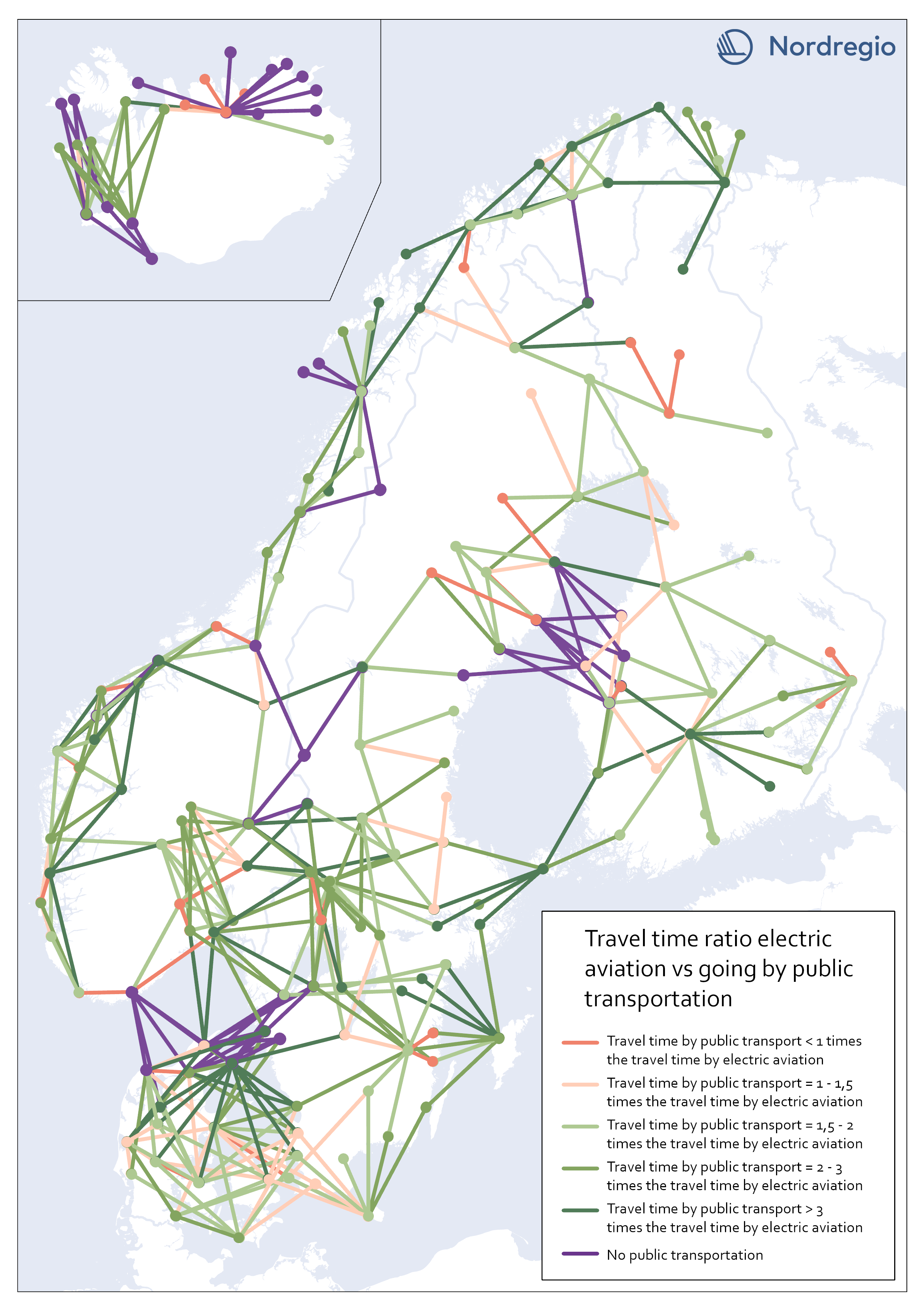
Travel time ratio – electric aviation vs public transportation
This map shows the travel time calculations for electric aviation versus travelling by public transportation. Routes represented by any nuance of green, are routes with significant travel time benefits for electric aviation in comparison with public transportation. The darker the nuance of green, the larger time benefit for electric aviation. The beige color represents routes where the travel time for public transportation is the same or up to 1,5 times the travel time for electric aviation. The red color represents routes where public transportation is faster than electric aviation. Purple lines represent routes where no public transportation is available. These were also routes where we could see significant time benefits for electric aviation. The number of changes when commuting with public transport may have a negative impact on perceived accessibility. In this accessibility analysis, however, we stay with the same criteria for public transport as for travel by car. For future research, the number of changes when commuting by public transport could be considered in the comparison.
- 2023 January
- Nordic Region
- Transport
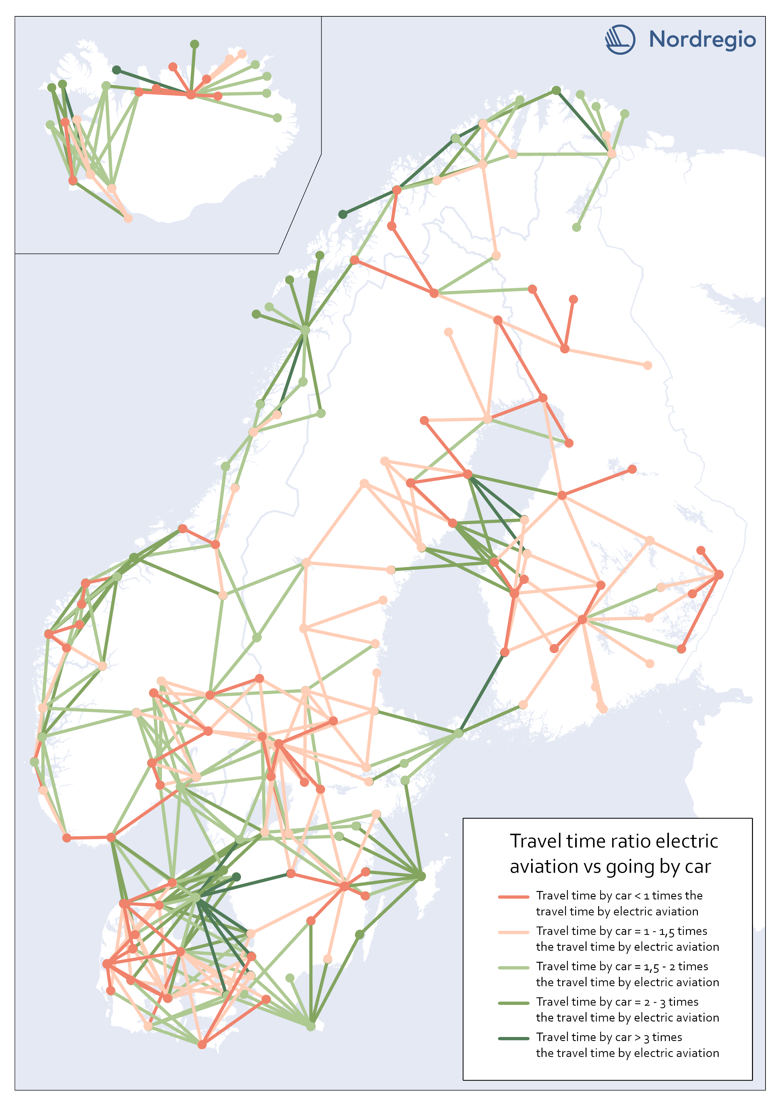
Travel time ratio – electric aviation vs car
This map shows the travel time calculations for electric aviation versus traveling by car. Routes represented by any nuance of green, are routes with significant travel time benefits for electric aviation in comparison with car. The darker the nuance of green, the larger time benefit for electric aviation. The beige color represents routes where the travel time for car is the same or up to 1,5 times the travel time for electric aviation. The red color represents routes where car is faster than electric aviation.
- 2023 January
- Nordic Region
- Transport
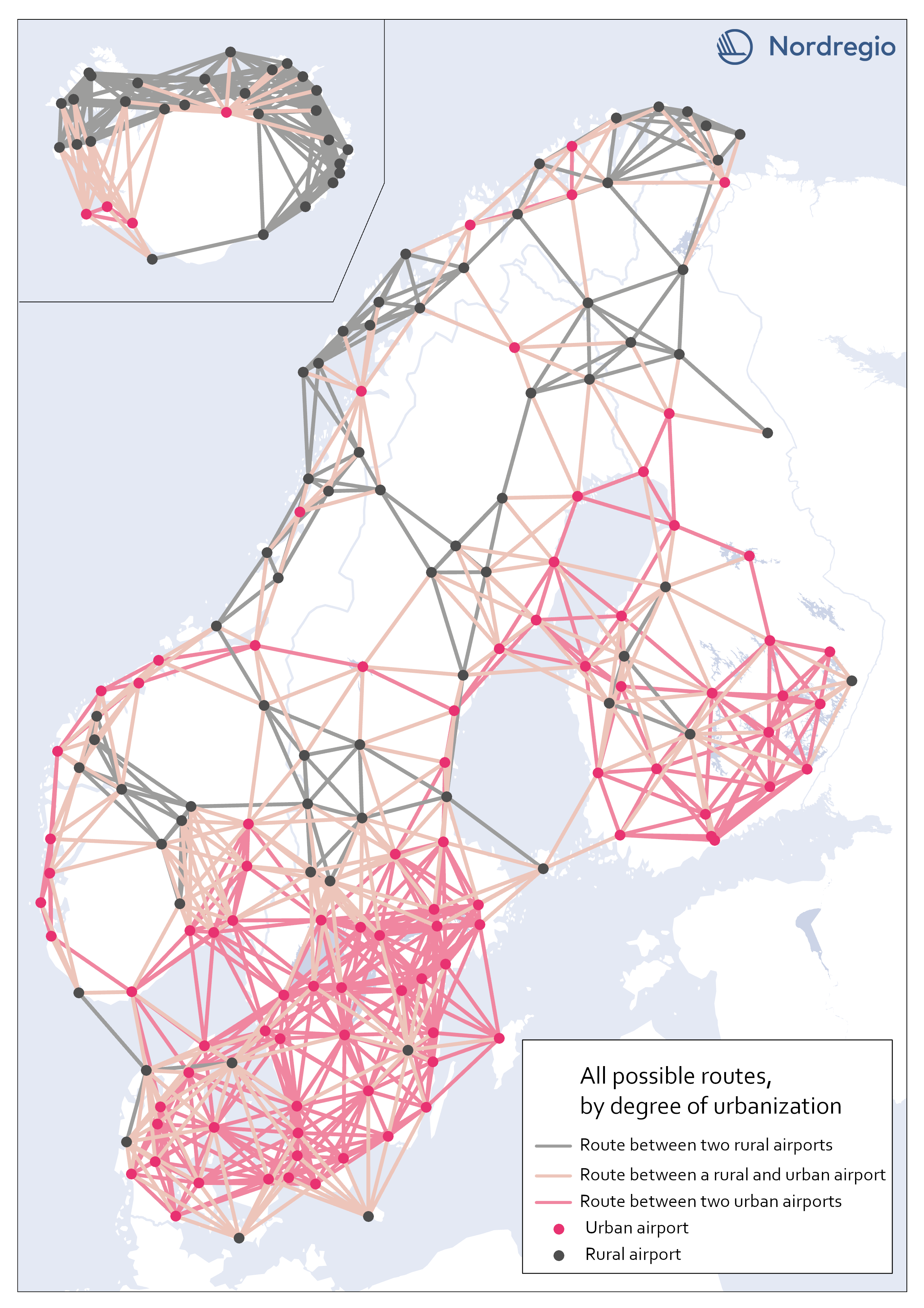
All possible electric aviation routes by a degree of urbanisation
The map shows all routes with a maximum distance of 200 km divided into three categories, based on the airports’ degree of urbanization: Routes between two rural airports, routes between one rural and one urban airport and routes between two urban airports. The classification is based on the new urban-rural typology. We restricted the analysis to routes between rural and urban areas as well as routes between urban areas that are separated by water. Those are 426 in total. We based our criteria on the assumption that accessibility gains to public services and job clusters can be made for rural areas, if better connected to areas with a high degree of urbanization. Because of possible potential to link labor markets between urban areas on opposite sides of water urban to urban areas that cross water are also included. This is based on previous research which has shown the potential for electric aviation to connect important labor markets which are separated by water, particularly in the Kvarken area (Fair, 2022). Our choice of selection criteria means that we intentionally ignore routes where electric aviation may have a potential to reduce travel times significantly. There might also be other important reasons for the implementation of electric aviation between the excluded routes. Between rural areas, for example, tourism or establishing a comprehensive transport system in the Nordic region, constitute reasons for implementing electric aviation. Regarding routes between urban areas over mainland, the inclusion of more routes with the same rationale as above – that significant time travel benefits could be gained between labor markets with electric aviation (for example between two urban areas in mountainous regions where travel times can be long) – can be motivated. Some of those routes can be important to investigate at a later stage but are outside the…
- 2023 January
- Nordic Region
- Transport
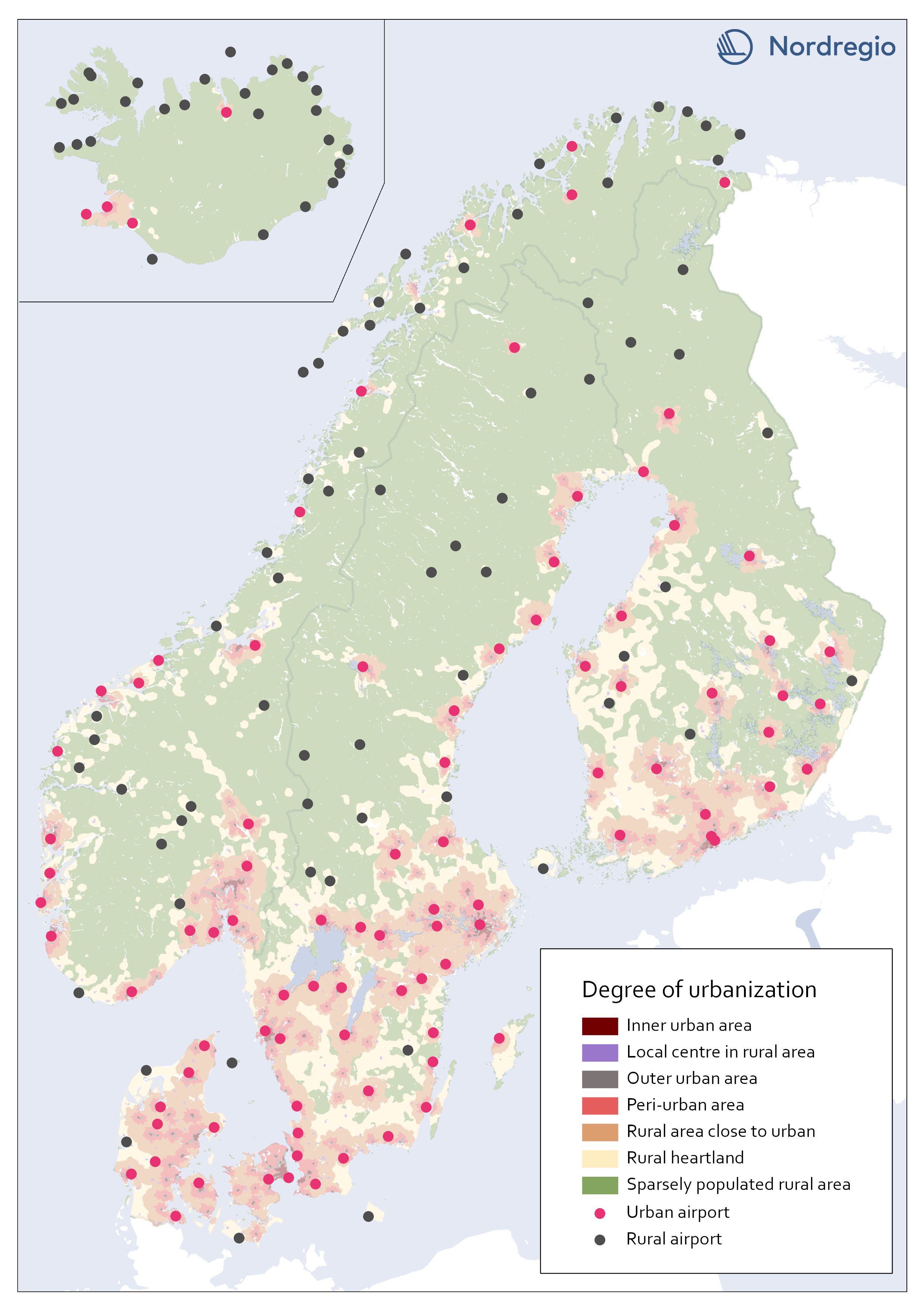
All airports in the Nordic region by a degree of urbanisation
This map classifies all airports by a degree of urbanisation. The classification is based on the new urban-rural typology. We classified all airports localized within any of the top five urbanization classes (Inner urban area, Local center in rural area, Outer urban area, peri-urban area, or Rural area close to close to urban) as Urban. All other airports, localized within the bottom two classes (Rural heartland or Sparsely populated rural area) were classified as Rural. No adjustments were made based on the proximity of the airports to urban areas. During the process we considered adjustments in the categorization based on the airports’ potential catchment area from a close urban area. For example, one can assume that Gällivare Lappland airport in the north of Sweden, has its main catchment area from Gällivare which is classified as a local center in rural area (i.e. Urban). The airport, though, is localized within the category Rural heartland. Yet, we decided to let the typology determine to which category each airport belong.
- 2023 January
- Nordic Region
- Transport
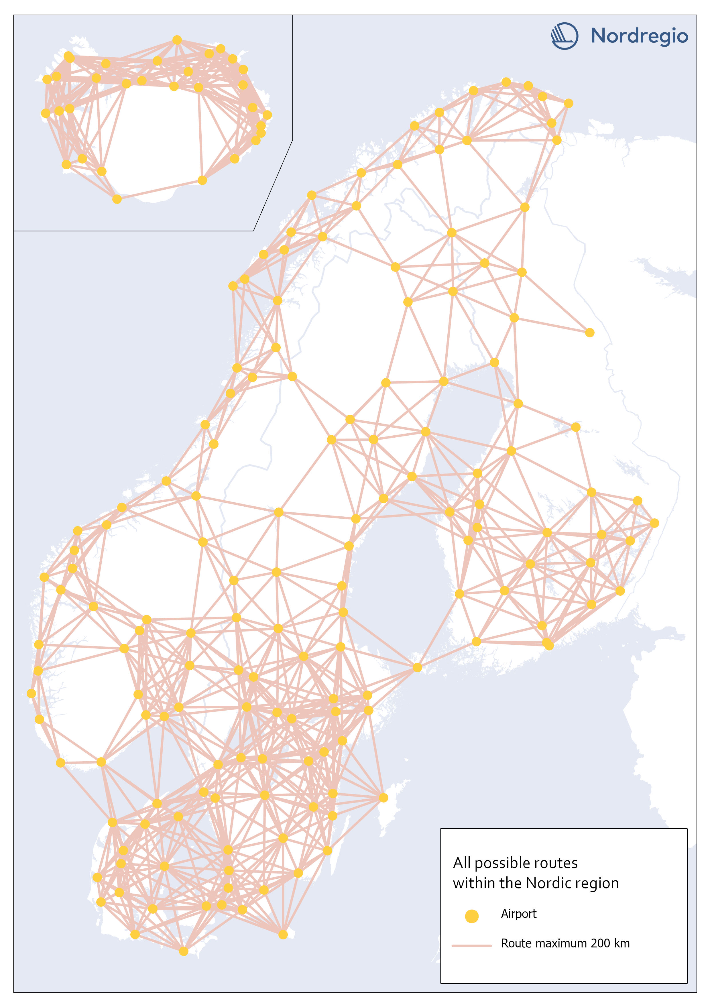
All possible electric aviation routes, max 200km, within the Nordic region
This map shows all possible electric aviation routes of a maximum distance of 200 kilometres within the Nordic region. First generation electric aviation will have a limited range due to battery capacity. According to the report Nordic Sustainable Aviation, routes up to 400 kilometers constitute an initial market for electric airplanes in the Nordic region. However, also shorter distance routes under 200 km, where cruise speed is less important and in sparsely populated regions where passenger volumes are very small, will be the focus (Ydersbond et al, 2020). The first generation of aircrafts that rely solely on electric power have a defined maximum range of 200 km (Heart Areospace, 2022). For this accessibility study, we only included routes of a maximum distance of 200 kilometers. This selection gave us 1001 possible routes in total.
- 2023 January
- Nordic Region
- Transport
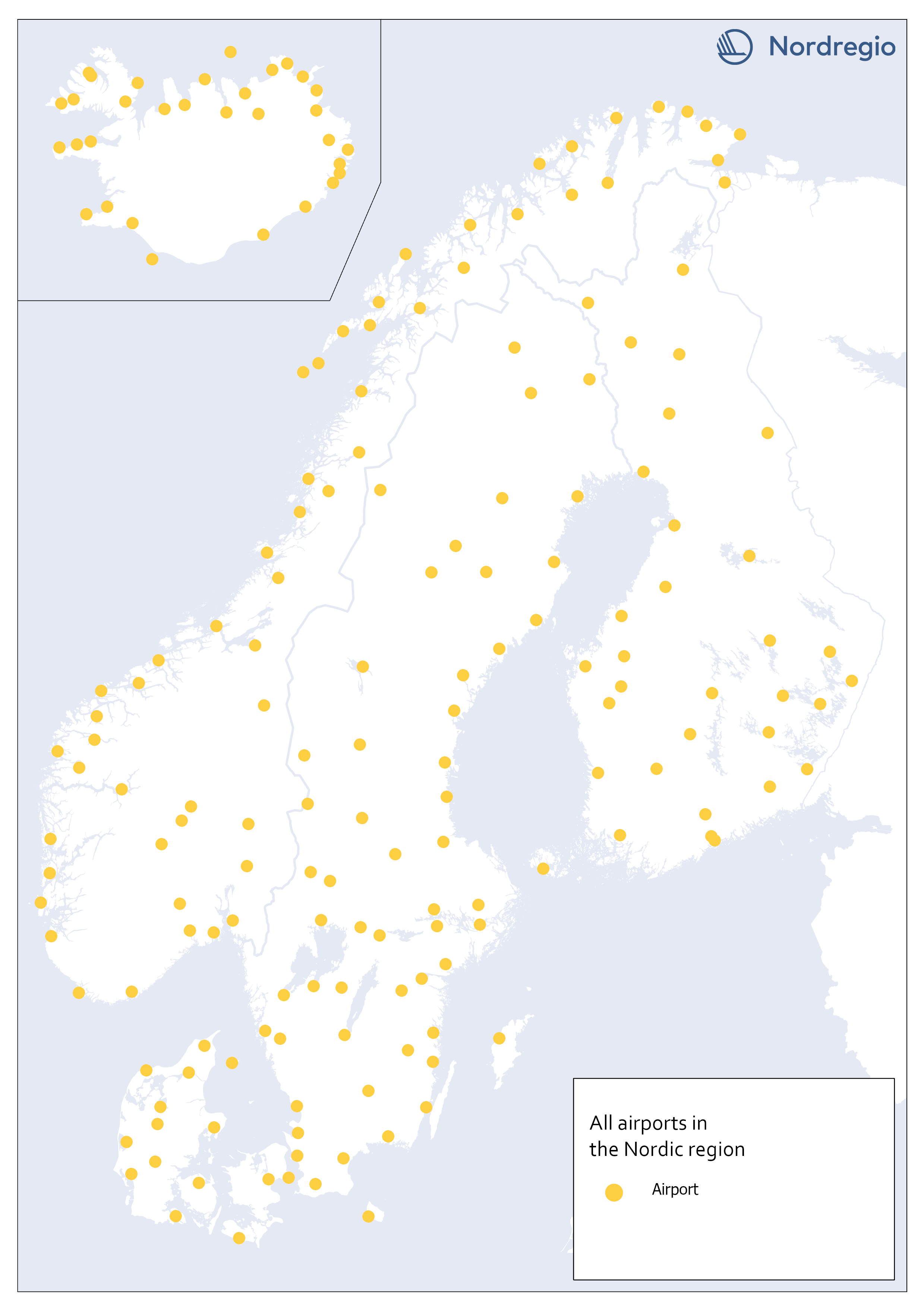
All airports in the Nordic region
This map shows all airports within the geographical scope which may be operated with commercial flight. To limit our selection of airports, we used a combination of two official airport code systems: IATA (International Air Transport Association) and ICAO (International Civil Aviation Organization). IATA-codes specify the airport as a part of a commercial flight route. However, the IATA system, is not solely limited to airports. Other locations, such as bus or ferry stations can also apply for an IATA location code, as long it is included in an airline travel chain. The ICAO-code, on the other hand, indicates that the location is an airport, but not necessarily for commercial flights In order to obtain a selection of airports that met our criteria, an airport was included only if it had both an IATA-code and an ICAO-code. Three different sources are used: 1) Swedavia (lists all airports in the Nordics that Swedavia traffics today). This is our main source, but it does not include all existing airports in the Nordic countries. Therefore, we also use two other sources: 2) Avcodes: Airport code database, from which other airports, that are not served by Swedavia, are obtained. 3) Wikipedia. Finally, the listed airports are checked against Wikipedia, to verify if any airports have been missed through the other sources. This selection gave us 186 airports in total.
- 2023 January
- Nordic Region
- Transport
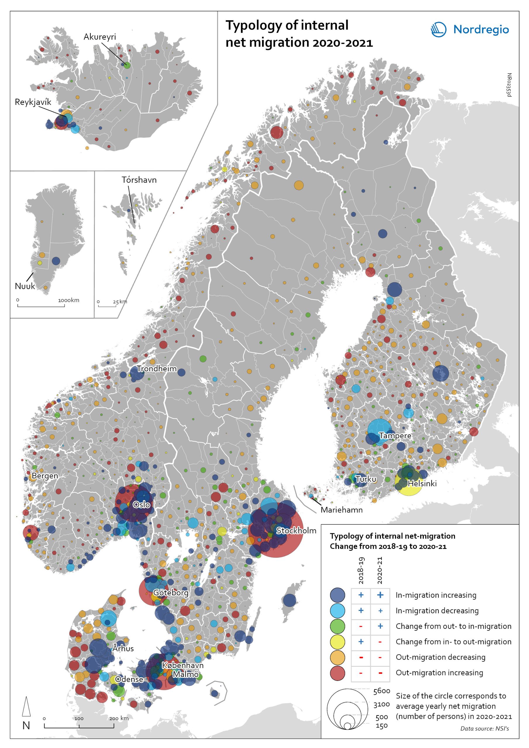
Typology of internal net migration 2020-2021
The map presents a typology of internal net migration by considering average annual internal net migration in 2020-2021 alongside the same figure for 2018-2019. The colours on the map correspond to six possible migration trajectories: Dark blue: Internal net in migration as an acceleration of an existing trend (net in-migration in 2020-2021 + increase compared to 2018-2019) Light blue: Internal net in migration but at a slower rate than previously (net in-migration in 2020-2021 + decrease compared to 2018-2019) Green: Internal net in migration as a new trend (net in-migration in 2020-2021 + change from net out-migration compared to 2018-2019) Yellow: Internal net out migration as a new trend (net out-migration in 2020-2021 + change from net in-migration compared to 2018-2019) Orange: Internal net out migration but at a slower rate than previously (net out-migration in 2020-2021 + decrease compared to 2018-2019) Red: Internal net out migration as a continuation of an existing trend (net out-migration in 2020-2021 + increase compared to 2018-2019) The patterns shown around the larger cities reinforces the message of increased suburbanisation as well as growth in smaller cities in proximity to large ones. In addition, the map shows that this is in many cases an accelerated (dark blue circles), or even new development (green circles). Interestingly, although accelerated by the pandemic, internal out migration from the capitals and other large cities was an existing trend. Helsinki stands out as an exception in this regard, having gone from positive to negative internal net migration (yellow circles). Similarly, slower rates of in migration are evident in the two next largest Finnish cities, Tampere and Turku (light blue circles). Akureyri (Iceland) provides an interesting example of an intermediate city which began to attract residents during the pandemic despite experiencing internal outmigration prior. From a rural perspective there are…
- 2022 May
- Demography
- Migration
- Nordic Region
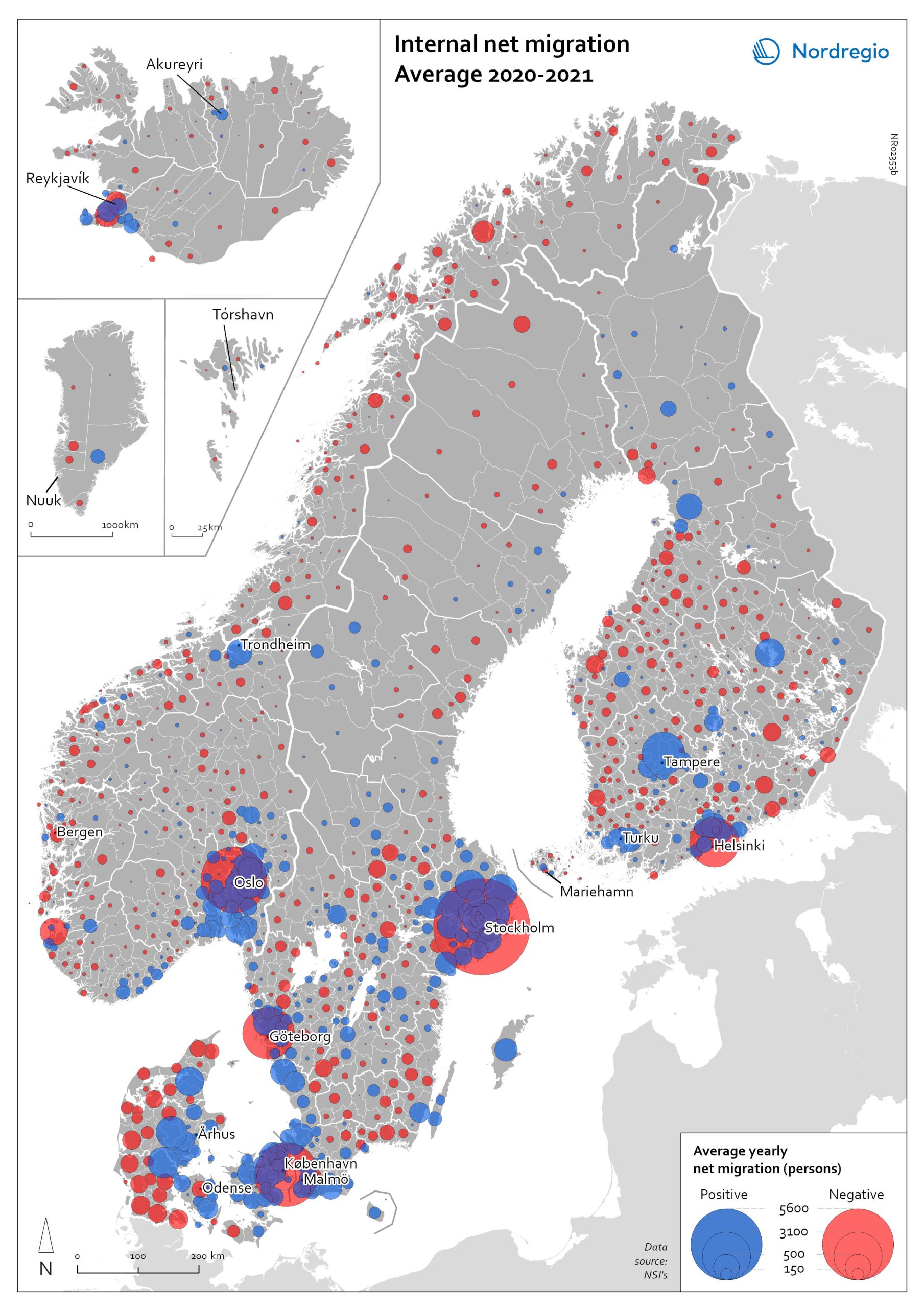
Internal net migration 2020-2021
The map shows the average internal net migration in 2020 and 2021 for Nordic municipalities. Blue dots indicate positive internal net migration (more people moving in than out) and red dots indicate negative internal net migration (more people moving out than in), while the size of the dots represents the extent of the positive or negative trend. Internal migration refers to a change of address within the same country. The map shows substantial outmigration from the Nordic capitals, as well as from Gothenburg and Malmö in Sweden. Alongside increased suburbanisation, the map also provides some evidence of growth in medium-sized cities and smaller cities within commuting distance of larger cities.
- 2022 May
- Demography
- Migration
- Nordic Region
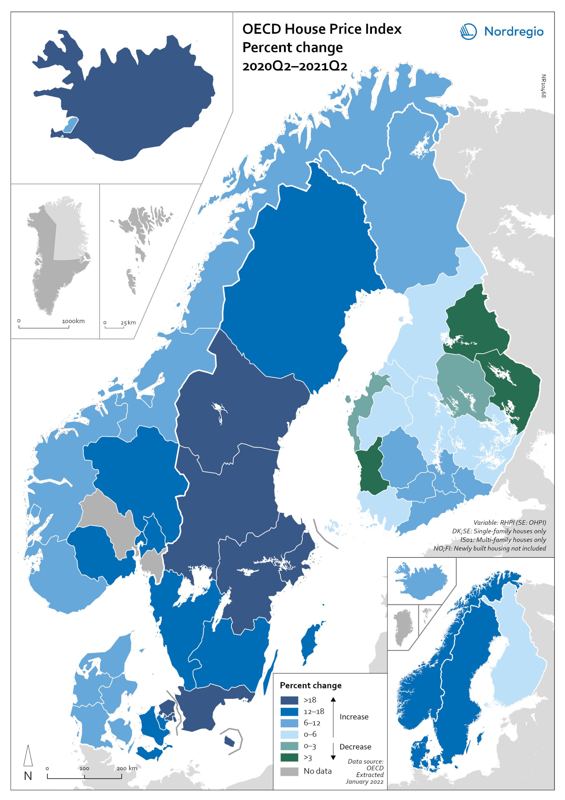
OECD House Price Index. Change 2020Q2–2021Q2
The map shows the relative change of the OECD House Price Index from Q2 2020 to Q2 2021. The map shows that the price development was not uniform within the countries. Iceland recorded the largest price increases overall, with the most marked price increases found outside of the capital region. All Swedish regions recorded increases above 20%, with the highest increases in the Stockholm and Malmö regions. All Norwegian regions showed price increases, though to a lesser extent than Swedish regions in most cases. In Denmark, Bornholm, Sjælland and the rural islands of Lolland and Falster recorded relatively high price increases, although many rural areas developed from low absolute prices in 2020. Finland was the only country where some regions saw property prices decrease. Moderate increases were still observed in some of the southern regions, where the major cities are located, and in the north.
- 2022 March
- Economy
- Nordic Region
